• There is NO official Otland's Discord server and NO official Otland's server list. The Otland's Staff does not manage any Discord server or server list. Moderators or administrator of any Discord server or server lists have NO connection to the Otland's Staff. Do not get scammed!

Really Terrible Layout

poopsiedoodle

Gibe moni plos
Joined
Nov 23, 2011
Messages
2,452
Reaction score
580
Location
Georgia
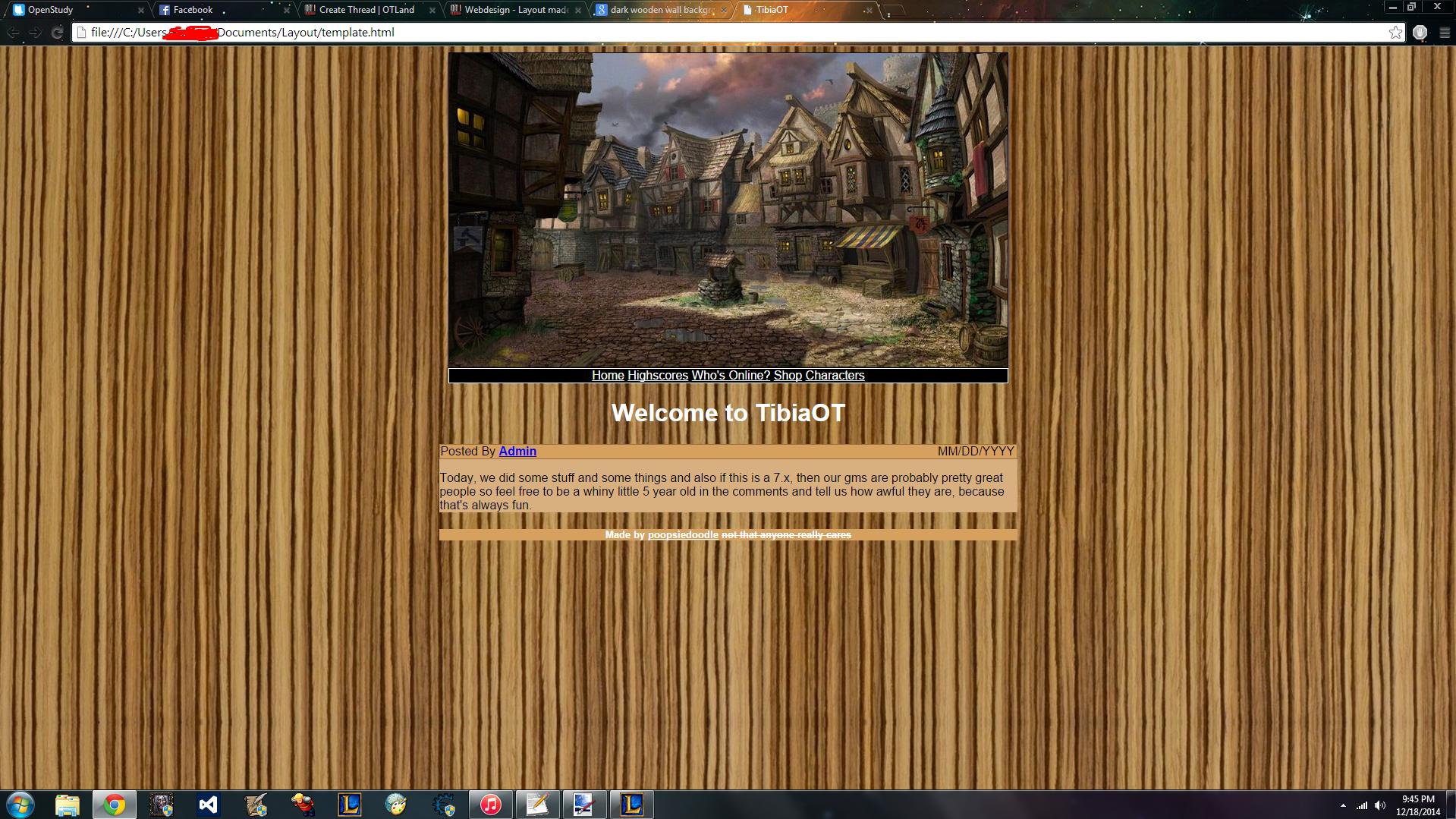
So, this is my first layout that I've ever made, and I'd say it's pretty horrible. Anyway, here it is (warning: screenshot quality is shit too):

WBnUzgG.jpg


If you can't tell, I'm taking my first web design class lmao
Also, I haven't the slightest idea about how to make a good layout for an OT website, because idk what kinda shit goes into that with the AAC stuff and all that

EDIT:
CURRENT LAYOUT:
 
Last edited:
Actually I like it a bit.
Try to make separators for the sections, and try to add something on the sides, looks empty.
 
by the way, if anyone wants the code for this so that they can make it not so terrible, lemme know
 

bumping it up to the activity bar, I reckon. It's still bad, but I'd say it's getting better.
 
Well, my opinion, not too bad for a begginer, it can be pretty decent with some minor changes:
  • Add some kind of CSS (style sheet)
  • Try to match header image width to the rest of website
  • Delete tittle under header and embed it on image
  • Please, change that background
 
Well, my opinion, not too bad for a begginer, it can be pretty decent with some minor changes:
  • Add some kind of CSS (style sheet)
  • Try to match header image width to the rest of website
  • Delete tittle under header and embed it on image
  • Please, change that background

You'd have to change absolutely everything to have it look decent
 
The main thing is padding. Add padding to all elements with text. Cannot have text too close to edges.
 
Back
Top