This time topic was a Full Set. There wasn't stiff guidelines, so now we have a lot of different sets. It's time to choose your favourite.
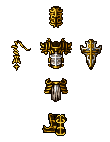
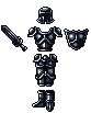
1.
Crusader Set
Basic equipement of a Holy Warriors from the North, of Crusaders.
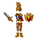
2.
Emperor's Set
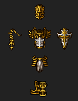
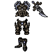
3.
Ruined King Set
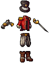
4.
Bang Bang Swashbuckler's Set
5.
Ancient Set
-------
Voting last for 7days
Thanks for entries. Hope you all keep improving and participating in future!
Also, from latest poll users picked a topic for 11th Challenge, which is
"The lord of time (character/monster, animation allowed for effects)"
Organisation thread will be posted later.
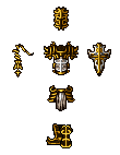
1.
Crusader Set
Basic equipement of a Holy Warriors from the North, of Crusaders.
2.
Emperor's Set
3.
Ruined King Set
4.
Bang Bang Swashbuckler's Set
5.
Ancient Set
-------
Voting last for 7days
Thanks for entries. Hope you all keep improving and participating in future!
Also, from latest poll users picked a topic for 11th Challenge, which is
"The lord of time (character/monster, animation allowed for effects)"
Organisation thread will be posted later.
Last edited: