OP
OP
Thorn
Spriting since 2013
yes, they are all for free, for now. in some future i will stop giving them for freeYou will allow players to use your sprites ?
yes, they are all for free, for now. in some future i will stop giving them for freeYou will allow players to use your sprites ?
yeah, but like i said, they are made to be mounts, and mounts can't be very big, or very small, here i can't aply what you mean :cThis pokemons are very good but need more work in proportion of size. Umbreon with same size of arcanine ?
So you say the head/nech should be more up? how do i make them? xd, well i copy a sprite from the gba games and draw, using that sprite to guide myself and use the same colors, sometimes moreThe horse is leaning more than 45* meaning its a out of perspectivebut they are all really nice. how do you make them?

1. Fur should be less bright. Maybe brown or dark grey?
2. I don't understand wtf is this shit on its legs. Some kind of red hair...?
3. I would also change tail because it is way too "furry".
4. Its left front leg(from my perspective it is right leg) is strange. I cannot describe what's wrong with it but something is.
Perspective is not bad.
yeahAhhhhhh! It's pokemon. That's explain its look a little... In this case only 4th point is still on the table.
about point 4, really don't know what to do there >.<haha thanks manWell. I can see some great works here. Especially love third one.
I remember your first sprites. Now your perspective skills are way better. You said you use colors from gba, so I can't give much of critic here. I would just sometimes play more with values. Fire on horse could use some better colors (to make it more realistic).
I suppose, I'm jealous. I should work a bit on myself too...
i though about making a better fire, more realistic, what colors should i use white too?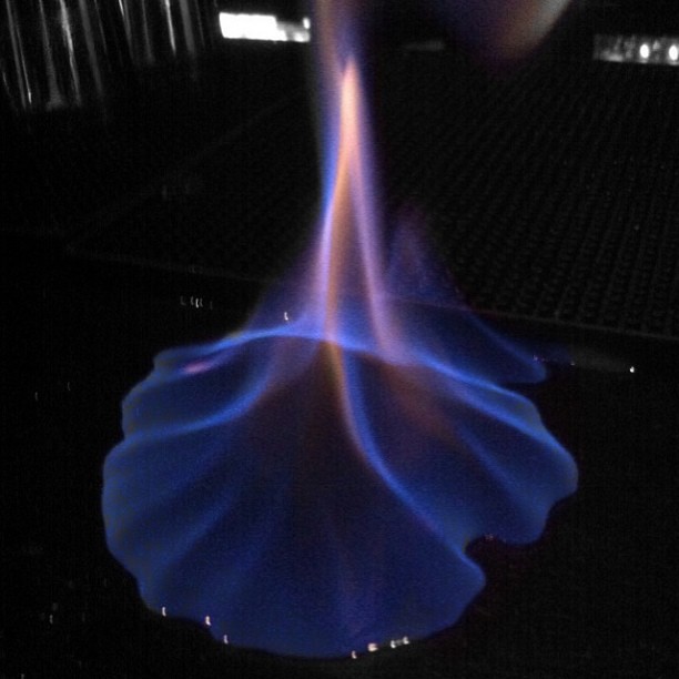
yeah i used those colors, i was looking for better colors, but they look bad on ponyta, maybe in some other creature it will look better, thanks for the helpi tryed fire unly once and i got a result i quite liked.
use a bit red maybe, orange and yellow.
don't use white, i don't think it will look good.
you can use blue to make alchool like fire (well, not on this case of course)
or green for other random chemicals that i do not recall.