You are using an out of date browser. It may not display this or other websites correctly.
You should upgrade or use an alternative browser.
You should upgrade or use an alternative browser.
Mikebadeaux's Mapping thread
- Thread starter mikebadeaux
- Start date
OP
OP
mikebadeaux
Mapper
- Joined
- May 16, 2010
- Messages
- 112
- Reaction score
- 1
@amiroslo
@Limos
Thank you fore the tips
Ima rep both of you
@Limos
Thank you fore the tips
Ima rep both of you
OP
OP
mikebadeaux
Mapper
- Joined
- May 16, 2010
- Messages
- 112
- Reaction score
- 1
Bump
Animera
* * * * *
Do you know the consequences of using too much autoborder? You will get automatic borderline, so don't use it too much!
Joke, you got potential
You only need to know to map raw (good) and use the good details at the good places, like that hydra eggs thing doesn't fit in a swamp.. And there are a lot of things wich could be removed..try think a bit logical
Joke, you got potential
You only need to know to map raw (good) and use the good details at the good places, like that hydra eggs thing doesn't fit in a swamp.. And there are a lot of things wich could be removed..try think a bit logical
Summit
New Member
- Joined
- Jun 12, 2008
- Messages
- 250
- Reaction score
- 2
AB
RAW
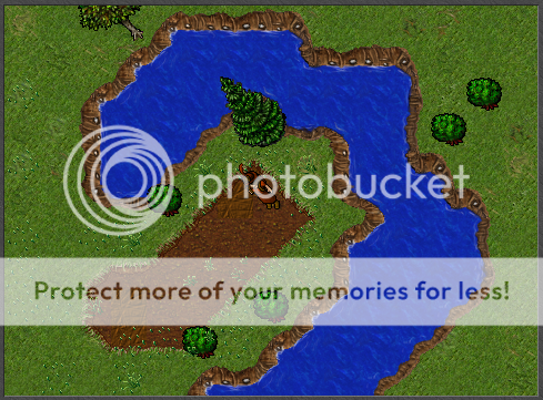
Honestly the raw river is bad, I've never in my life seen a river swing back and forth like that. It's not natural. The only time they make sharp turns is when something forces it to go that way (like part of a mountain falling in a river). Rivers follow a path of least resistance and turning the river into corrugated sheet metal is not a path of least resistance. Also, though I realize that you probably didn't care about the path of the river as opposed to the shape of the boarder but, a river in reality essentially never "horse shoes" on it's self like the first pic.
@Map:
I'll cut ya some slack since my first go was actually far far worse than that. I will however still give some critiques.
first picture:
The water looks far too straight lined ( marked in red). You want to make it more polygonal or rounded, never have a 90 degree angle in water either like on the left and top right. The statues (marked in pink) might as well have had the grass connect to the temple, and the temple is just floating on water which is very unrealistic so make some land for it to be on but generally unless it's a dock of some type then buildings shouldn't be on little islands like that. The hay field or what ever it is (marked in blue) just looks bad over all. The plant life is far and few between, try changing up the grass types and throwing some trees/flowers/ect down but be careful about how much you do because it can quickly get out of hand. The temple seems baron and empty, try scaling down the size of them and make more than 1 floor. a wooden balcony is in most cases a good thing to add. Think of a church when you make a temple. Unless it's an NPC's house I would avoid putting furniture in them, people just get annoyed but it.
Second picture:
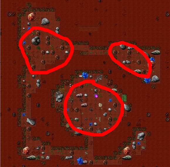
The rotworm cave isn't what I would call detailed, it's more along the lines of "spammed". The clump of rotworms (marked in red) are way too packed in there, spawns should have breathing room in between each 2-4 monsters to give mana/hp time to regenerate. It's just generally over spawned. As for the details their really arn't any, theres rocks but a clump of rocks don't make an area detailed. Again play with the ground types, throw a couple small plants that fit the cave theme, and also try some overlaying details like walkable rocks and such.
Third picture:
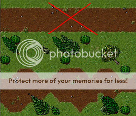
This one is actually pretty decent. The major change would again be ground type alteration and spawn reduction (too many snakes). I would certainly alter the entrance to it isn't a straight corridor. Think about what a cave would look like in reality. Also, the dead trees are just out of place so I'd remove them.
Fourth picture:
Theres only so much you can do with a waterfall but still lots of room for improvement. The dead tree is out of place again. The mountain is far to straight, even on cliffs it's never a straight wall. and again straight lines on the water. Last change, plant life and ground types.
Fifth picture:
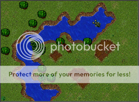
This one is far too "busy" although from a detail stand point it is slightly better. Again, ground types seem to be a reoccurring theme. Straight lines and 90's again, swamps are even less lenient on that. They really need to be RAW pallet. And plant life, this time it's overboard. try scaling down the amount of large plants and try to put in smaller plants. Subtle details are necessary for this kind of area.
Sixth picture:
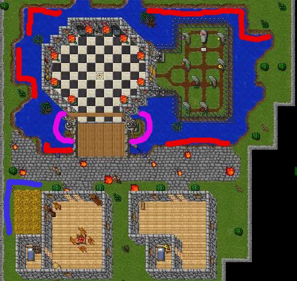
Well, I realize theres not much you can do with that but still it doesn't look right. You have floating building syndrome again. I would make the dp on land and have a walkway that goes to a dock to get to the ship rather than the ship pulling up right to the dp like that. Remember a dp is kind of like a bank in a way, not a warehouse for merchant ships.
Seventh picture:
Straight walls on the interior of the cave, try to make them more jagged. Spawn amount is way over the top for this to be dragons. It's also smart to have dl's on a separate floor. Ground types should be added. The plant life looks too linear, try to make it a bit more sporadic. The water just feels out of place to me.
Eighth picture:
Honestly, It's just bad. Nothing in particular about it, just doesn't work. Also, 90 degree angle again. The one thing that does work is the plant life, it actually fits the area but still needs some tweaking.
Ninth picture:
Nothing to really say about it, I wouldn't have put that much food out obviously but the rest of it is acceptable. Though it is a bit cramped.
Tenth picture:
It's a bit hard to see so pro tip, hide the spawn lights next time. Other than that its actually pretty good, some ground type tweaks, gettng rid of the 90's on the bottom side of the canyon (if that is a canyon), and maybe just a little bit more detailing with small things.
Last edited: