2Rec
Excellent OT User
- Joined
- Jul 31, 2013
- Messages
- 550
- Solutions
- 48
- Reaction score
- 887
Hi there,
on the beginning i need to say, that for this first post, it's more kinda request for help than a show-off and i was going to post it as support thread, but since i felt it doesn't fit so well, i've decided to create a mapping thread and pin a little question here.
But I would of course try to post some fresh, unrelated pieces once in the while.
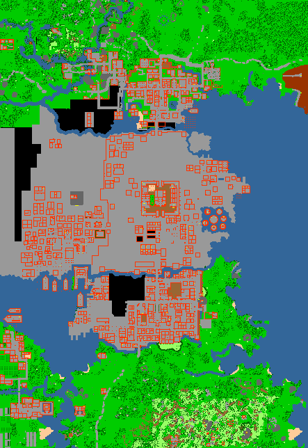
Sooo, i'm revamping some RL map pieces and i want to make it look as poor and gloom as it can get.
Mostly i'm assisting myself with examples of 1700's europe and Taboo TV series.
I would love to see some opinions if i'm going the right way with the setup(grounds/walls) and maybe some help from other mappers, with some style ideas/templates for architecture and such.
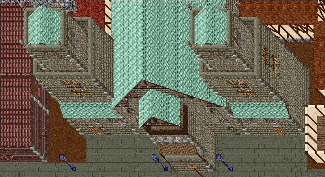
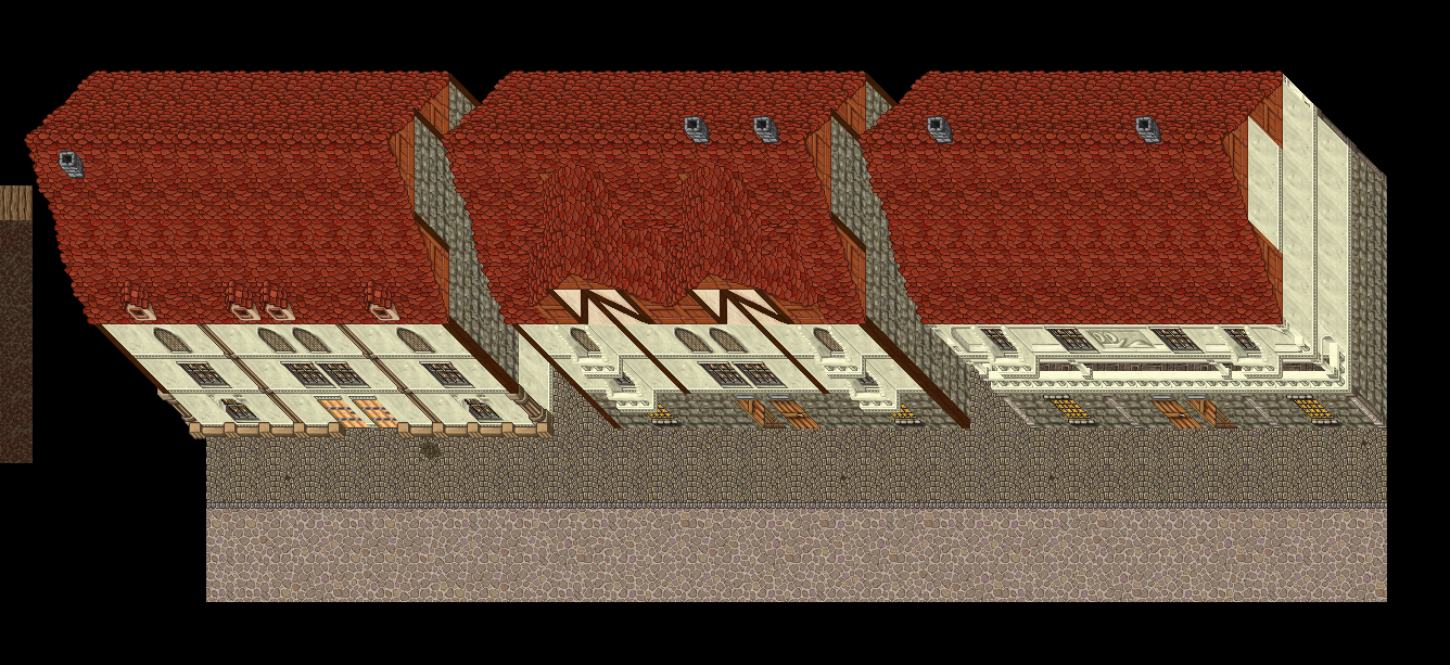
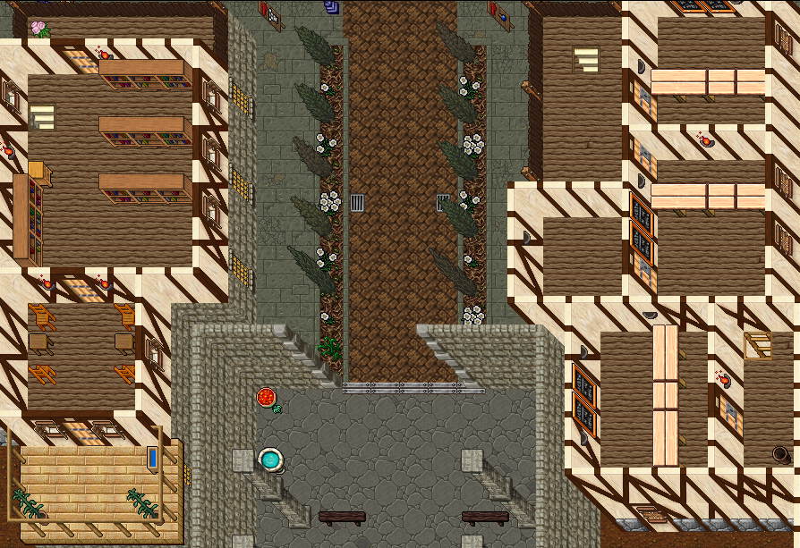
Here's my try on some houses, but it feels a bit empty and weird. (don't mind borders)
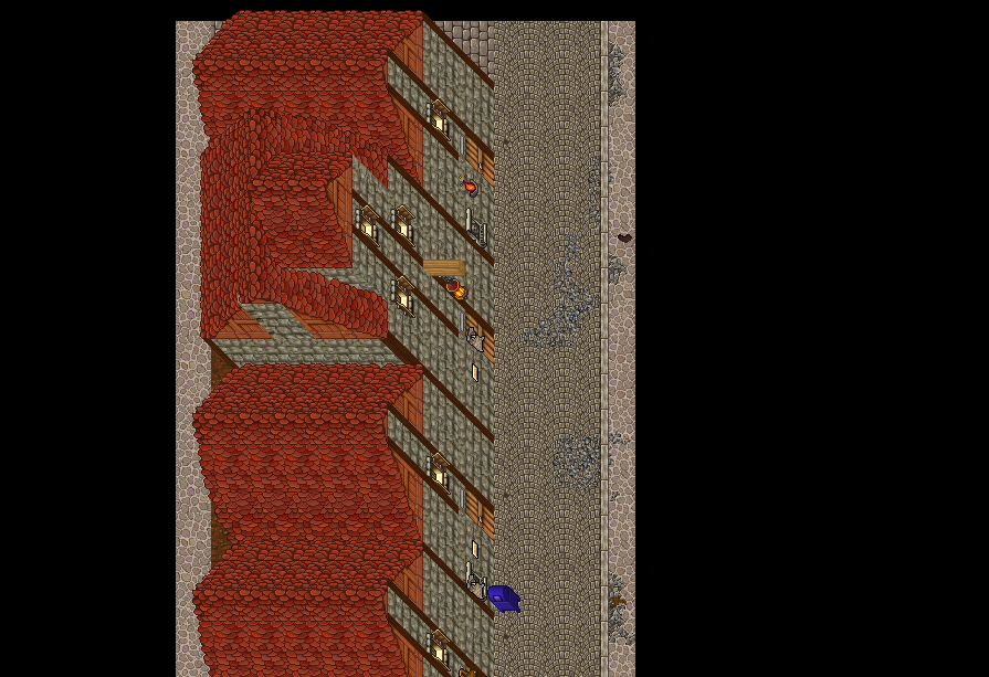
I want to change the form of these Thais houses to fit into the theme and get rid of this RL vibe, but i ran out of ideas.
Thanks in advance.
Cheers
on the beginning i need to say, that for this first post, it's more kinda request for help than a show-off and i was going to post it as support thread, but since i felt it doesn't fit so well, i've decided to create a mapping thread and pin a little question here.
But I would of course try to post some fresh, unrelated pieces once in the while.
Sooo, i'm revamping some RL map pieces and i want to make it look as poor and gloom as it can get.
Mostly i'm assisting myself with examples of 1700's europe and Taboo TV series.
I would love to see some opinions if i'm going the right way with the setup(grounds/walls) and maybe some help from other mappers, with some style ideas/templates for architecture and such.
Here's my try on some houses, but it feels a bit empty and weird. (don't mind borders)
I want to change the form of these Thais houses to fit into the theme and get rid of this RL vibe, but i ran out of ideas.
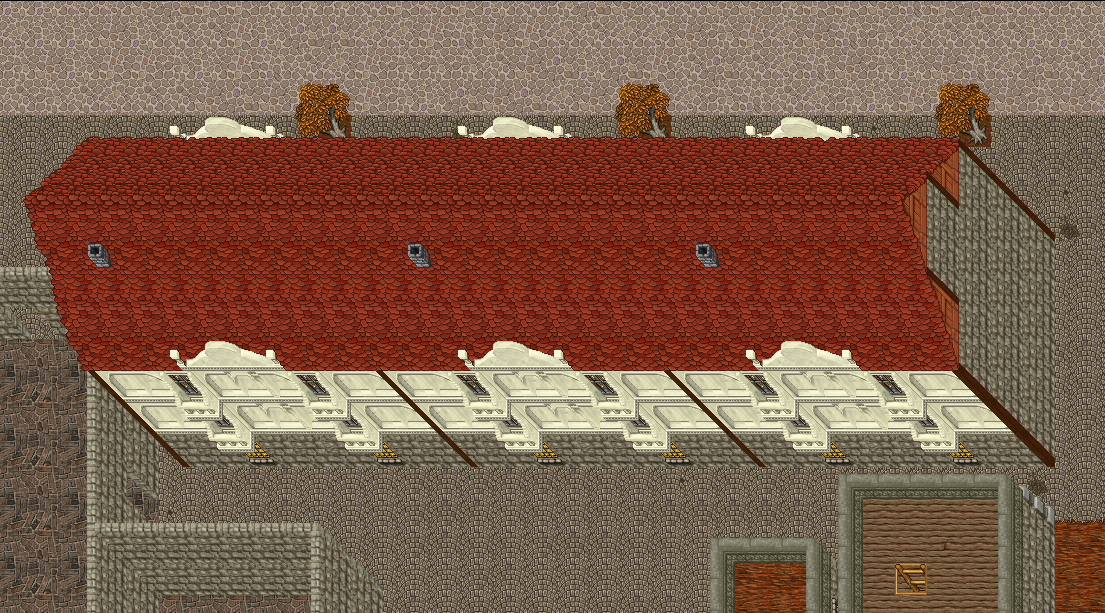
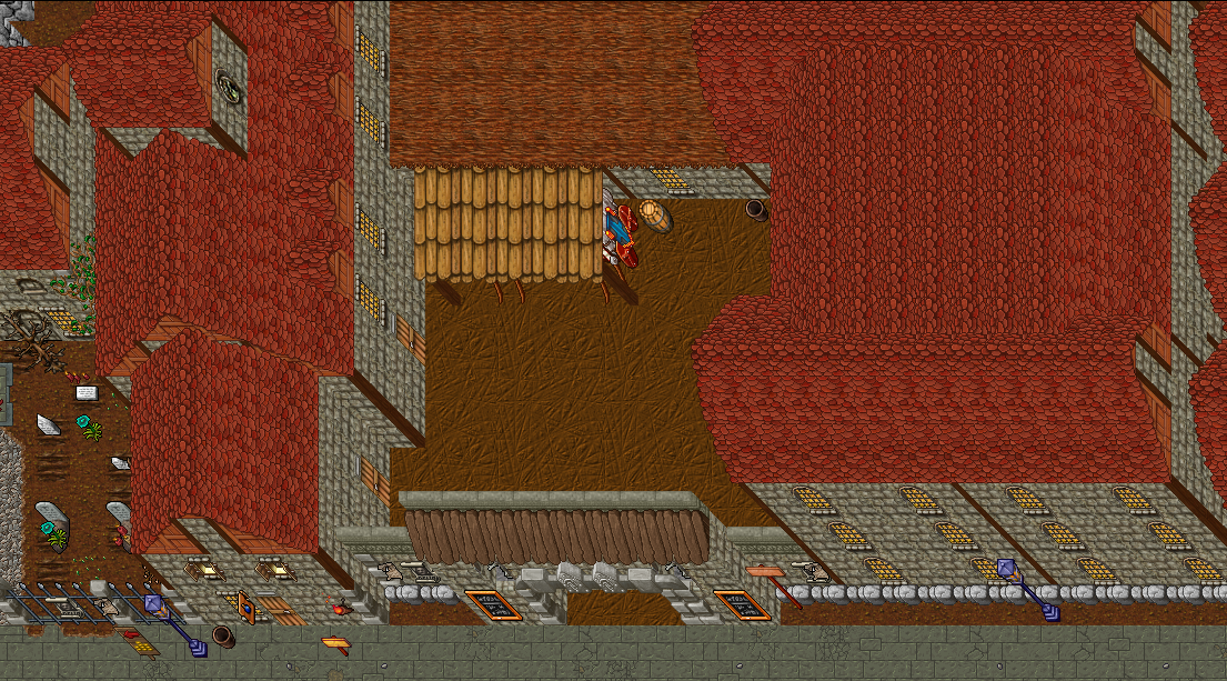
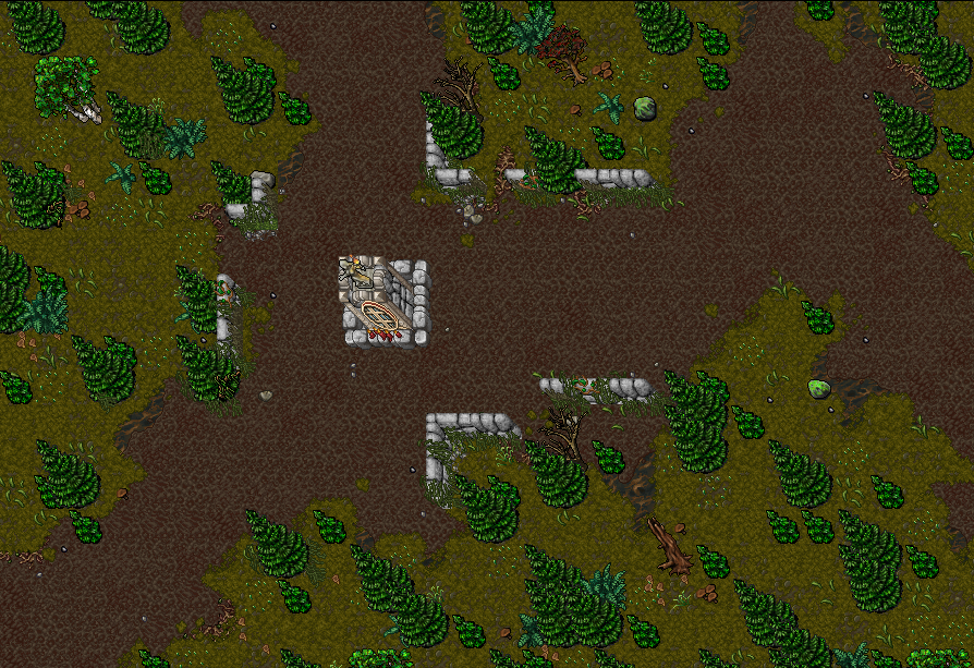
1.
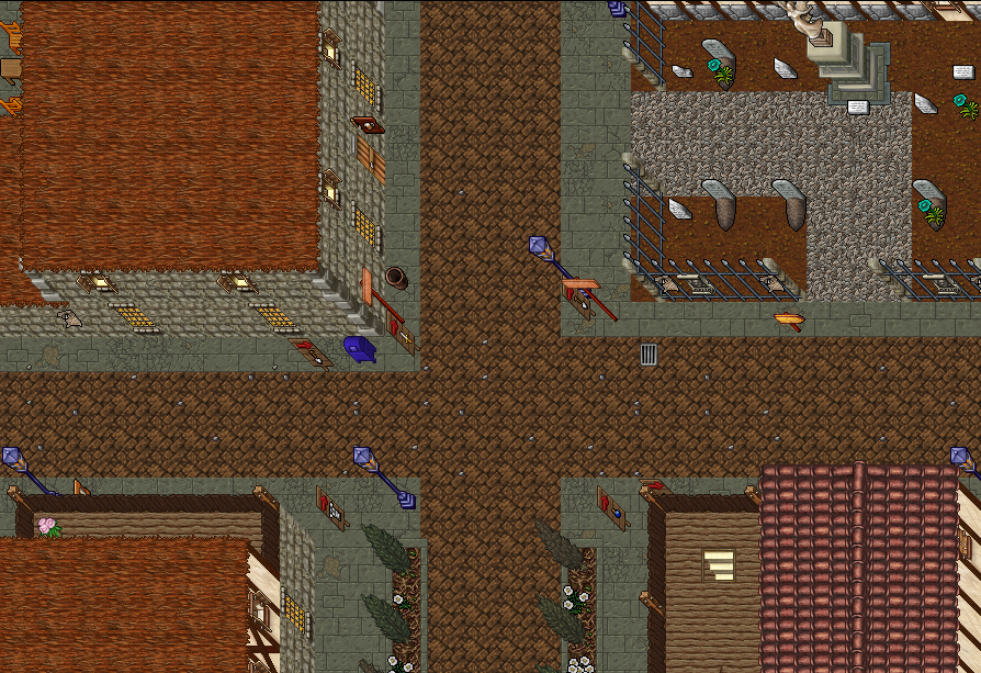
2.
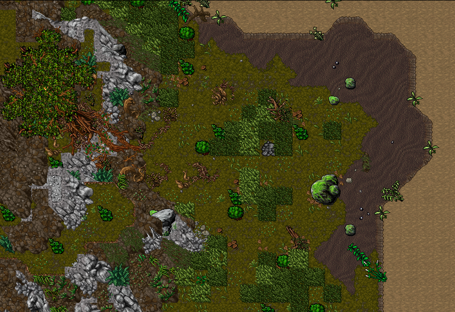
3.
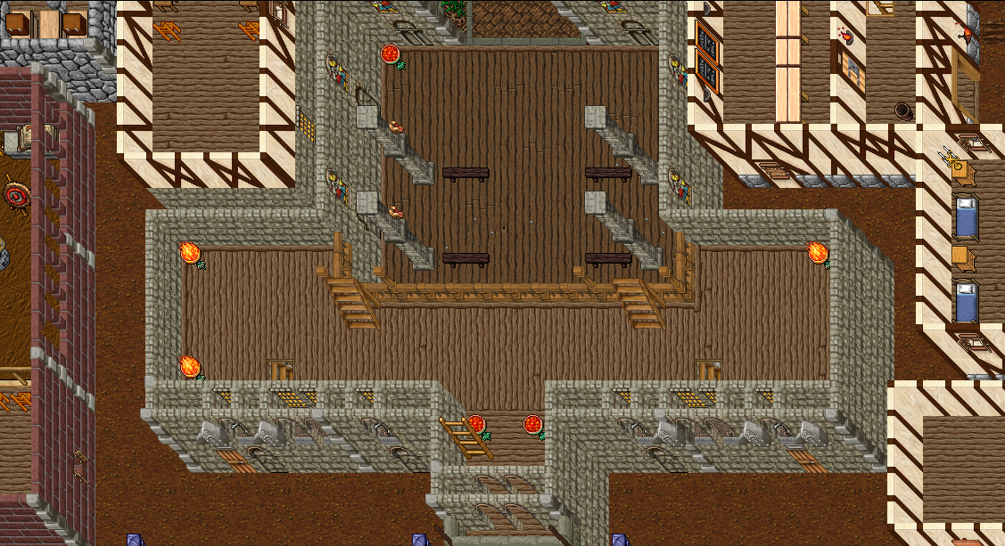
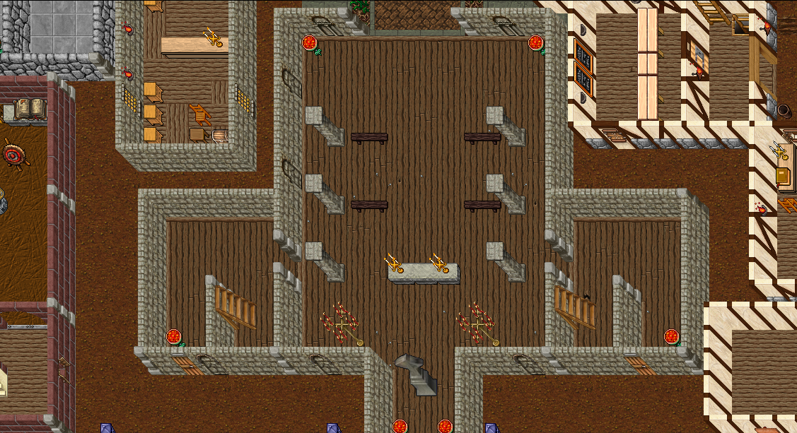
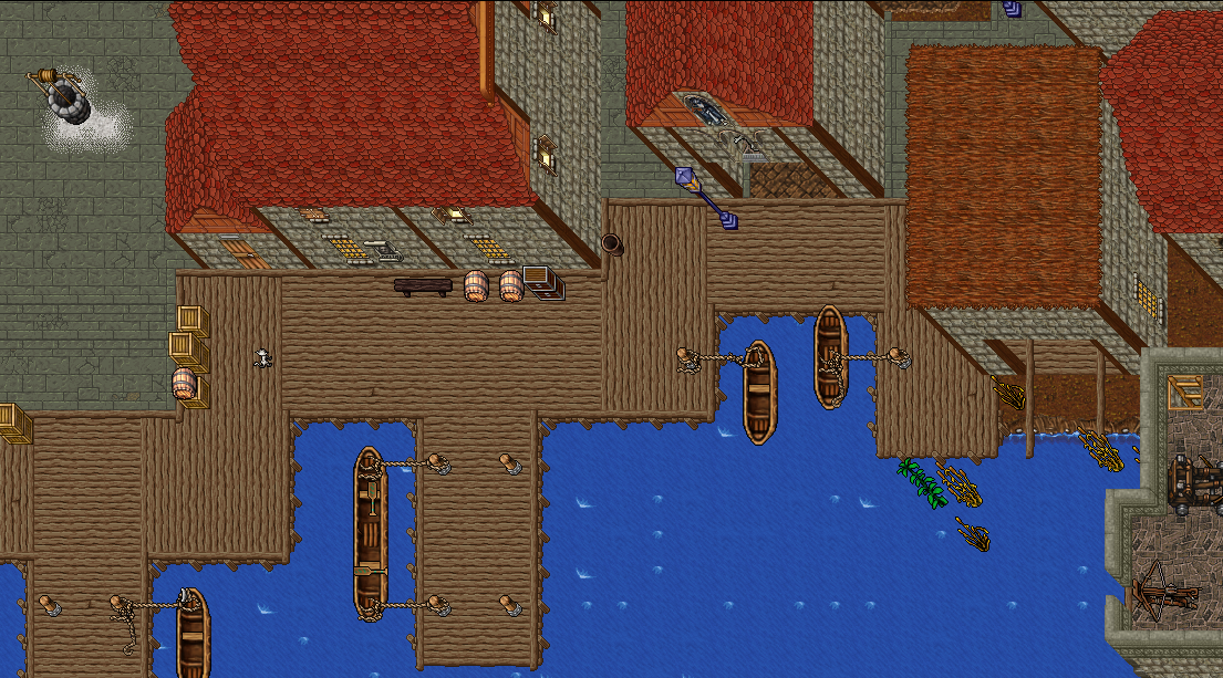
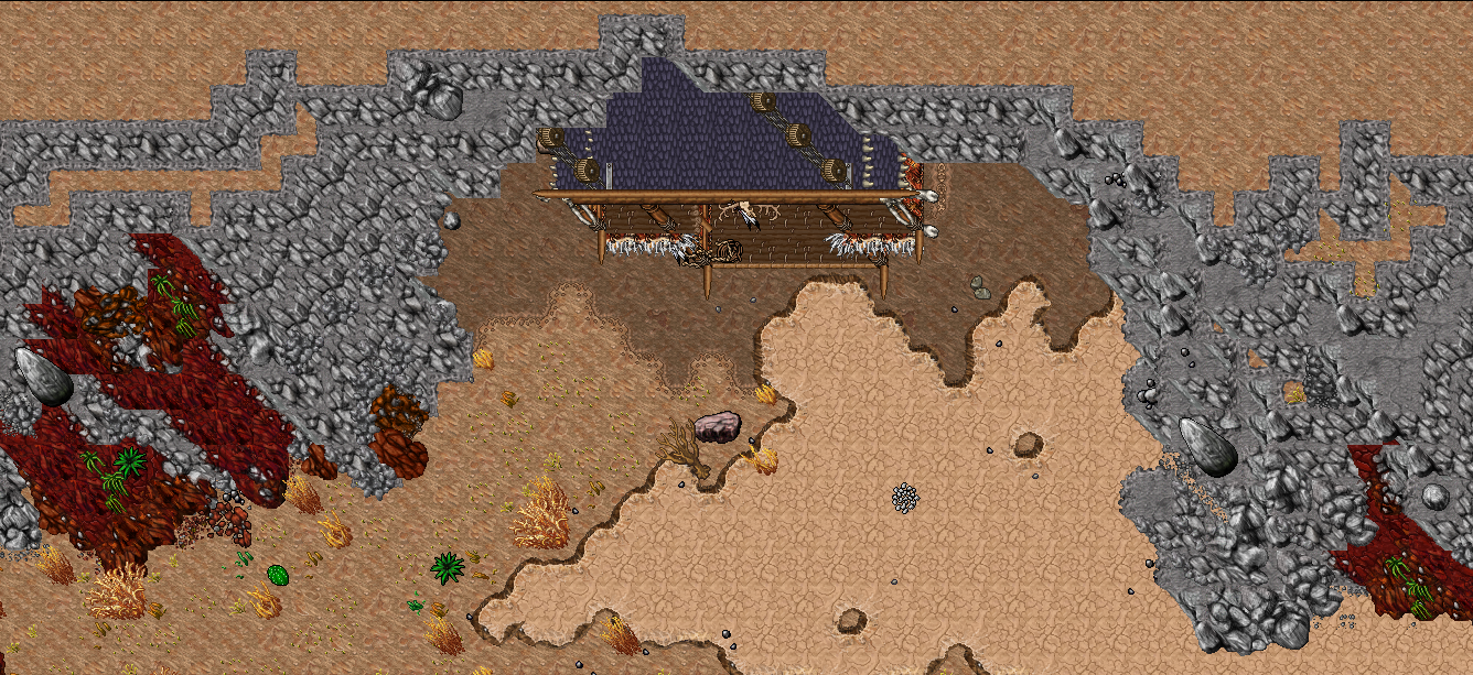
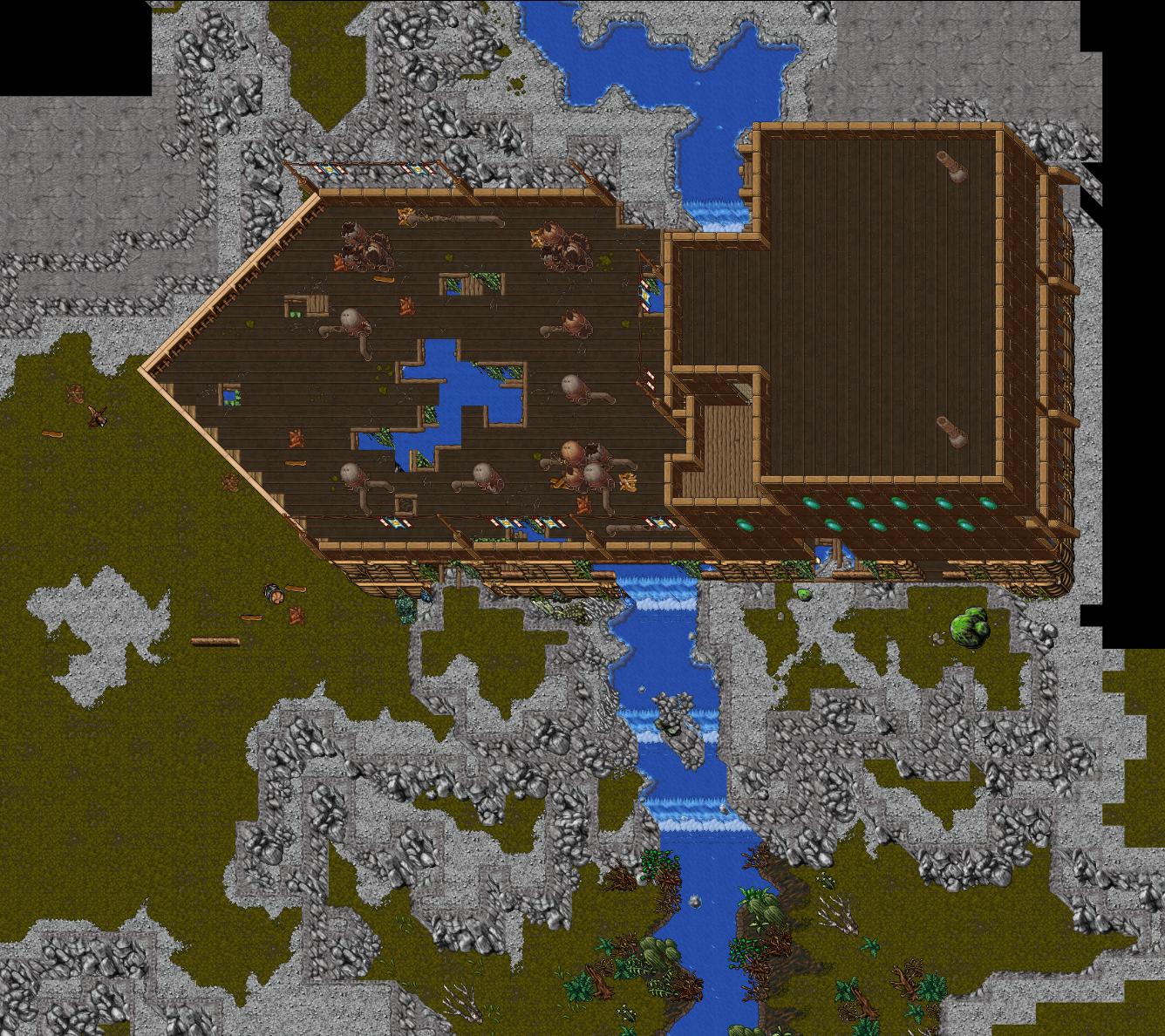
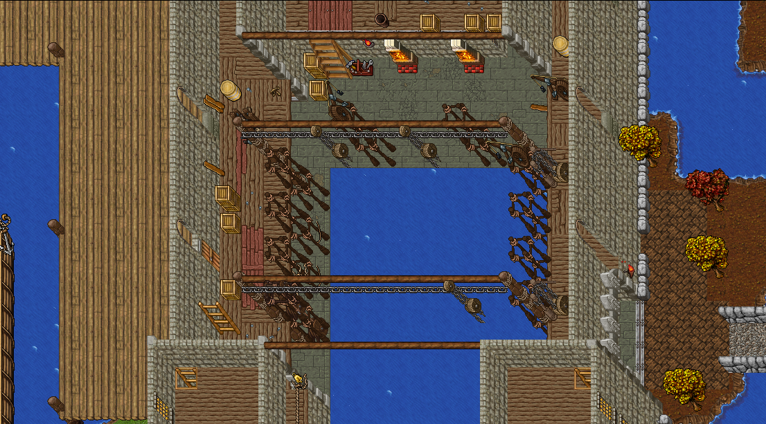
4. Thais castle converted to shipyard.
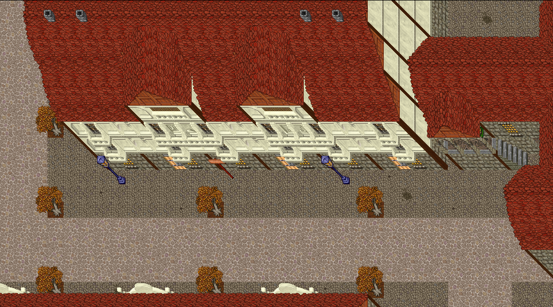
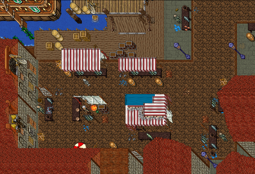
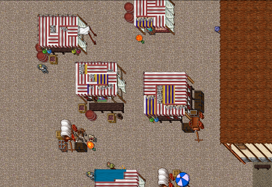
5. Try on marketplace stands.
2.
3.
4. Thais castle converted to shipyard.
5. Try on marketplace stands.
Thanks in advance.
Cheers