• There is NO official Otland's Discord server and NO official Otland's server list. The Otland's Staff does not manage any Discord server or server list. Moderators or administrator of any Discord server or server lists have NO connection to the Otland's Staff. Do not get scammed!

Webdesign My layouts

Shikate

Pixel Artist since 2011
Joined
Mar 30, 2011
Messages
404
Reaction score
838
Location
Poland
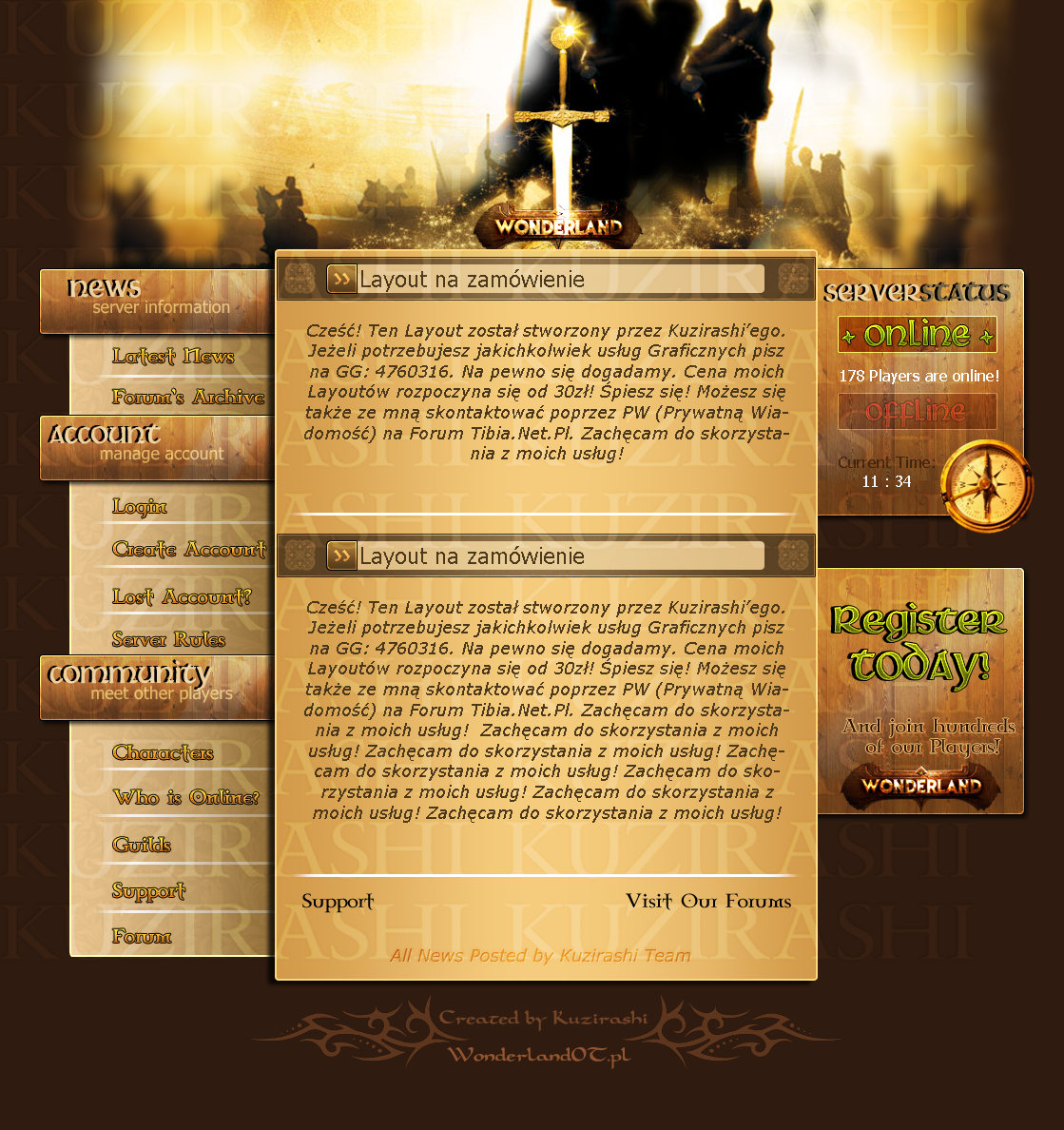
Check this out guys and rate my work:

ninjaworld.jpg

First lay

cmentrum.jpg

Second lay

eonots.jpg

Third lay, based on second

screenyu.png

My last layout

menuh.png

Menu for that lay

screenzh.png

My next lay; I m working on it

menusae.png

Menu


Please comment and you can recommend me some tutorials.

Sorry for my bad English
 
Last edited:
No Way This IS Shit I would made better graphics in Paint. Haha That's Joke. Fat chance! Anyway this work is good it's so delicious and moist. Look at me still talking when there's Reply to do.
Maybe you'll find someone else to help you.
Maybe Black Mesa
When I look out there, it makes me GLaD I'm not you.
I've experiments to run.
There is research to be done.
On the people who are still alive.
And believe me I am still alive.
I'm doing Science and I'm still alive.
I feel FANTASTIC and I'm still alive.
While you're dying I'll be still alive.
And when you're dead I will be still alive.
XD Good Job
 
If you're a newbie: You're talented, keep up the good work!
If you're an experienced designer: Nice designs, but can improve 'em a bit!

Nice layouts bro.
 
About the first:
1. Don't use shadows in typography while doing paper scrolls, it sucks
2. The header is pretty dark and maybe the thematic is not very well selected, you could improve on that
3. Remove that stroke thing above News title!
4. Menu links should not be images, but texts! Or you can try Cuffón.

About the second:
1. You were unhappy while choosing this dark header title, it is not visible!
2. If you want to do some rock effects, apply some soft and blur and do not use strokes, the top and bottom borders of content looks horrible!

About the third:
1. Are you sure you will use a high definition image to fill entire page?

About the forth:
1. Nice menus, i liked pretty much, but you just screwed in the right menu and in the background, turned the layout very messy

About the last one:
1. Getting nice, but remove that render from the menu, complete nonsense
 
Thanks. I ll remember youre words ;] . I m a graphic almost 2 months so I think I still can do some bugs :p And ok when I ll open Photoshop once again I delete render from menu.
 
RELEASE EM AND ILL REP+++ <3 xD
There are some very nice work you'll made :)
 
They will be used in some OTS'es but coders aren t going to finish it fast. :/
 
I love the background of 3rd layout. I thin thats the best one but you could change a lil bit size of sections, I mean eg. "Accounts" is too big but undersections are to small, thats just my opinion.
 
A hottip is the word "Less is more", you should not overcreate and overuse glowing. It might look nice at first, but it will destroy the living length of the design by alot since people will easier get tired of it. My suggestion is that you create something very simple, then go from there adding a few touches to it.

If you're unsure what I mean, maybe these images will show you the difference:
BwiaM.png
vs
dQLxK.png
 
Back
Top