• There is NO official Otland's Discord server and NO official Otland's server list. The Otland's Staff does not manage any Discord server or server list. Moderators or administrator of any Discord server or server lists have NO connection to the Otland's Staff. Do not get scammed!

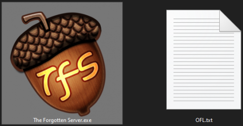
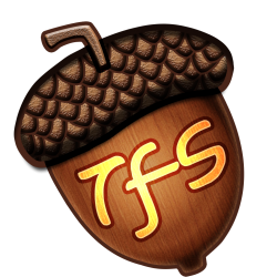
New TFS logo / icon

i think it should be same style as forum logo
example:

View attachment 54376

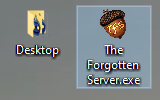
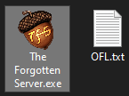
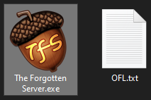
how it looks on desktop:
View attachment 54377
This is absolutely amazing. It's so simple and it just screams open tibia. Would like it to be a bit sharper though.
I think the "otland icon" fits TFS perfectly, it's very nostalgic and does not at all imply tfs = otland and if someone takes it that way they would quickly learn the difference by visiting.

Lets also not forget that this squirrel is the icon people see every time they host a quick server for their friends for fun and every time they changed their ip for a decade and might not even remember the name of this forum.

This "otland icon" represents open tibia for probably the majority of the casual ot playerbase.

Arguing against using this icon is really silly, not because i think it deserves to be the icon but because IT'S AN ICON HOW ARE YOU ARGUING.
 
No programs ever uses an icon with initials, unless they have several programs
That's not true at all, A LOT of apps are using initials as their icon. The only difference is, they use it in a far better way than what is posted here.
 
That's not true at all, A LOT of apps are using initials as their icon. The only difference is, they use it in a far better way than what is posted here.

Examples? I never heard of A LOT that is not in these 3 cases I mentioned. I would love to know a lot of examples that you know.
 
Examples? I never heard of A LOT that is not in these 3 cases I mentioned. I would love to know a lot of examples that you know.
Google, Facebook, Netflix, FileZilla, Qt, Path of Exile, Satisfactory, Diablo 3
Basically just by opening my Start Menu I get these and they are pretty popular ;)
 
Google, Facebook, Netflix, FileZilla, Qt, Path of Exile, Satisfactory, Diablo 3
Basically just by opening my Start Menu I get these and they are pretty popular ;)

Never heard about "Satisfactory".

Also, you forgot that TFS is 3 letters.

  • Google, Facebook, Netflix and Diablo 3, uses just 1. They are all beatiful. Easy to fit in an icon. But they use just 1 letter.
  • FileZilla and Qt, uses just 2. Not that easy to fit in an icon, but I think they're ugly, IMO.
  • So, the only example that fits here, since TFS has 3 letters, is PoE (Path of Exile) and their icon is extremely ugly (and I don't think this is just my opinion).

The idea of professionalism + clean + icon (fury / nut) is impossible with also 3 letters, IMO.

Maybe you should try to give examples with 3 letters instead this time.
I really don't know cool icons with 3 letters, that is not ugly as PoE.
 
@River KA its fine, Google, Facebook, etc. are not compound words and thats why a letter is enought. You can't express "the forgotten server" by just using a T, maybe TF but still not working for me.
 
a9xRknl.jpg
 
Better not to use copyrighted images :D

Correct, if you enter (atleast win) the voting you will have to give us (OTLand) the right to use that SPR.
Really no point for the forum to give ex free premium if you(the creator) can revoke the rights after x days / months.

What I wanna say is that it should be an "open source" icon where no one is trying to "win" from creating a simpel icon.
 
Edit: I removed another test because it wouldn't work for small sizes. Ignore this post.
 
@River KA very nice representation and thanks for taking my idea and recreating it from scratch with your drawing skills, even though it's not perfect it's the best icon i've seen so far, you got my like definitely ;)
 
Back
Top