I think they are kinda saying, yours without the text would also workIt's because Xikini and BahamutxD prefer the icon of hemresnus321. So they are trying any argument they can, ignoring what I said already.
I showed already that the tiny icon changes, so it keeps readable on the others.
If people approve mine, I will make a poll for they choose minor changes like that.
You are using an out of date browser. It may not display this or other websites correctly.
You should upgrade or use an alternative browser.
You should upgrade or use an alternative browser.
New TFS logo / icon
- Thread starter Don Daniello
- Start date
River KA
Veteran OT User
- Joined
- Feb 1, 2010
- Messages
- 535
- Solutions
- 27
- Reaction score
- 336
I think they are kinda saying, yours without the text would also work
Yes, I forgot that. I will make the head when tiny, without TFS when small and other sizes with TFS. What do you think?
BahamutxD
Jack of all trades, master of none
It's because Xikini and BahamutxD prefer the icon of hemresnus321. So they are trying any argument they can, ignoring what I said already.
I showed already that the tiny icon changes, so it keeps readable on the others.
If people approve mine, I will make a poll for they choose minor changes like that.
You are wrong there. That was the best example in this thread to compare what you showed to another option.
Ill tell you I like yours, just that it's a bit hard to read. Actually I'd make the raccoon more brownish to move away from Firefox vibes and because there are no orange raccoons? Maybe I'm wrong there lol
Last edited:
RACCOON WTFYou are wrong there. That was the best example in this thread to compare what you showed to another option.
Ill tell you I like yours, just that it's a bit hard to read. Actually I'd make the raccoon more brownish to move away from Firefox vibes and because there are no orange raccoons? Maybe I'm wrong there lol
MAN YOU NEED TO GET YOUR EYES TESTED. RACCOON? WHUT IN THE ICE AGE 3!?
Stanos
Veteran OT User
They saying facts. My eyes are really good, i have 4k monitor (HP DreamColor Z31x Studio Monitor)It's because Xikini and BahamutxD prefer the icon of hemresnus321. So they are trying any argument they can, ignoring what I said already.
I showed already that the tiny icon changes, so it keeps readable on the others.
If people approve mine, I will make a poll for they choose minor changes like that.
and your logo is hard to read when its scaled to a icon, if logo is hard to read even tho its readible but its still hard to read it belongs to a trash can because customer should never struggle to read what it says. But what i noticed you dont like to admit it
River KA
Veteran OT User
- Joined
- Feb 1, 2010
- Messages
- 535
- Solutions
- 27
- Reaction score
- 336
Since some people disagreed with the TFS text since it seems to be unreadable in small sizes, I made some changes.
---
Tiny at folder and at task bar:
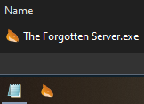 (yes, it changes the icon image when is tiny)
Small at folder:
 (yes, it changes the icon image when is small)
Large at folder:
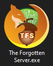
Extra large at folder:
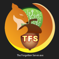
Original icon image as 1024x1024:
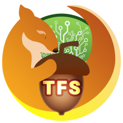
The background is green because of the open-source concept.
Gif with all sizes: (click here)
All sizes: (click here)
Hope you all like it.
---
Tiny at folder and at task bar:
 (yes, it changes the icon image when is tiny)
Small at folder:
 (yes, it changes the icon image when is small)
Large at folder:

Extra large at folder:

Original icon image as 1024x1024:

The background is green because of the open-source concept.
Gif with all sizes: (click here)
All sizes: (click here)
Hope you all like it.
Last edited:
BahamutxD
Jack of all trades, master of none
RACCOON WTF
MAN YOU NEED TO GET YOUR EYES TESTED. RACCOON? WHUT IN THE ICE AGE 3!?
Whoops lol brain fart xD
oen432
Legendary OT User
Too much details that don't work together as a whole.Since some people disagreed with the TFS text it seems to be unreadable in small sizes, I made some changes.
---
Tiny at folder and at task bar:
View attachment 54792 (yes, it changes the icon image when is tiny)
Small at folder:
View attachment 54794 (yes, it changes the icon image when is tiny)
Large at folder:
View attachment 54795
Extra large at folder:
View attachment 54796
Original icon image as 1024x1024:
View attachment 54799
The background is green because of the open-source concept.
Gif with all sizes: (click here)
All sizes: (click here)
Hope you all like it.
This green background feels "random" and is just a green circle at lower resolutions, this "TFS" text is just poorly made and doesn't fit, nut has depth while the text doesn't.
Also too much Firefox vibe in this, I would say it can be seen as plagiarism (animal with same shape and a circular background).
From all of that I can say... this head icon is the best because it's simple (just do something about that eye/eyebrow).
oen432
Legendary OT User
Because Fury is OTLand's logo, not TFS. Why are you trying to take the easy path?Just take Fury and apply it as the logo, why are you all over complicating this?
Beo
Three Magic
- Joined
- Aug 25, 2009
- Messages
- 9,075
- Solutions
- 1
- Reaction score
- 857
Because Fury is OTLand's logo, not TFS. Why are you trying to take the easy path?
If you're going to throw this argument, then people shouldn't be opting for a redesign of Fury, nor even entertaining the idea.
Why redesign a logo from a website that isn't part of TFS?
Otland is the home of TFS, which is why Fury would show that connection. Either go all out and create a brand new logo and separate TFS from Otland or just stick the Fury logo in and create the tie between Otland and TFS.
oen432
Legendary OT User
But we are not just "using Fury from OTLand". We are making Fury-like logo that would have the connection you are talking about.If you're going to throw this argument, then people shouldn't be opting for a redesign of Fury, nor even entertaining the idea.
Why redesign a logo from a website that isn't part of TFS?
Otland is the home of TFS, which is why Fury would show that connection. Either go all out and create a brand new logo and separate TFS from Otland or just stick the Fury logo in and create the tie between Otland and TFS.
Handicap Ninja
Advanced OT User
- Joined
- Sep 28, 2020
- Messages
- 263
- Reaction score
- 169
now that's just being difficult xDBut we are not just "using Fury from OTLand". We are making Fury-like logo that would have the connection you are talking about.
Astir Lotus
Well-Known Member
- Joined
- Sep 14, 2018
- Messages
- 47
- Solutions
- 1
- Reaction score
- 96
Otland is the Fury, and TFS could be a Nut, @oen432, said this on page 2.
This would still create a connection between the two.
Because as Oen said. Squirrels like Nuts.
Maybe add som server like feauters to the Nut. It is not a must to have the text TFS written on it. Just looking at my taskbar I can only see Teams with a T softly on the side, with a purple guy standing behind the other.
If you really want the Fury as the logo for TFS, you can make a baby Fury. Since TFS is a produce from OTland, as a Baby Fury is a produce from a Fury.
oen432
Legendary OT User
Innovative*now that's just being difficult xD
X
Xikini
Guest
Can we have a pair of nuts?
For reasons.
For reasons.
Ascuas Funkeln
Rakkedo Game
- Joined
- Apr 14, 2013
- Messages
- 549
- Solutions
- 32
- Reaction score
- 307
- Location
- Poland
- GitHub
- AscuasFunkeln
Similar threads
- Replies
- 20
- Views
- 3K

