Adnan Keskin
New Generation Mapper
....
Attachments
-
 screenshot_2014-11-3-23-13-26.jpg148 KB · Views: 207 · VirusTotal
Last edited:
 haha mostly using the command CTRL J and finding what i want
Also use these, http://otland.net/threads/rme-custom-extensions.163337/started to use it atm
")
yes very begginer but im getting the hang of things very quicklyNice maps.
You are begginer ?
Regards.
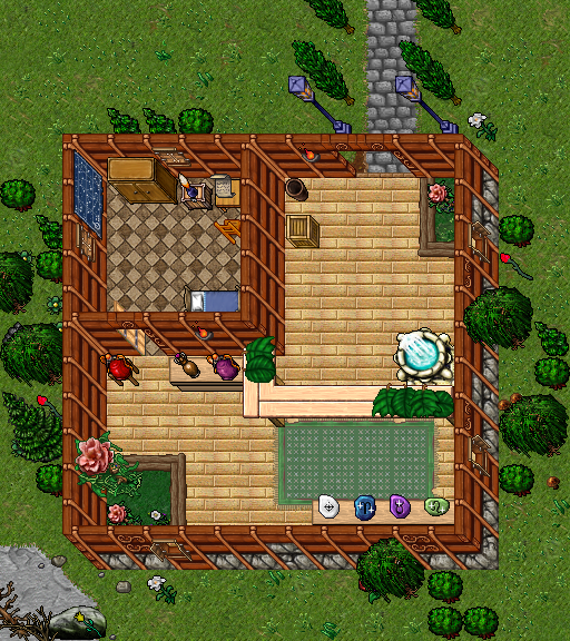
in the remake last picture how did u do the garden inside the building....Cool! It looks like you have an okay understanding of the layout of maps, but there's some work that needs to be done when it comes to bordering and detailing. For the shop, the first thing I noticed when looking at the image was this:
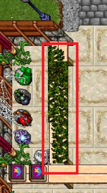
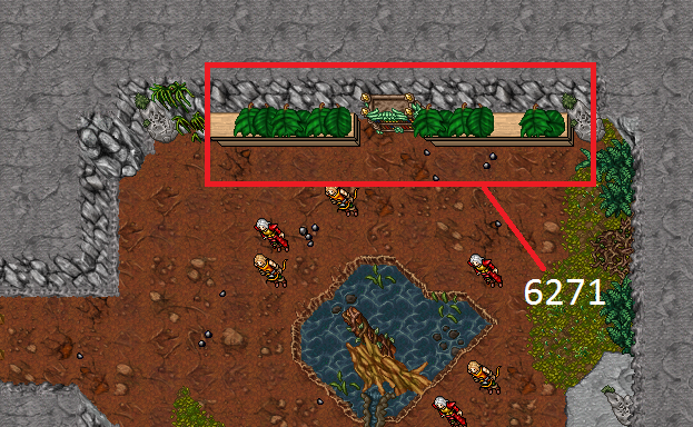
You always want to avoid using sprites (borders, in particular) that create this sharp edge. In general, there are always other options that work without the downside of the sharp edges. These are a possible replacement:
The second thing that drew my attention was the bordering. It is clear that you're using the autoborder tool, which is perfectly fine if your aim isn't to create a showoff piece (having said that, most of the seasoned mappers tend to only use RAW as far as I'm aware). However, even if you should choose to stick to the autoborder option, there are a few things to keep in mind.
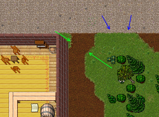
You should for the most part stay away from using the thick borders between grass and cobblestone or any other city-like ground tile. I tend to mostly use the thick grass border when bordering between grass and dirt, while more or less always sticking to the thinner ones when bordering between grass and city-like tiles.
(green arrows point at thick borders, blue arrows at thin borders)
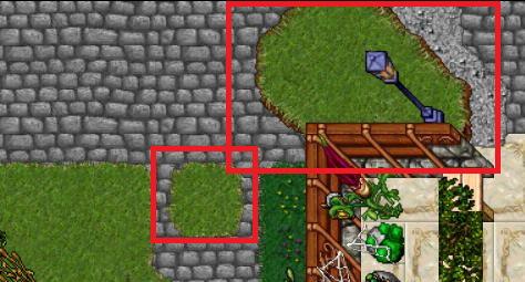
Continuing on the borders and tiles, I don't like the mix between the pavement and that rock soil. If I were you, I'd get rid of it and just keep the grass and pavement. Your placement of grass tiles is also a bit unusual. As a rule of thumb, try to avoid using smaller patches of grass like these:
I don't feel like writing up any more suggestions right now, but these should at least make you aware of some of the areas where you can improve!
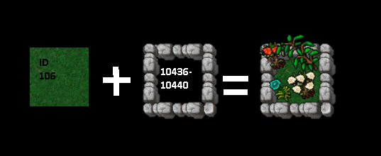
Finally, here's my take on your image. I hope that this helps you visualize the changes I've suggested
+1 thank you for replyIt for ver. 8.6, but if u use other clinet u can use other boarders
by PAINT !!
in the remake last picture how did u do the garden inside the building....
