You are using an out of date browser. It may not display this or other websites correctly.
You should upgrade or use an alternative browser.
You should upgrade or use an alternative browser.
Ranger's Arcani OTClient showoff
- Thread starter Oskar1121
- Start date
Ochman
Veteran OT User
- Joined
- Feb 27, 2016
- Messages
- 351
- Solutions
- 5
- Reaction score
- 252
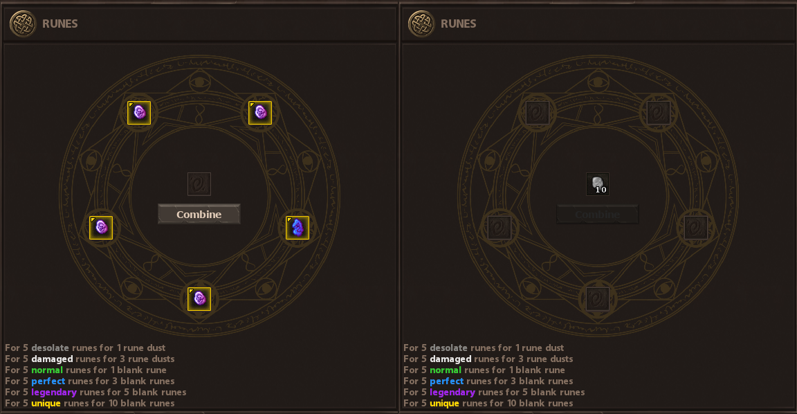
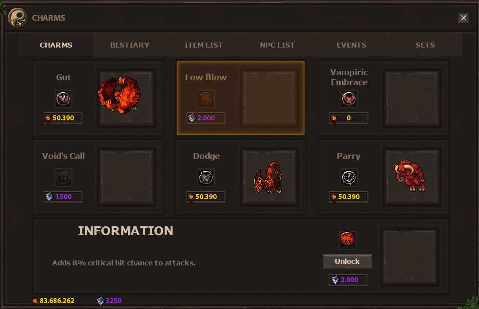
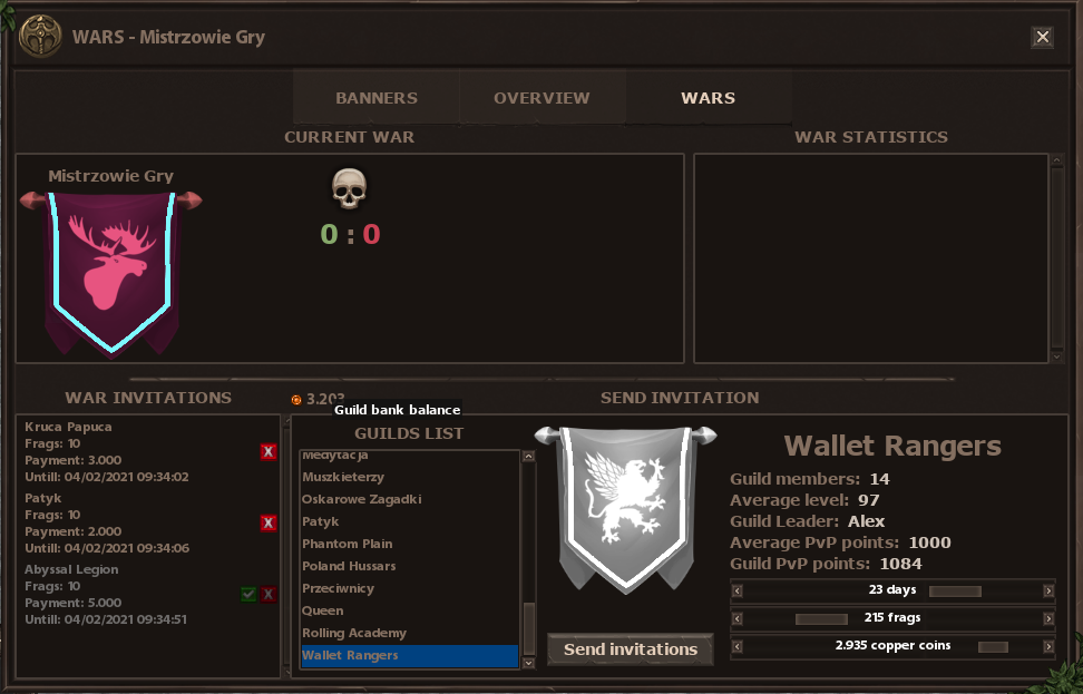
I think Ranger's Arcanii is the only client that not only adds new functionality but also fits it into the game theme. Just look at this converter, he could easily add 5 random places and button "Combine", but he made it a whole new story - added spiritual ring, description, I bet somewhere in RA world it's part of an NPC story. Or better yet - part of monsters story, cuz they have it too.
That being said, I wouldn't be me without complaining:
It's nice and all but what does this description even mean. Is this first "for" even needed there? Wouldn't it be better to say "Change" or "Convert" instead of "For"?
I appreciate people learning languages and, hell - I'm learning too! - but try to use proofreadings tools e.g. Grammarly or something =)
Last edited:
Kuzyn
Excellent OT User
RA server is a custom so I guess that people who are not interested in any custom content will not even try it outLooks awesome and all but like someone previously said it's overwhelming and for a casual player it's going to very confusing and discouraging them from playing as there's so much to grasp your head around.
* We don't use classic Tibia runes, our runes are persistent and give you passive bonuses.
Itutorial
Legendary OT User
- Joined
- Dec 23, 2014
- Messages
- 2,419
- Solutions
- 68
- Reaction score
- 1,074
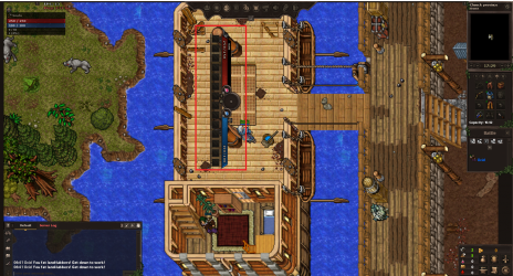
Not something I want to have in my screen haha. Also, all the UI windows were scrambled, disorganized, and on top of eachother. I had to modify where everything was and couldn't get the chat box to move for a minute until I figured out there is very limited space where you can drag for it to move. Hopefully, you will create a default set up for the UI and fix the chat box a bit.
Ochman
Veteran OT User
- Joined
- Feb 27, 2016
- Messages
- 351
- Solutions
- 5
- Reaction score
- 252
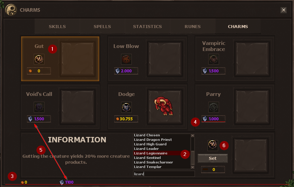
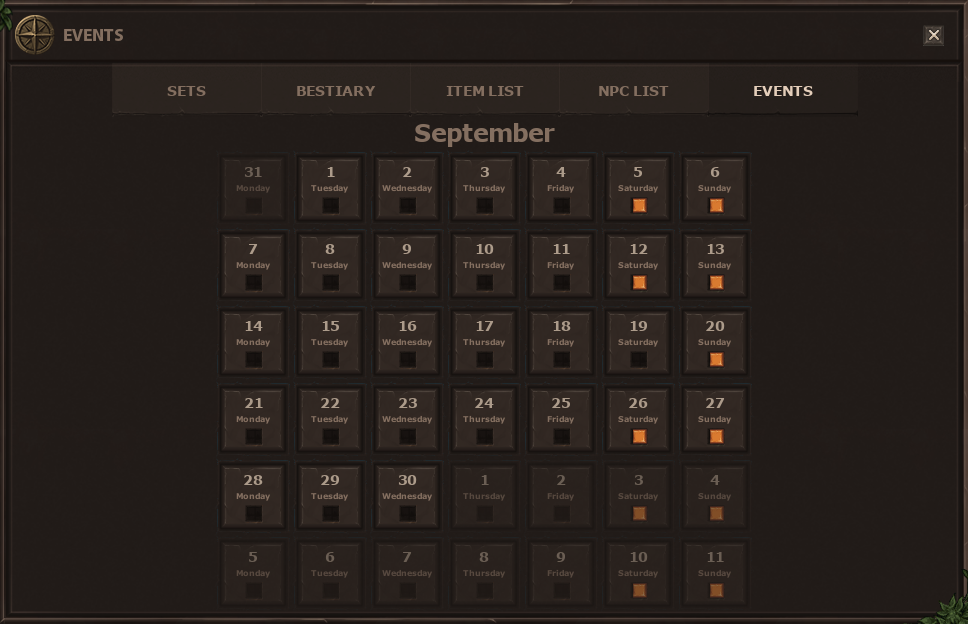
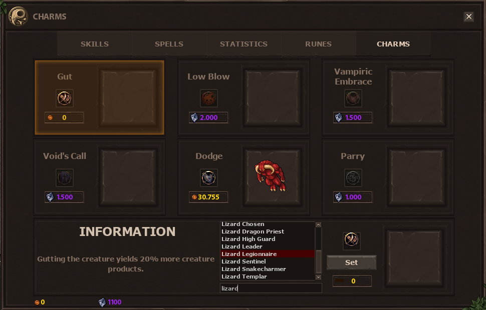
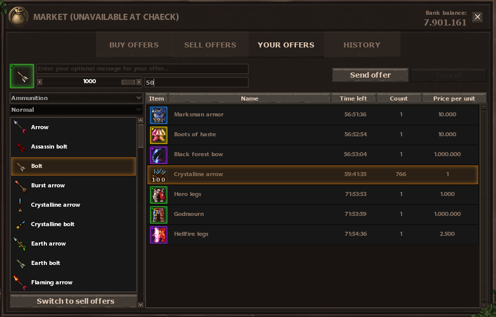
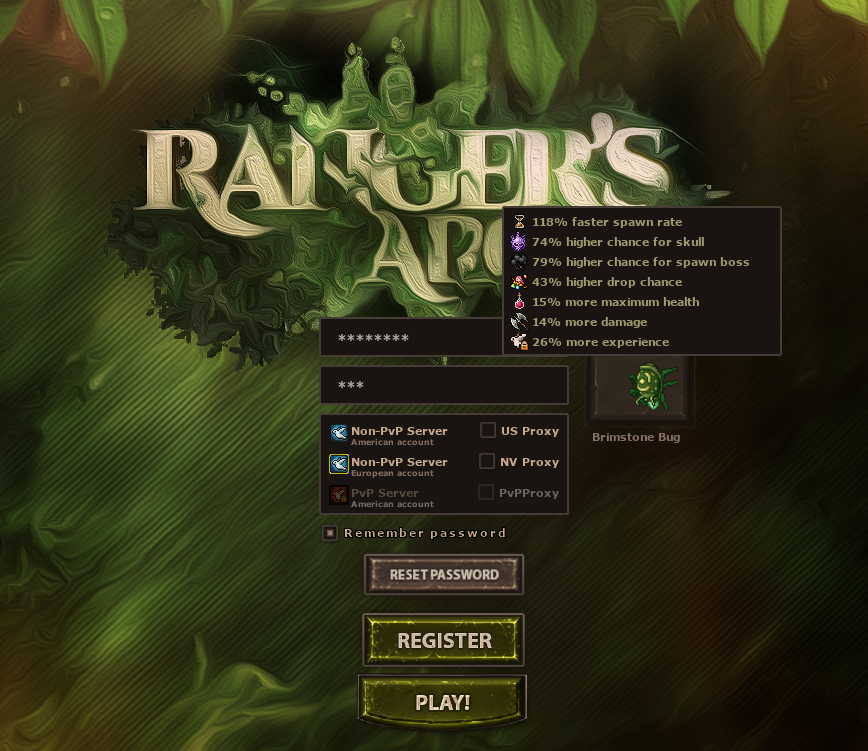
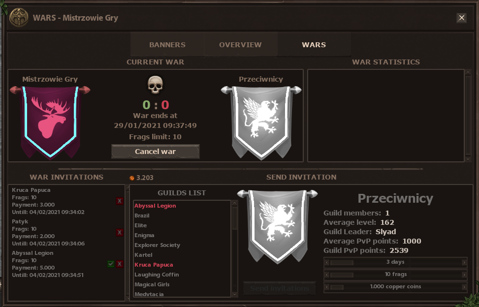
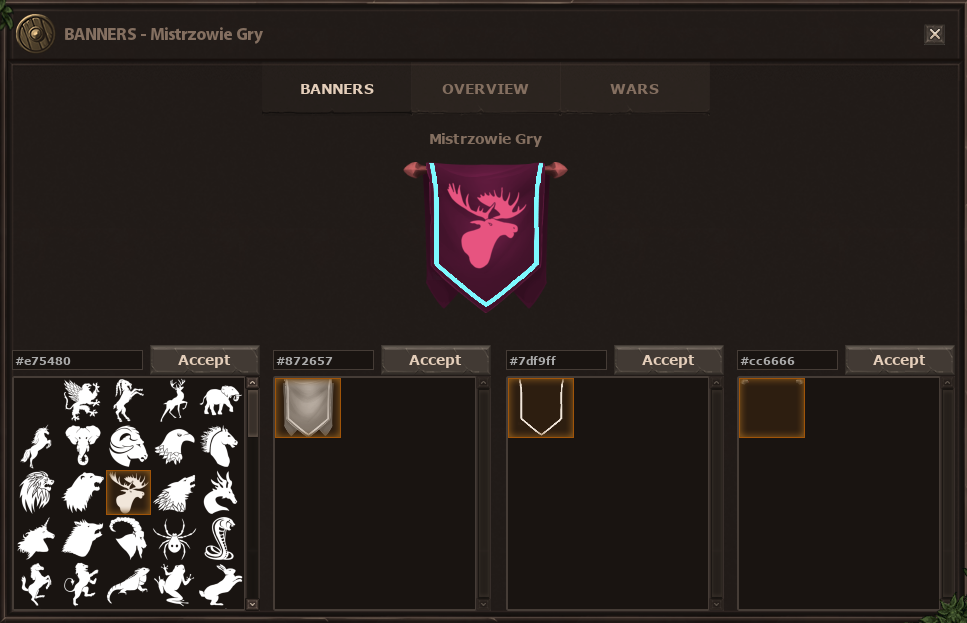
1&2. Why wouldn't you unify the highlight color between 1&2?
3 & 4. Maybe add some margin-bot on the icons, so they do not run out of the frame? In 4 I assume it's because of the 'inside' border, but it still does not look pleasant. In 3, however, it looks like the window is too tight and could've been higher for like 2-3px
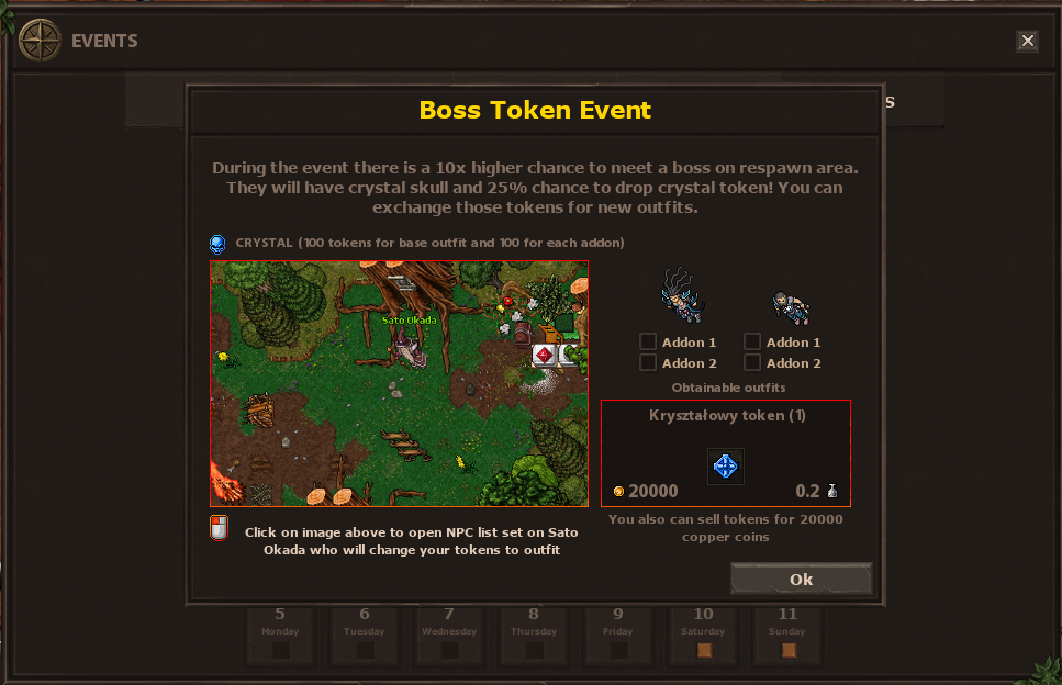
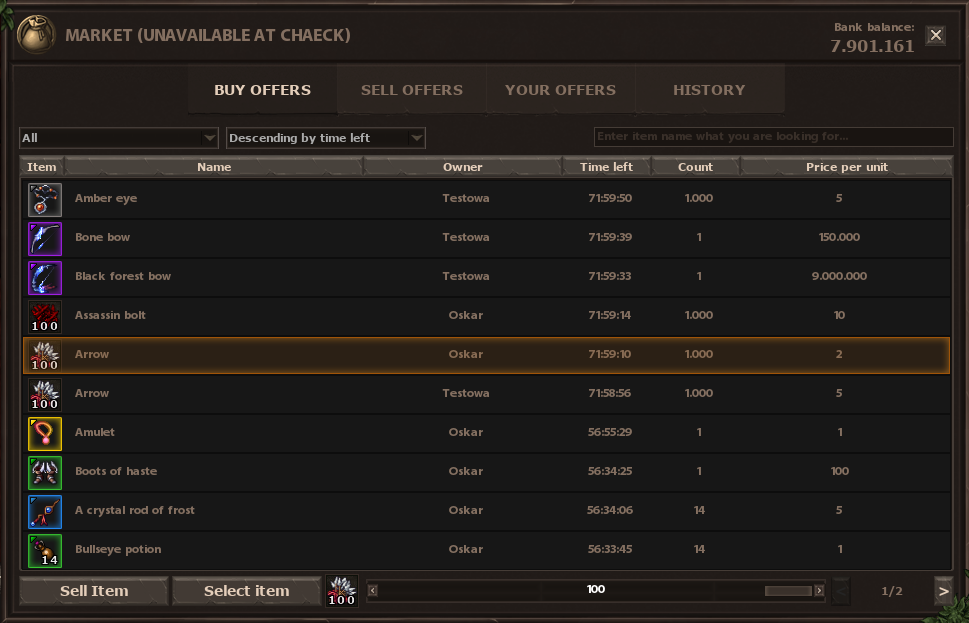
5. Standardize/unify/localize number display everywhere (either with dot separator or not, do not mix them). Also in image here you use 20000 "gold coins" (or however they are called) without the dot and suddenly here you use it with it.
6. Woopsie? Isn't it too high compared to frame/border & other icons? Especially when you look at 1&6 since those are the very same icons but with different padding/margin.
Those are just friendly suggestions, nice work overall =)
Last edited:
Kuzyn
Excellent OT User
This spellbar is intended (numbers), if you don't need those bars, just disable them in optionsView attachment 52610
Not something I want to have in my screen haha. Also, all the UI windows were scrambled, disorganized, and on top of eachother. I had to modify where everything was and couldn't get the chat box to move for a minute until I figured out there is very limited space where you can drag for it to move. Hopefully, you will create a default set up for the UI and fix the chat box a bit.
About chat, there is a hand in corner for moving it, you can also move by "text space", but ofc you can't move it when you have text here, because then you are able only to copy text.
Ochman
Veteran OT User
- Joined
- Feb 27, 2016
- Messages
- 351
- Solutions
- 5
- Reaction score
- 252
I believe he meant that this spell bar should not appear in the middle of the game screen, since it was his first launch of the game. He suggests that the initial startup should already have it sorted out in some good fashion.
I might sound stupid now but it feels that there are too many features in Ranger Arcani, charms, runes .. etc.. Isn't it better to keep it simple and work towards them when the game is for example released to steam or something like that? I've played Rangers Arcani and I love it, it is very unique but can be too much sometimes.
Itutorial
Legendary OT User
- Joined
- Dec 23, 2014
- Messages
- 2,419
- Solutions
- 68
- Reaction score
- 1,074
The spell bar is actually great, in-fact you should remove the player information box completely seems all of the info is on the spell bar UI. As Ochman said I was talking mainly in the sense that at first launch everything was scattered and gave a bad impression. You should make a default set up and create a tutorial on where/what everything is and does (at-least the major stuff). The game looks professional and I would hate something so small to ruin the experience right off the start.This spellbar is intended (numbers), if you don't need those bars, just disable them in options
About chat, there is a hand in corner for moving it, you can also move by "text space", but ofc you can't move it when you have text here, because then you are able only to copy text.
Again, I just want to say, all of the boxes were stacked on each other with no organization. The spell bar was vertical, when it should be horizontal. My recommendation is to fix the UI so it has a default set up that is organized. I am sure there is a bunch of stuff you are working on but sometimes the best things to get right are the small things. A new person (never played tibia) would have problems figuring it all out.
Lastly, when you look at something a box appears on your screen. That is fine by itself but the box is far to big and covers a pretty good portion of the screen. I see that as an issue, you may disagree. I also recommend not stacking 3x things you look at. The box should be replaced by whatever you look at. If it was my way I would also make the box transparent.
Kuzyn
Excellent OT User
We will not remove player information box, because some players prefer it over HP/Mana above spellbar. You have choice, you can even disable them both and turn on arcs with hp/manaThe spell bar is actually great, in-fact you should remove the player information box completely seems all of the info is on the spell bar UI. As Ochman said I was talking mainly in the sense that at first launch everything was scattered and gave a bad impression. You should make a default set up and create a tutorial on where/what everything is and does (at-least the major stuff). The game looks professional and I would hate something so small to ruin the experience right off the start.
Again, I just want to say, all of the boxes were stacked on each other with no organization. The spell bar was vertical, when it should be horizontal. My recommendation is to fix the UI so it has a default set up that is organized. I am sure there is a bunch of stuff you are working on but sometimes the best things to get right are the small things. A new person (never played tibia) would have problems figuring it all out.
Lastly, when you look at something a box appears on your screen. That is fine by itself but the box is far to big and covers a pretty good portion of the screen. I see that as an issue, you may disagree. I also recommend not stacking 3x things you look at. The box should be replaced by whatever you look at. If it was my way I would also make the box transparent.
I think that we can work on positions of those elements during first launch, but we also don't want to force "best" setup. There is a tutorial about client, check this Client - Rangers Arcani (https://rangersarcani.online/client/). I will record a new video before launch of new pvp world, because that one is 1 year old and we've added new things. But remember that you have also ingame tutorial windows
Sadly we're anchored in Tibia community right now so I think that there won't be many players like thatA new person (never played tibia) would have problems figuring it all out.
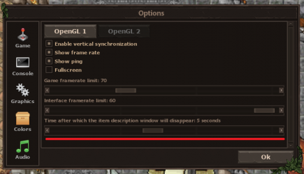
About looking at items, it needs to display everything about the specific item because it's important info for a player. You can also view 3 items at once because it helps you to compare items, I think that later you could find it more useful. If you think that those boxes are too long on the screen, you can change time of display, between 1 and 10 secs:
