Salvus
Well-Known Member
- Joined
- Feb 7, 2019
- Messages
- 102
- Solutions
- 1
- Reaction score
- 70
I've never mapped before. This is the first time I have tried to map.
We'll see if I managed to do something nice, follow along on the journey xD
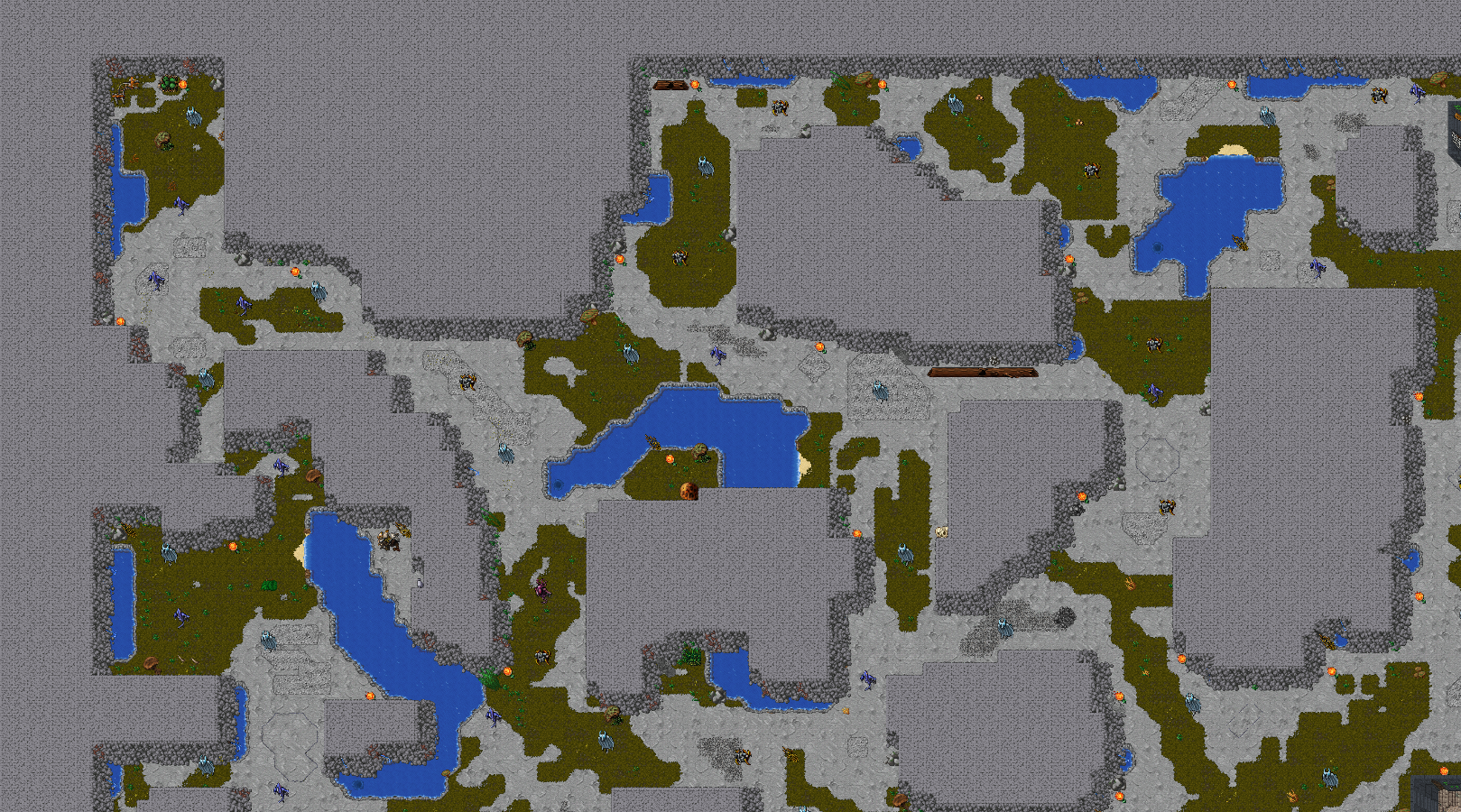
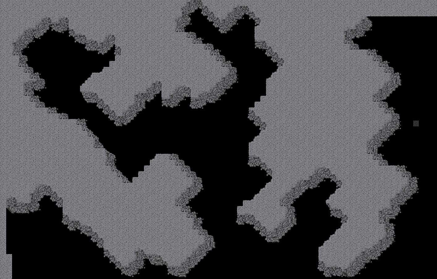
The purpose of this mapping is to build a whole new map
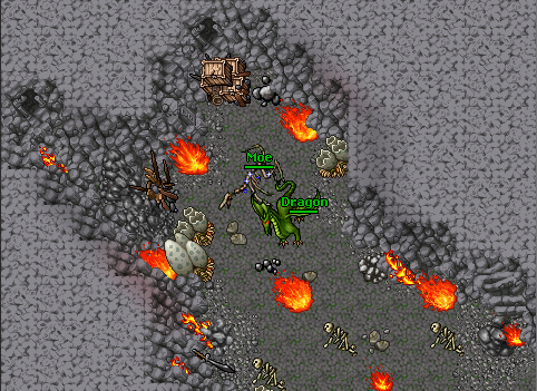
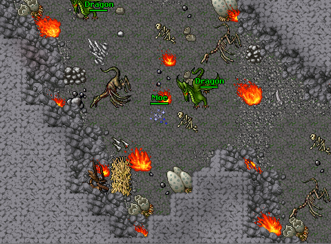
Temple/DP
City
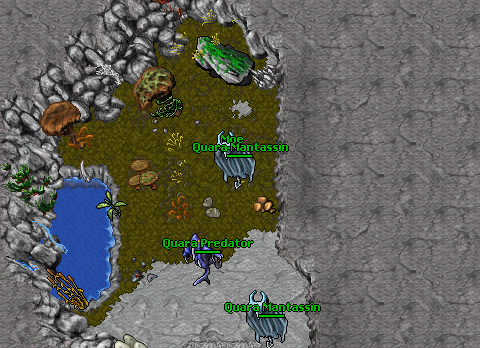
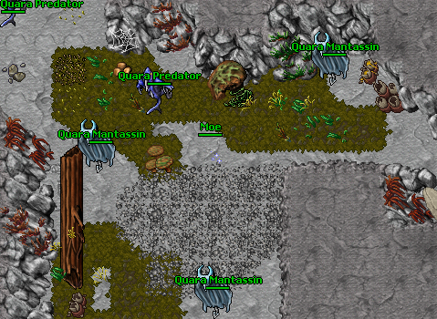
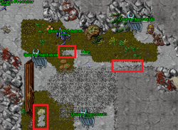
50 Hunting places
25 Quests
10 Bosses
Sure something more, but we will fix it on the way
I will post the map for free later when it's done.
---------------------------------------------------
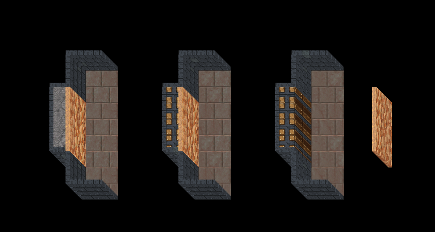
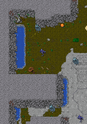
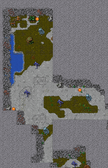
We start by mapping a temple/dp

We'll see if I managed to do something nice, follow along on the journey xD
The purpose of this mapping is to build a whole new map
Temple/DP
City
50 Hunting places
25 Quests
10 Bosses
Sure something more, but we will fix it on the way
I will post the map for free later when it's done.
---------------------------------------------------
We start by mapping a temple/dp
")
")