You are using an out of date browser. It may not display this or other websites correctly.
You should upgrade or use an alternative browser.
You should upgrade or use an alternative browser.
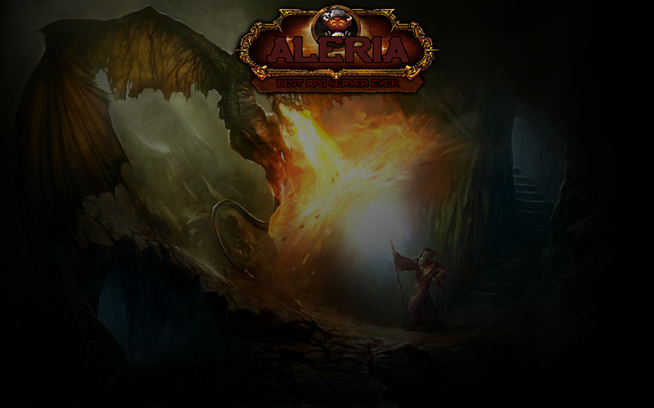
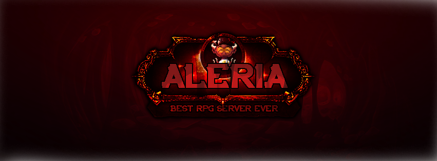
Webdesign Some logos I made for my OT.
- Thread starter Nekiro
- Start date
- Status
- Not open for further replies.
")
OP
OP
- Joined
- Sep 7, 2015
- Messages
- 2,759
- Solutions
- 127
- Reaction score
- 2,279
definitely doesnt look like this one but with other colors
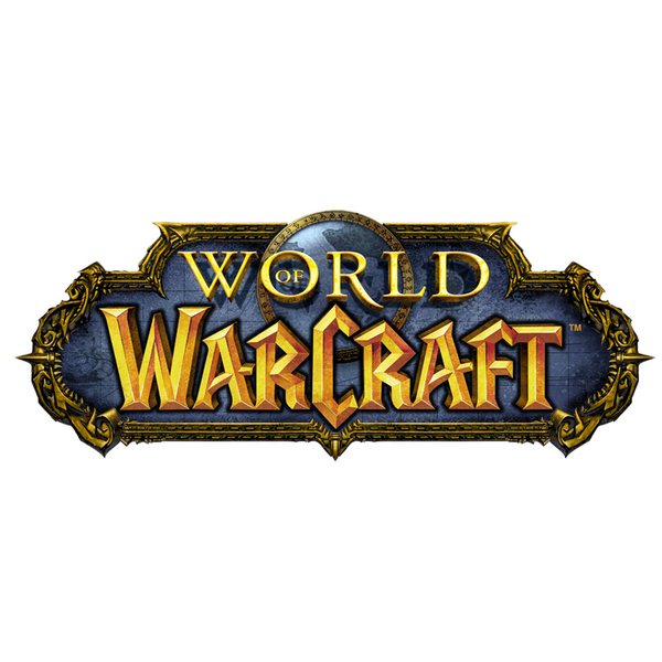
You know that only one similar item in this image is frame right ?XD
And yes it doesnt look like this.
OP
OP
- Joined
- Sep 7, 2015
- Messages
- 2,759
- Solutions
- 127
- Reaction score
- 2,279
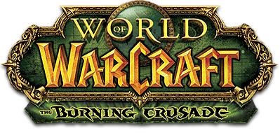
you straight up copied the entire design of it, including the part where the expansion name is, and just recolored / added ur own text lol
1/10 design
10/10 copying wow logo
You just see shitty wow logo on this picture? Maybe you could look at whole?
you took the logo, removed the text, changed the color to be red-ish, put aleria where it says wow, put best rpg server ever where it says expansion name, made the background of the inside of the logo black and added transparency to show through, so its not just solid black, which im guessing you did because you couldnt figure out a way to keep a good color scheme after just removing the wow text, and added a little thing in the globe, which as far as i can see, is the only original thing you did to the logo
OP
OP
- Joined
- Sep 7, 2015
- Messages
- 2,759
- Solutions
- 127
- Reaction score
- 2,279
you took the logo, removed the text, changed the color to be red-ish, put aleria where it says wow, put best rpg server ever where it says expansion name, made the background of the inside of the logo black and added transparency to show through, so its not just solid black, which im guessing you did because you couldnt figure out a way to keep a good color scheme after just removing the wow text, and added a little thing in the globe, which as far as i can see, is the only original thing you did to the logo
no comment.
poopsiedoodle
Gibe moni plos
nice original piece of art for your background too
L
LordVissie
Guest
I prefer the second one.
- Status
- Not open for further replies.