• There is NO official Otland's Discord server and NO official Otland's server list. The Otland's Staff does not manage any Discord server or server list. Moderators or administrator of any Discord server or server lists have NO connection to the Otland's Staff. Do not get scammed!

Wuva's (newbie) gallery

Joined
Jul 30, 2008
Messages
80
Reaction score
30
Hi, as the title suggest, I will be posting here my newbie sprites.
Edits, comments, suggestions, insights are always welcome.
If you want to use any of them (which I doubt with my skills atm) just contact me first.
That's it.

Sprites:
OexViZO.png
KhbQUmC.png

r670Kmh.png
WU9pOWH.png

S9mBtuv.png
 
Last edited:
I actually liked your helmet design but it's painting is so dark that you can't read any detail when u see it.
 
I actually liked your helmet design but it's painting is so dark that you can't read any detail when u see it.
Yeah, I know, I will try to make it better :D]

edit:
Updated the helmet, but I still think it needs some contrast on the bottom part, but I dunno what to do there
dVQIVxu.png
 
Last edited:
Try applying less saturated colors, it will help in distinctness! :)
 
Try applying less saturated colors, it will help in distinctness! :)
Do you have a tutorial about that or something? Or, if can and want to, help me just with the color pallete for this one :D

Edit: Nvm. Found a few tutorials about Saturation and stuff. It's this what you meant?
U80TxiP.png
CG1BLPo.png
 
Last edited:
This shield actually looks like some "crystal armor" :p
that's because it didn't ended as I was expecting, but yeah, It's more like an armor.
Here's a small edit to make it an armor
WU9pOWH.png

And another to make it shinier
e6WTVhn.png


New edit on helmet:
4A1bKg6.png
 
Last edited:
Tried to do my first monster, but I didn't like it at all :C
It was supposed to be a hoodie-zombie(ish)... Can someone help me ? D:
I feel like I made mistakes on contrast, but that's not all :C
aE2eHb5.png


P.S.: If that counts for something, I did not copy any base creature / outfit to do it.
 
Last edited:
I'm not sure about the details because of the noise effect, the sprite is very polluted. Search about pixel clusters to reduce it.

also the perspective degree is wrong, try to follow the green line to keep it right
fm7wj5.png
 
I'm not sure about the details because of the noise effect, the sprite is very polluted. Search about pixel clusters to reduce it.

also the perspective degree is wrong, try to follow the green line to keep it right
fm7wj5.png
And also that looks just uggly haha
I will try to start again that sprite
Almost forgot: what do you think about the helmet ?
 
I have tried to do a 64x64 sprite of a monster (just to test).
It is not finished yet, but it was supposed to be a zombie-ghost-like monster with some rags, but the rags don't look like I want yet (In fact, the body part looks very uggly :).
S9mBtuv.png

The sprite idea came from this. Also, how does the perspective works on 64x64? It is wrong?
If someone want to edit:
Slg5TZq.png
QG6ijEB.png
 
Last edited:
You are striving and I do appreciate it.

The helmet is better, you evolved enough and you should be proud of it.

Now if you want to improve this helmet you'll need to increasing it in size, otherwise you have no room to work the AA and a good metal texture.


About the monster 64x64. His arms looks like a zombie, and in the picture they are fallen (so you need to work with the height)
7eccd99da6.png
First, thanks mate.
About the helmet, thanks for the advice. Maybe I will re-sprite it bigger.
Yeah, I've changed the arms to look like it's chasing you HAHA
 
Hi ricardosohn, finally checking out your thread,
It looks like you have ways to go, but this axe shows promise
J90ntGp.png


If you find it hard to draw monsters, try taking some monster sprite that already exists as an underlayer, and using it as a reference for the perspective of your own monster.

The helmet is getting better and better, I can see you're learning.
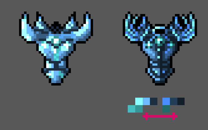
The armor is way too shiny, with transitions from dark to bright colors being very rough and sudden, making it look more like only an outline that was filled with a single color.
It definitely has room for improvement.
Always try to start out with filling the outline with darker colors, then applying lighter colors inside to draw your details in. Once you have a 'map' of your details, you'll get the intuition how to work around popping those details out.
And don't be afraid to use dark colors for something that is supposed to be shiny. If you take a look at my video where I teach how to draw shiny gems, you'll notice that half of the gem is filled with a very dark color. You may get a feeling of how to deal with crystals if you watch that video, if that's something you might want to learn.

I did a quick remake of your armor (if you don't me using it as a base) to show you an example of what you could get if you flesh out the contrasts more and work around putting more effort into the details. It can certainly be improved more, but it should be enough for you to zoom in and study some places on the sprites that may interest you, to see how it's done.

BF4ON9H.png


UgBVudj.png


Cheers, hope to see you post more!
 
Back
Top