• There is NO official Otland's Discord server and NO official Otland's server list. The Otland's Staff does not manage any Discord server or server list. Moderators or administrator of any Discord server or server lists have NO connection to the Otland's Staff. Do not get scammed!

Xome of the Omen |RPG|

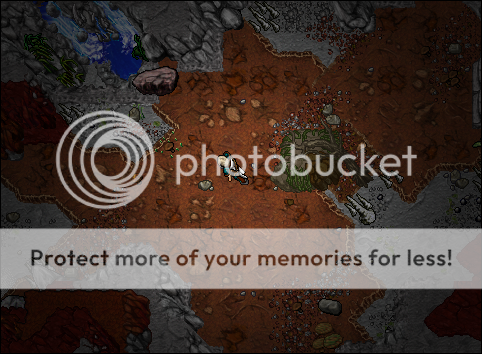
Sneak peak of the Catacombs!
dwnf6n7L.png

Really looking forward to suggestions while i'm at the beginning of this area, a few things will change here and there, but for the most part heres the idea.

I guess OP delivered, I liked it a lot @Blez.
 
Honestly, it doesn't look like you've spent more than like 10/15 minutes of it. I expected more to be honest. It doesn't look like shit, but it's for showoff so it should look coolio, but it really doesn't.
 
Against all critics (and idiots, that can't even leave a feedback), I can imagine how it will look like when it's finished, pretty classic but cool!
Just do us a pleasure and post finished pieces :)
Keep it up!
 
TzMl0fRT.png
I will be honest. After you show us this screen i thought that your maps are on high level, but what I can see now? Your maps are looking a bit square, but what is the most important? Details. You aren't using much details, why?​
 
TzMl0fRT.png
I will be honest. After you show us this screen i thought that your maps are on high level, but what I can see now? Your maps are looking a bit square, but what is the most important? Details. You aren't using much details, why?​
His style is more focused on simplicity, usually. But this latest piece by him doesn't look that great to be honest. It just seems 'off'.
 
@Dark199
I know that some maps looks great even if they are simple. For example one screenshot.
2zfs5ro.png

By @.Shirako.
I'm aware maps can look great if they're simple, I'm saying that Blez did a poor job this time, when he was able to make this for Necronia a few months ago.
6_zpsebd427a4.png
 
By any chance you can show the rest of that cave?:) I loved it!
I doubt it since Tjenn'Lunar hasn't been fully revealed to the public yet. When it is released, most definitely.
 
Just a revamp for a town, :) original by saramix or w.e

I think it looks okay, especially the layout of the place! However, I do have some points I'd like to touch on. Before I go through what I'd consider changing, I also want to mention that some of the "weird thing" about the picture could be explained by that the ground tiles aren't randomized.

Now; While I agree with the others that this looks somewhat iffy, I wouldn't say it's due to it being too simplistic. I actually have the exact opposite feeling where I think several objects are redundant.

Here's a picture to help me go through my feedback:
Yw84rvH.jpg


Red:
I would personally remove the stones on the roofs, they look out of place IMO. While we're at it, I'd also bench the marked bench for the same reason. :p
Blue:
Nature square: The patch of grass here looks weird to me. I would try to reduce the amount of space here instead of filling it with grass.
Building square: There's something about this building that doesn't quite mesh with the surroundings. Perhaps it's the combination between the dark stone walls and the light wooden pieces.. Regardless, I don't feel like it fits in. You could try the same layout but with different walls!

Looking forward to seeing an updated version of it! :)

<spook>P.S only for the spooks among us: please get rid of the grass tufts on the pavement..</spook>
 
Back
Top