-
2026 staff recruitment is open! Check it out and consider applying!
You are using an out of date browser. It may not display this or other websites correctly.
You should upgrade or use an alternative browser.
You should upgrade or use an alternative browser.
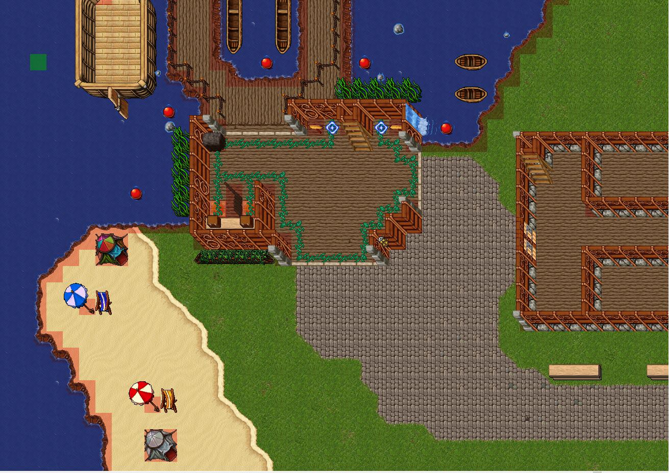
Donation Island 25% Complete
- Thread starter MeloB
- Start date
OP
OP
MeloB
GOD Arctic
- Joined
- Nov 22, 2017
- Messages
- 42
- Reaction score
- 4
Less autoborder my dude.
For example look at the coast line compared with autoborderAnd using raw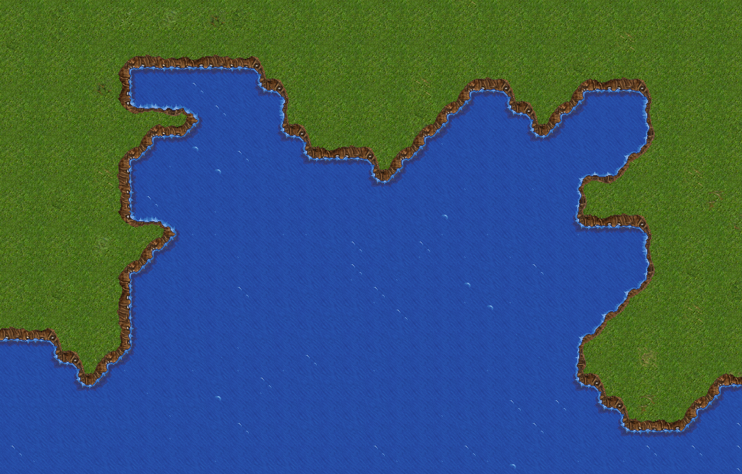
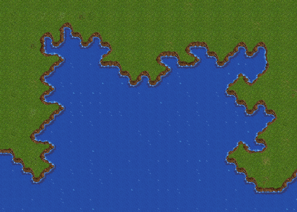
I dont under stand what you mean they both look about the same just a few diffrences
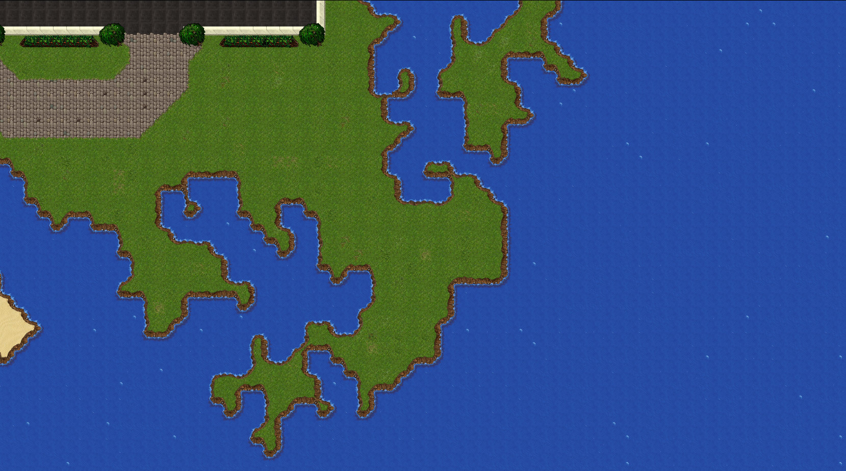
Is this what u mean??
Last edited:
Jfrye
Mapper, trying to learn scripting
What he means is to have less straight spots and try to use more "turns" to make it look more natural. The second attempt is a lot better, but there are some places that just look bad. The little green spots that have borders backed up back to back, with a little brown streak in the middle just looks bad.
I would look over the picture he posted a little more, and try to get some more inspiration to make the shape a little better. Also, in my opinion, I would use the other sand/water border. The one where the water actually looks like it is coming up on the sand.
I would look over the picture he posted a little more, and try to get some more inspiration to make the shape a little better. Also, in my opinion, I would use the other sand/water border. The one where the water actually looks like it is coming up on the sand.