RoyalzBHO
Excellent OT User
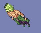
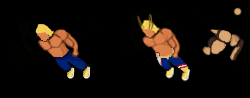
Thanks to Shikate for tips/help with Broly
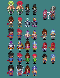
Skin sprites for http://dblots.pl
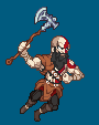
Kratos pixel-art
Do NOT use any sprites listed above, thanks.
Last edited by a moderator:
like always perfectly detailed sprites
Thanks to Shikate for tips/help with Broly
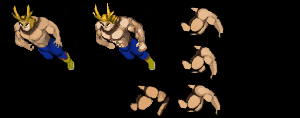
Flat LoG-refreshed sprites made for fun in my free time
Skin sprites for http://dblots.pl
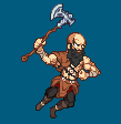
Kratos pixel-art
Do NOT use any sprites listed above, thanks.
Have to say it's the best sprite I saw from you
Thanks to Shikate for tips/help with Broly
")

Have to say it's the best sprite I saw from you
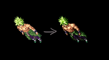
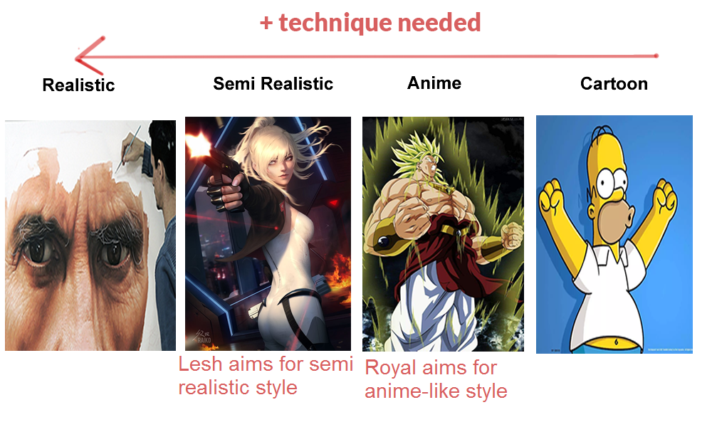
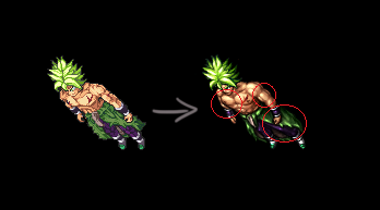
You have a nice start there, but I think you need more attention on perspective and painting.
Did a quick edit, hope it helps for study purposes.
Fixed most of the perspective errors, worked on a more dynamic pose and improved volume & painting overall.
There's still several things to improve but they're minimal for now.
Keep walking!!
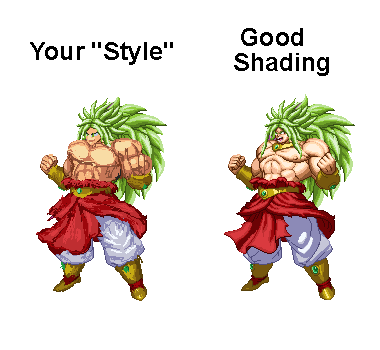
Thank you for your time spent doing that. It actually looks better proportion and perspective-wise, however, i still don't like the way you shade, so i'm going to stick with my "style". I do, however, like the way you did his chest and arms' lightning, that will help a lot. Thanks again!
Sorry, but what you're doing isn't a style, nor shading.It actually looks better proportion and perspective-wise, however, i still don't like the way you shade, so i'm going to stick with my "style".
In my opinion Royalz is spriting more anime style which is prefect style for dragon ball projects or similar projects. You shading style gives that tibia/old look which is not good opinion for that style servers, i find your shading really dark and not even close to anime look. So i support Royalz styleSorry, but what you're doing isn't a style, nor shading.
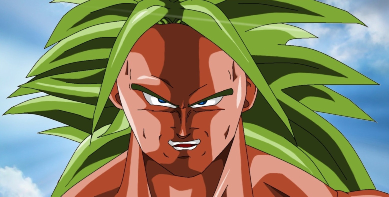
For example: I took this broly sprite (right) from the internet as an example.
Your current "style" (left) consist on base color placement, scratches and a few dithering, we can't call that shading because it's flat.
A good enough shading works like on the right image.
Also using "style" as an excuse won't get you anywhere. You need to learn the fundamentals before creating your own style.
are you burro ?In my opinion Royalz is spriting more anime style which is prefect style for dragon ball projects or similar projects. You shading style gives that tibia/old look which is not good opinion for that style servers, i find your shading really dark and not even close to anime look. So i support Royalz style
Are you Turkish? Probably yes because first think goes in your head is donkeyare you burro ?
In my opinion Royalz is spriting more anime style which is prefect style for dragon ball projects or similar projects. You shading style gives that tibia/old look which is not good opinion for that style servers, i find your shading really dark and not even close to anime look. So i support Royalz style

I think some people here need glasses lolAre you Turkish? Probably yes because first think goes in your head is donkey
Sorry, but what you're doing isn't a style, nor shading.
For example: I took this broly sprite (right) from the internet as an example.
Your current "style" (left) consist on base color placement, scratches and a few dithering, we can't call that shading because it's flat.
A good enough shading works like on the right image.
Also using "style" as an excuse won't get you anywhere. You need to learn the fundamentals before creating your own style.
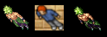
That's actually the exact opposite, lmfao. Leshrot's Broly is way more cartoonish than Royalz's.
Royalz's Broly looks like he resized it at least two times larger than it's drawing size. When I first saw it I actually thought there was some dirt on my screen, before realizing what I was actually looking at.
Royalz be like
Never said it was, I do sprites.it's not even a pixel art
Base color placement is okay. Scratch and put pixels randomly for dithering and cheer to it work right isn't.Secondly, the way i do isometric for now may consist on base color placement and other things you've mentioned, but that's how you actually learn and polish your ways of doing pixel art. That's how it all works without any Photoshop brushes, you have to learn to do it yourself and every idiot can use Photoshop to do 80% of the job for him.
Lastly, i'm not using style as my excuse and actually sticking to it and polishing it, as i mentioned before, WILL get me even further than you can ever be.
In my opinion Royalz is spriting more anime style which is prefect style for dragon ball projects or similar projects. You shading style gives that tibia/old look which is not good opinion for that style servers, i find your shading really dark and not even close to anime look. So i support Royalz style
That's all from me, im grateful for your tips, but i will be even more if you don't post here no more with that attitude.
") good luck with other works.
good luck with other works.