You are using an out of date browser. It may not display this or other websites correctly.
You should upgrade or use an alternative browser.
You should upgrade or use an alternative browser.
New TFS logo / icon
- Thread starter Don Daniello
- Start date
i'am mexican i don't speak english
Attachments
-
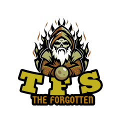 descarga.png92.9 KB · Views: 21 · VirusTotal
hemrenus321
Advanced OT User
But TFS is from OTLand owner so I dont see anything wrong with it to be honest + its just a iconIMO it should NOT be the same as OTLand logo. OTLand is one thing, TFS is another and it should stay that way.
I'm not even going to bother.. This gets my vote! Nice onei think it should be same style as forum logo
example:
View attachment 54376
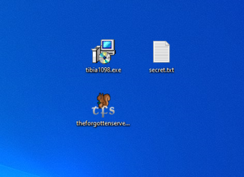
how it looks on desktop:
View attachment 54377
oen432
Legendary OT User
It's not just an icon... TFS is maintained by the community of OTLand. There is active fork of OTClient on otland GitHub, does it mean that they should change the icon to the squirrel too? If Mark wanted to use OTLand icon, he would do that from the beginning.But TFS is from OTLand owner so I dont see anything wrong with it to be honest + its just a icon
The icon is for the user to know what app they are using, not where it comes from.
BUT FURY IS OUR LORD AND SAVIOUR AND IS A PART OF TFS. HE IS A PART OF US ALL. HE IS THE COMMUNITYIt's not just an icon... TFS is maintained by the community of OTLand. There is active fork of OTClient on otland GitHub, does it mean that they should change the icon to the squirrel too? If Mark wanted to use OTLand icon, he would do that from the beginning.
The icon is for the user to know what app they are using, not where it comes from.
oen432
Legendary OT User
Ok, now take a second and imagine completely different icon that would make sense.BUT FURY IS OUR LORD AND SAVIOUR AND IS A PART OF TFS. HE IS A PART OF US ALL. HE IS THE COMMUNITY
TFS - The Forgotten Server
We have to parts here that matter
1. Forgotten (abandoned, ditched) - often associated with a place that is covered with moss/overgrown (nature took over due to no human activity, hence forgotten), rust (if it's metal) and overall corrosion.
2. Server - this doesn't need explaining, it's a server, so physical server icon would work
Combine these two parts and create an icon that shows a physical server with some moss/overgrown and rust. Bang, you have the best icon that shows you are using freaking TFS.
Or you know, meme and make it less professional, I mean who cares about making better image for this community, right?
Whilst I get your point, it doesn't need to look boring.Ok, now take a second and imagine completely different icon that would make sense.
TFS - The Forgotten Server
We have to parts here that matter
1. Forgotten (abandoned, ditched) - often associated with a place that is covered with moss/overgrown (nature took over due to no human activity, hence forgotten), rust (if it's metal) and overall corrosion.
2. Server - this doesn't need explaining, it's a server, so physical server icon would work
Combine these two parts and create an icon that shows a physical server with some moss/overgrown and rust. Bang, you have the best icon that shows you are using freaking TFS.
Or you know, meme and make it less professional, I mean who cares about making better image for this community, right?
Incorporating Fury makes it a community thing. Hell, open tibia isn't exactly a professional outfit. As long as it says TFS it should be enough in reality but why not link it to OTLand now? I don't see the issue with having Fury involved with the logo for a project that pretty much belongs to the community that already has Fury as a mascot.
oen432
Legendary OT User
Just wanted to throw my opinion on this topic, I'm honestly out of arguments so do your thing. It's still fresh thread so probably more people will post their ideas and maybe something even better than our ideas will come up.Whilst I get your point, it doesn't need to look boring.
Incorporating Fury makes it a community thing. Hell, open tibia isn't exactly a professional outfit. As long as it says TFS it should be enough in reality but why not link it to OTLand now? I don't see the issue with having Fury involved with the logo for a project that pretty much belongs to the community that already has Fury as a mascot.
Well IMO who really cares about an icon? And I bet Mark had the same idea when he started 1.x and removed the old 0.x icon.
I can agree with @oen432 that it might be a wrong to use the "fury" but at the same time who really cares?
If you ask me we could leave it blank but it would still be fun to find a new logo, even if its just the fury with TFS written around it (linked above)
This is the perfect way to let others than C++ / Lua experts help the community in diffrent ways, so it still has a huge from me
I can agree with @oen432 that it might be a wrong to use the "fury" but at the same time who really cares?
If you ask me we could leave it blank but it would still be fun to find a new logo, even if its just the fury with TFS written around it (linked above)
This is the perfect way to let others than C++ / Lua experts help the community in diffrent ways, so it still has a huge
Stanos
Veteran OT User
So seeing all of those arguments why dont you just create logo that represends both, what i have in mind is use github style logo with fury inside so it will represend otland and social coding at the same, and everyone will be happy, probably.
- Joined
- Mar 16, 2017
- Messages
- 1,459
- Solutions
- 163
- Reaction score
- 2,152
- Location
- London
- GitHub
- MillhioreBT
- YouTube
- millhiorebt
I totally agree with you!Ok, now take a second and imagine completely different icon that would make sense.
TFS - The Forgotten Server
We have to parts here that matter
1. Forgotten (abandoned, ditched) - often associated with a place that is covered with moss/overgrown (nature took over due to no human activity, hence forgotten), rust (if it's metal) and overall corrosion.
2. Server - this doesn't need explaining, it's a server, so physical server icon would work
Combine these two parts and create an icon that shows a physical server with some moss/overgrown and rust. Bang, you have the best icon that shows you are using freaking TFS.
Or you know, meme and make it less professional, I mean who cares about making better image for this community, right?
yes!@Stanos:
So seeing all of those arguments why dont you just create logo that represends both, what i have in mind is use github style logo with fury inside so it will represend otland and social coding at the same, and everyone will be happy, probably.
oen432
Legendary OT User
If you guys are really into that Fury then maybe instead of using that Fury, use a... nut?
If this Fury is a squirrel and is the mascot/patron of OTLand then why not make a NUT as an icon for TFS, that would make them both have connection. That makes sense cause you know... squirrels eat nuts.

If this Fury is a squirrel and is the mascot/patron of OTLand then why not make a NUT as an icon for TFS, that would make them both have connection. That makes sense cause you know... squirrels eat nuts.

- Joined
- Mar 16, 2017
- Messages
- 1,459
- Solutions
- 163
- Reaction score
- 2,152
- Location
- London
- GitHub
- MillhioreBT
- YouTube
- millhiorebt
Your idea is perfect!If you guys are really into that Fury then maybe instead of using that Fury, use a... nut?
If this Fury is a squirrel and is the mascot/patron of OTLand then why not make a NUT as an icon for TFS, that would make them both have connection that makes sense.

hemrenus321
Advanced OT User
IMO it should NOT be the same as OTLand logo. OTLand is one thing, TFS is another and it should stay that way.
they are linked, there is no TFS without OTLand and vice versa. Another option is to use "Fury" with server in hands(look at OTland IP Changer icon) there's no point to reinvent the wheel with modern vector logo.
Anyway, that's just my 2 cents, maybe we should vote to keep the "fury".
This gives me ideasIf you guys are really into that Fury then maybe instead of using that Fury, use a... nut?
If this Fury is a squirrel and is the mascot/patron of OTLand then why not make a NUT as an icon for TFS, that would make them both have connection. That makes sense cause you know... squirrels eat nuts.


River KA
Veteran OT User
- Joined
- Feb 1, 2010
- Messages
- 535
- Solutions
- 27
- Reaction score
- 336
I think makes no sense at all to keep the initials "TFS".
No programs ever uses an icon with initials, unless they have several programs like Adobe (Photoshop, Illustrator, ...), it's about a program language (like Lua) or has no idea of a cool icon that represents their project.
E.g., Visual Studio, Discord, Chrome, Github, WinRAR, WinSCP, RME, ItemEditor, and so on uses an icon without initials.
I like the idea to keep the Fury or a nut as @oen432 mentioned, but keeping the professionalism.
And I see no reason not to use a modern vector logo, since the TFS is modern.
So, IMO, we should keep:
- Modern icon, since TFS is modern
- Professional: clean, as vector and without initials
- Fury or a nut, that would represent our mascot
Handicap Ninja
Advanced OT User
- Joined
- Sep 28, 2020
- Messages
- 263
- Reaction score
- 169
nice it's the fury server now
Similar threads
- Replies
- 20
- Views
- 3K


