• There is NO official Otland's Discord server and NO official Otland's server list. The Otland's Staff does not manage any Discord server or server list. Moderators or administrator of any Discord server or server lists have NO connection to the Otland's Staff. Do not get scammed!

OtLand [Competition] OtLand logo

Status
Not open for further replies.
I know, and I feel sorry for the 8th art competition. I know it failed but this time, this competition is more creative and hopefully more active.

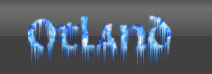
This competition consist on making a new logo for OtLand. Yes, the image below Affiliates list on the top.

The winner will get the image used as OtLand's official logo, and a three month donator subscription.

The image has to...
  • be the same size as the image given below.
  • be based on the one we have provided.
  • be in Graphics Interchange Format (.gif).
  • contain the text "OtLand".

logo.gif


NOTE: If you plan on using images on the logo, please make sure you have the permission of the author to use it, or that the image is released in public domain.

Kind regards,
OtLand Staff.
 
Last edited by a moderator:
Here's what I made (By using Agostino's mage):

Currently BMP, because it's simple to change to GIF and if this'd be used it'd be a simple move to change format.

Note that I just want the best for OTLand, so don't tell me I'm trying to steal his job, whether I win or not, I will not take the full credits for this :p

I don't wanna be rude or anything but you didn't improve agostinos logo. Didn't like it because most of your logos have a BIG shadow distance which I don't think is near professional :p Makes me think of cartoon, especially your gold text effect.

A tip: Don't add too much on your logo, it might be cool but it has to look good as well ;p
 
I just edited my entry. I think this one looks better than my old ones. Pretty simple & clean. I might add animation to it.
 
I don't wanna be rude or anything but you didn't improve agostinos logo. Didn't like it because most of your logos have a BIG shadow distance which I don't think is near professional :p Makes me think of cartoon, especially your gold text effect.

A tip: Don't add too much on your logo, it might be cool but it has to look good as well ;p
Ever tested it in the site? I have ;) It looks great there, atleast with the onClick effect *awesome* :D

Ok, Colandus :p

I guess I love this one.

logo3.gif
Yeh that's way better :D
 
Ever tested it in the site? I have ;) It looks great there, atleast with the onClick effect *awesome* :D
Nope I haven't but I was just criticizing your design.

New animation for my new logo is added!
 
I have two questions..

- Do I still have time to submit my entry?
- Which rights exactly do you plan to have with the logo? Will I still be credited if selected somewhere? etc. etc.
 
i though it might be a nice idea to have a portal to replace the 'o' and have it animated. I dunno how to do something like that so i though i might as well post the idea for some1 else maybe to do for themselves of course
 
Sorry for not paying attention to the time limit ;).. but I didn't noticed it and I might aswell place it with my other question eh xD?

Ah well.. Might start sketching a bit..
 
To bad Luexo saw this thread erhm mh mh... mh... Im thinking about retiring :D
 
Status
Not open for further replies.
Back
Top