Ok, I'm no expert on this stuff. There's tons of people here way better than me, but since none of them have responded to your request for suggestions I will. There was a number of points that I felt like I could see that could be improved upon. Take what you like, leave the rest.
First, here's a blown up version of your top left sprite from the prior page.
The first thing I notice is with the lineart. I bet you drew the rocks clockwise because they look like fallen dominoes. Each leaning on the next one. I'm really not sure what you were going for, but I don't think that was really intentional. A more haphazard fashion in which some are on top and some are below would probably give a better effect. (the colors don't indicate any depth, just the lineart, the convex divisions all point one direction)
The next thing I notice is that they all look flat. Some rocks are fairly flat, but I really don't know why they all should be, again, maybe this is something you were going for, but it looks off to me.
In addition to looking flat they look polished, again, you might have a reason...
Lastly, imo the line art is way too heavy. Generally, a black outline will make something pop out. If this is just supposed to be decoration you should probably ease up.
So, here's what I wound up with, I'll show them next to each other for comparison.
I'll mention some of the things I did.
I just picked one of your colors, but saturated it more (I think your desaturated colors are fine), and made a ramp. I realized you had I think 29 colors, seems a bit high (maybe some program "compressed" it?), I used 5 for the rocks 1 for transparency.
I replaced your line art with a dark brown, lighter brown on the outside where it will meet grass, darker on the inside where it can indicate a drop before meeting the water. I also used darker colors for the inside where you should see more of the rock as it slopes towards the water, to indicate the depth. On the outside I imagine it would meet the grass quite high up.
When shading between the rocks I made sure to provide variety, some rocks are nestled below other rocks, receiving shadows on either side, agreeing with the lineart. Other rocks are higher up, above on each side. And a few of the divisions they seem to be about the same elevation. Even if the pond is artificial this is expected I think.
Finally, I made imperfections on the individual rocks. Allowing the rocks to shadow themselves in depressions and cracks.
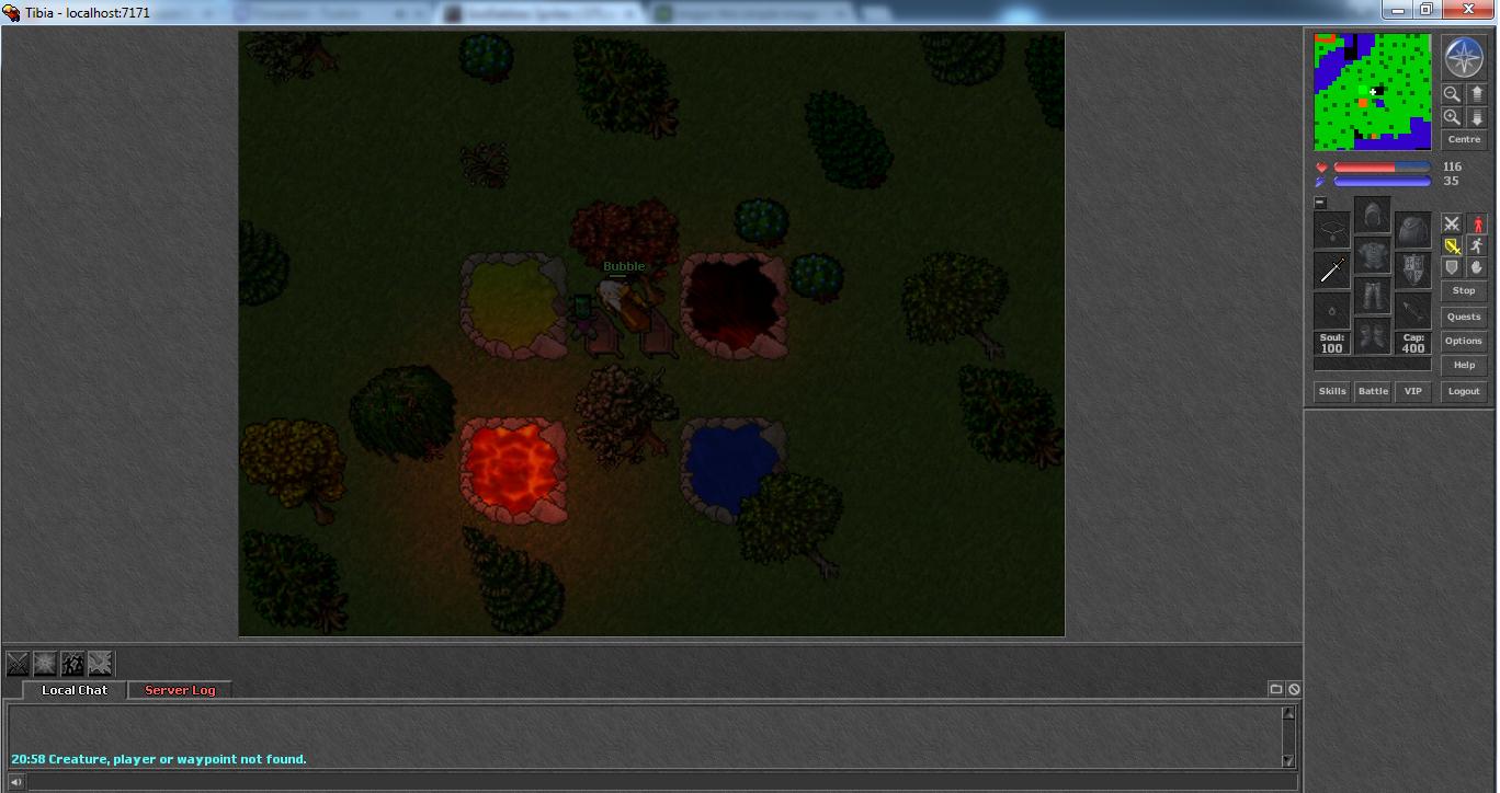
I wouldn't use the rocks like this for lava though. You should make a separate set for lava, illuminated from the inside and underneath with a red. You could use volcanic rocks for those. And a lot more could be done with the rocks, maybe more smaller rocks could be added, maybe some sand on the inside, if it always meets grass on the outside, something could be done with that. But I tried to imitate your style as I'm not really sure what the purpose is.
Anyway, I hope I could help. As I mentioned before, take what you like and leave the rest. Sorry for being so wordy.
")


 ) But i learned alot during the progress, stone depths etc.