Saphron
Rare Pepe
- Joined
- Jul 7, 2010
- Messages
- 731
- Reaction score
- 1,311
tldr: The D is best
They all are quite amazing though let me start what I think about all of them and pick my personal favorite.
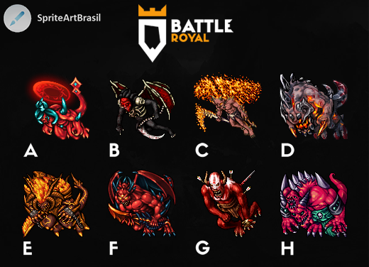
3/10 A -> bad anatomy, looks more like a pony than a demon- pony demon perhaps? /- pointless magical halo which has no reason to be there, for it has no relation with other parts of sprite.
6/10 B -> Incredible design, but it has issues with red parts of being noisy in relation to other things which are blurry, I do believe this work loses a lot because of the black background.
5/10 C -> Solid work, though I do believe not enough patience was put into reflections of fire on the skin, and on fire itself. Its noisy and doesn't represent wings as good as it could.
10/10 D -> Incredible design, great strong shapes which were empowered with reflected light, and darker color on feet to bring attention to higher part of sprite, I really like it, the only thing which I have problem with are those three strange horns? on his head which don't seem to have much relation with the way he shades the rest. But personally design and the way its shaded makes me really enjoy looking at it, and its rare because as most of you know I hate sprites made with brushes. And this is my winner, I rarely see a work done so perfectly.
4/10 E -> Quite interesting, I do like the fire, but it could be less noisy on the yellow bright parts to make it more clear. Sprite lacks depth, all parts of it seem to be one same plane, there isn't much variation on the colors and it all kinda feels like a block. I like the head, but in relation to the rest it seems to small, also some small issues with perspective are present as well. (lovely tail btw.)
9/10 F -> I think its the most solid work out there, though it has issues as all of them, the contrast is too strong, there is no light play on sprite, muscles in his visible hand are quite strange, they look like bubbles, the visible lower part of the sprite could have a slightly different palette to improve the depth, but otherwise its quite lovely and if the issues would be fixed this one would be the winner.
7/10 G -> Quite interesting but the pose makes him look weird, the head feels out of place but the shading especially on his hand and knee are very amazing, I can learn a thing or two from it.
9/10 H -> Well its quite sad really, for this is my favorite work of them all if we talk about design, it really portrays well evil influence and corruption but it just doesn't have enough contrast, shades even though brushes are present the muscles and space between his head and hand aren't shaded well enough, the right hand seems to be completely out of place - its quite sad because this would be my winner, but I just cant unsee those small things, anyways great work I wish to see more from you soon!


") Can I have contact from you to owner of Padventures, or it's impossible?
Can I have contact from you to owner of Padventures, or it's impossible?