• There is NO official Otland's Discord server and NO official Otland's server list. The Otland's Staff does not manage any Discord server or server list. Moderators or administrator of any Discord server or server lists have NO connection to the Otland's Staff. Do not get scammed!

Leshrot Graphics Gallery

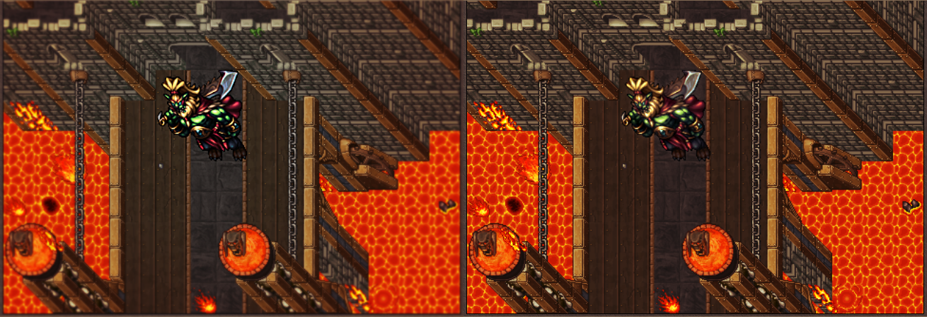
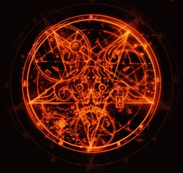
It looks like it's meant to glow. Compare to something like the exura animation:

latest


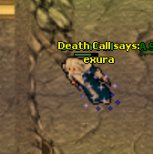
It doesn't have an outline either, because it's not meant to create a strong contrast but rather the sparkling effect.

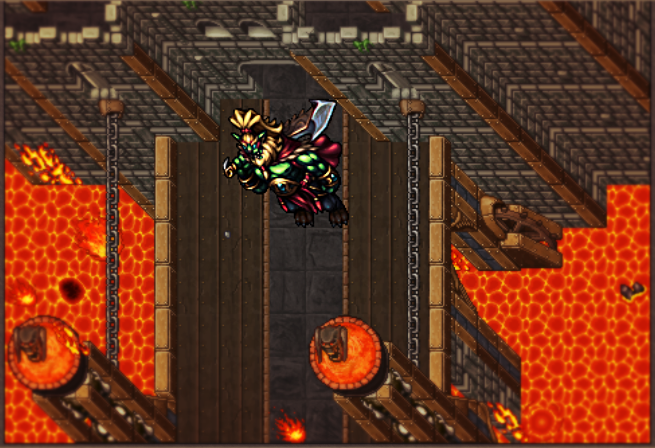
I look at it as something like this:

da79340410461630d947f7974285ac0f.gif

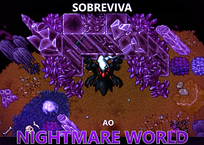
Used it for my ot lul :D

Screen capture - e2edf64d5417e5285839f557c80407a0 - Gyazo
 
Last edited:
Without animation they are nice, though left one is on acceptable level if it comes to animation when right one is not and looks like it was made in a hurry. Also, I cant unsee that wings and character are in completely different resolution
 
I like the wings, but animation sucks
I agree. Actually the wings were made in 96x96, had to resize to work ingame then I hadn't planned a good space on canvas to make animations in order to lose less quality.

Btw, next models will be done in proper 64x64 size. That and another few points gonna be improved, so it will look even better.

Thanks for your feedback
 
Last edited:
This was very funny to work on, Orc Boss for Shadowrealm.
I really missed making such awesome creatures, more are coming soon.


mhFi1T5.png
I think you over do it with the detail. Plus the character & it's colors don't blend in with the background making the image look plastic and fake. Tibia's monsters blend in with the background by subtlety standing out making them look like they are part of the image.
 
I think you over do it with the detail. Plus the character & it's colors don't blend in with the background making the image look plastic and fake. Tibia's monsters blend in with the background by subtlety standing out making them look like they are part of the image.

I understand your point,
As I post on Facebook also, I usually work with more sharpness on focal point (sprite) and blurr on the aroundness (bg), making the details and sprite itself stand out.
Ke7ioWj.png

The second is another version with less changes, and we can push it even further changing even more contrast/colors & etc.

Hope you like it now.
 
The second is great, tho it does not perfectly fit my graphic sense colorwise.

Anyways the sketch, design, and detail is a perfect example why Leshrot is one of the best spriters in OTLand community
 
Better, but it still looks like you did the sprite in lower res than the one shown here, resized it, applied sharpness and that was the result. The second one is clearly better but lacks details as the first one (especially on face) still dont get me wrong , that isnt a bad sprite it just doesnt fit the scene :D
 
Better, but it still looks like you did the sprite in lower res than the one shown here, resized it, applied sharpness and that was the result. The second one is clearly better but lacks details as the first one (especially on face) still dont get me wrong , that isnt a bad sprite it just doesnt fit the scene :D

Ingame screenshots are resized unless you shrink the game screen, clients also have AA enabled in general.
Original sprite made in 96x96.
 
Hello! Here's a few things I done on past year for PxG (PokeXGames).

Here's Darkrai, the Boss from Nightmare World update.
WlwwWyq.png

"Survive the Nightmare World"
There's a long time I don't post pokemons btw.

The outfits for the Global Tournament 14, everyone who joined it received one :D
hY187Ea.png

Made these in a livestream and learned a lot with people suggestions!

Hope you enjoy it
 
Back
Top