You are using an out of date browser. It may not display this or other websites correctly.
You should upgrade or use an alternative browser.
You should upgrade or use an alternative browser.
Maltexor's Sprites
- Thread starter Maltexor
- Start date


Yellowhat
BOo!
- Joined
- Mar 11, 2013
- Messages
- 514
- Reaction score
- 554
I guess people are a bit busy on mondays hehe.
But ofc, they are decent sprites.
Keep on spriting and show us more ;>
But ofc, they are decent sprites.
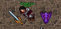
- There's no real need to have blood on the edge of the 3rd sword.
- You have black(or too dark) lines inside of your sprite.
- Handles on the sword could use some rework as it seems there are no handles on them.
Keep on spriting and show us more ;>
I guess people are a bit busy on mondays hehe.
But ofc, they are decent sprites.
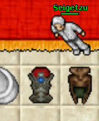
Best sprite is the shield it looks really cool. But the dark edges on the top seems a bit weird, try making it a little brighter.
- There's no real need to have blood on the edge of the 3rd sword.
- You have black(or too dark) lines inside of your sprite.
- Handles on the sword could use some rework as it seems there are no handles on them.
Keep on spriting and show us more ;>
Thanks for your Feedback i will Update like you said and post it later
")


alot better, now try to get rid of the black inside of the sprite and replace it with a dark yellow(brownish color)
use these colors for the handle and see if u can manage ;>

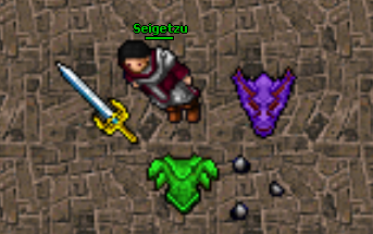
Ok i tested a bit around and i got this.


And i did this Armor in a short time.

Last edited:
Thorn
Spriting since 2013
In the time i have learning to sprite i have realized that are 3 extreme important things: Shades, Lights, and the colors you choose.
If you do a green armor, just green looks too plain, you could add more different colors, or add more shades and light to make it look better
Hope it helps
If you do a green armor, just green looks too plain, you could add more different colors, or add more shades and light to make it look better
Hope it helps
Lortsa1992
Active Member
Very good first sprites!
In the time i have learning to sprite i have realized that are 3 extreme important things: Shades, Lights, and the colors you choose.
If you do a green armor, just green looks too plain, you could add more different colors, or add more shades and light to make it look better
Hope it helps
That's true mate, i need too learn a bit more about light's and wich colors i use but i guess it's okay for my first sprites and i stared to sprite yesterday ;D
But i guess if i do more sprites and learning to shade and set the lightning right, the day will come i can make pretty good sprites

Very good first sprites!
Thanks!


Thorn
Spriting since 2013
I think is too much AA, maybe try to use less colors. If you want to play with shadows and lights, use the same basic color but really dark and white, or white with a little of the color you are using 
I will try itI think is too much AA, maybe try to use less colors. If you want to play with shadows and lights, use the same basic color but really dark and white, or white with a little of the color you are using
So much blur. DO NOT USE IT. NEVER use this photoshop/gimp option. NEVER.
I never use blur just using Brush or Colored Pencil maybe it's a bad idea to use a bit of Brush Option^^
Sometimes i use it much but sometimes not that's why some of my Sprites looks fine and some not xD i watched some youtube videos of Spriting i guess i do a better Shield and Armor Tomorrow.I don't think there's too much AA, opposite, he's just using brush too much.
Try yellowhat's tutorial.
