• There is NO official Otland's Discord server and NO official Otland's server list. The Otland's Staff does not manage any Discord server or server list. Moderators or administrator of any Discord server or server lists have NO connection to the Otland's Staff. Do not get scammed!

Map reviews

Xenios

Well-Known Member
Senator
Joined
May 28, 2007
Messages
3,449
Reaction score
58
Location
Netherlands
This is almost the same as showing of your map but the difference is that here the only thing that can be replied is: criticism that is only intended for improve purposes.

So, people saying things like "This sucks" or "nice job, keep it up" are not welcome and will be deleted when they are posted. This may result into a infraction when this happens a couple of times with the same person.

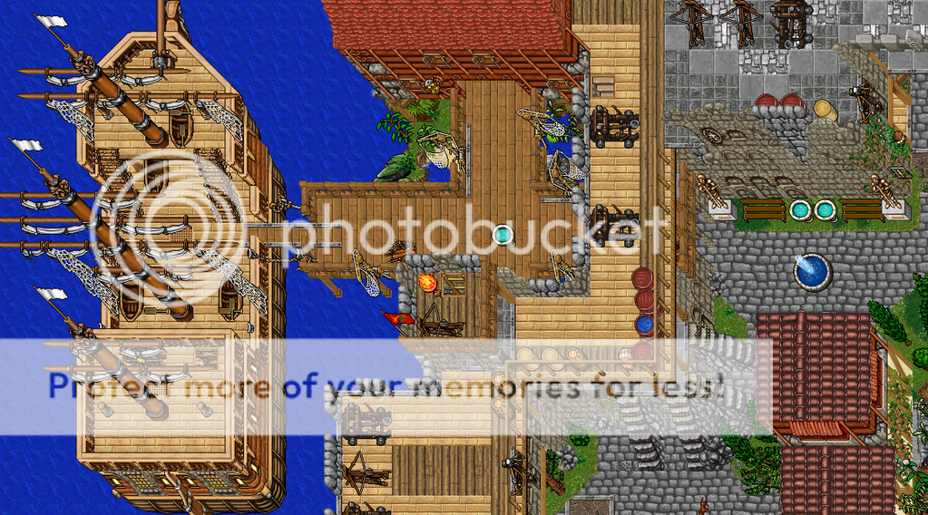
Everyone can show their map and everyone can get & give good improvements about it so let's start:

If you're new and don't know much of mapping yet then I really suggest that you
look at our mapping tutorial section.
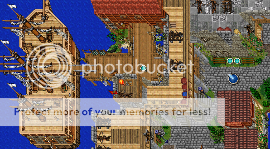
 
well heres a vampire castle ive been workin at, seems done to me. anything to add? subtract?

whole thing:
nei2p0.png


floor 1:
2gxhag8.png


floor 2:
2z7k80p.png


i can post other floors later.. but theres not to much on them. just a dining hall and the former king's room.
 
I really like the castle Fetus.
Only things I see are that it looks as though there should possibly be a path leading to its entrance, and maybe like there should be more of something in the corner towers on the lower levels.
The shoreline might also look nicer if you rockied it up a bit.

Here is one of three of "Slatia's" harbors.
SlatiaHarbor.png

I know the nets are a lil sketch, but hey- it's a thought.

Edit:
@ Xenios: Thanks for the suggestions

SlatiaHarborImproved.png
 
Last edited:
Looks good, but the mountain stairs just isn't right those 2 stairs on the corner should be removed since it can be annoying for players that can stand on 1 sqm, and can simply move between the stairs when pking. Also you would need to put some more street lights so people can see where they're walking at. :)
 
Poof. It looks good, although I don't like that carpet on top of a mountain? Looks weird, even if there's been a building, the carpet should've been gone among with the walls.
 

do me a favour, make a screenshot of the Mountain with Jungle grass on the mountain instead of the normal.

I think that would look better if you ask me but I have to compare first before i can say that to 100% :p


kind regards, Evil Hero
 
"Even if there's BEEN a building"
Didn't say there was any walls, I just made a little "utstick" to make you understand why the carpet didn't fit in. :)
 
Well, first of all... You can't possibly have that on a map. What player would even sruvive 1 second in there with all those monsters...?
Then another thing I would like to point out, (maybe it's just my own taste) but I think You should not mix ALL the magic fields... at least not in such a small area.
Think about these things, and It might be a bit improved :)
 
Well that castle looks pretty cool in my opinion, although don't really like all the mixture of details in there, such ass grass tufts at the end of the mountain, and that Marble Balcony. The 8.4 orange roof and that chimney doesn't fit so well either, but I can see why you choose to have them, add a bit of realistic feeling into it. (too bad they didn't make a 3d roof like that with the normal brick roof :()
That's my opinion, feel free to not care, I've heared quite alot around here that I suck, I just felt like giving you my thoughts.
 
Was bored and Kinda fixed and trixed with Chauz idea..

15e8d49.png


:>
 
Back
Top