-
2026 staff recruitment is open! Check it out and consider applying!
You are using an out of date browser. It may not display this or other websites correctly.
You should upgrade or use an alternative browser.
You should upgrade or use an alternative browser.
My Gallery
- Thread starter marek12
- Start date


oen432
Legendary OT User
Kratos?
OP
OP
marek12
Available for sprite works
- Joined
- Apr 8, 2020
- Messages
- 398
- Solutions
- 4
- Reaction score
- 395
Kratos?
that's true.
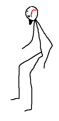
and here is a finished one

and here is a finished one
dami1310
◄ Unidentified ►
Not a troll, literally what I thought when I first saw it. Despite this, it is quite good ofc.Yeah, ignore that dami trollIts quite good, though needs a bit more polishing and work on perspective. Keep it up!
Tip: Make the gap between feet longer and make the legs look more natural instead of being straight af.
oen432
Legendary OT User
Oh god that's even worse, what happened to him


OP
OP
marek12
Available for sprite works
- Joined
- Apr 8, 2020
- Messages
- 398
- Solutions
- 4
- Reaction score
- 395
you were right with the leg's looks paralysed. I completely agreed on that.Not a troll, literally what I thought when I first saw it. Despite this, it is quite good ofc.
Tip: Make the gap between feet longer and make the legs look more natural instead of being straight af.
hope after edit it looks better
dami1310
◄ Unidentified ►
Looks like this atmyou were right with the leg's looks paralysed. I completely agreed on that.
hope after edit it looks better
a bit exaggerated, but yeah, something like this
OP
OP
marek12
Available for sprite works
- Joined
- Apr 8, 2020
- Messages
- 398
- Solutions
- 4
- Reaction score
- 395
not to me. maybw I got somwthing wrong with my eyesLooks like this atm
a bit exaggerated, but yeah, something like this
his on leg is more pushed forward and thats intentional. other than that I don't see the same as you do

Leshrot
Best spriter & cutest too
- Joined
- Nov 17, 2012
- Messages
- 391
- Reaction score
- 791
The overall perspective needs a bit more attention, the upper part of his body is leaning back a bit.
The legs definitely improved with Dami's feedback, but their anatomical design still needs a little more study. Great improvement anyway.
The legs definitely improved with Dami's feedback, but their anatomical design still needs a little more study. Great improvement anyway.
OP
OP
marek12
Available for sprite works
- Joined
- Apr 8, 2020
- Messages
- 398
- Solutions
- 4
- Reaction score
- 395
The chest with shoulders is intentionaly in this position. it gives the same effect as you would do it in real life. this way he look more like he standing straight with the arms tucked back.The overall perspective needs a bit more attention, the upper part of his body is leaning back a bit.
The legs definitely improved with Dami's feedback, but their anatomical design still needs a little more study. Great improvement anyway.
about the anatomy I would love to see what you mean by that
cool to learn from someone else so explain a bit more what is wrong with that.
thank for the feedback as well
Leshrot
Best spriter & cutest too
- Joined
- Nov 17, 2012
- Messages
- 391
- Reaction score
- 791
Chest & shoulders isn't the main problem, but the angle of the entire upper body who's leaning back a few degrees (yellow line), and should be near 45º (green line) mostly. Made a quick edit and also pointed some other basic stuff.
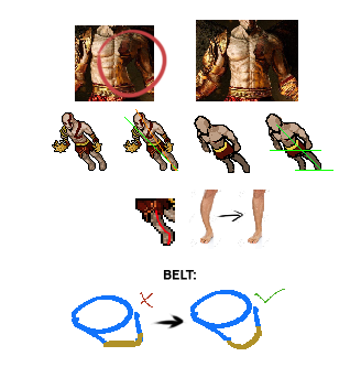
I would look for perspective fundamentals mostly, I recommend to train drawing boxes, cylinders and this kind of this basic 3D forms in perspective to improve at it.
I would look for perspective fundamentals mostly, I recommend to train drawing boxes, cylinders and this kind of this basic 3D forms in perspective to improve at it.
Last edited:
OP
OP
marek12
Available for sprite works
- Joined
- Apr 8, 2020
- Messages
- 398
- Solutions
- 4
- Reaction score
- 395
Chest & shoulders isn't the main problem, but the angle of the entire upper body who's leaning back a few degrees (yellow line), and should be near 45º (green line) mostly. Made a quick edit and also pointed some other basic mistakes.
Perspective fundamentals mostly, I recommend to train drawing boxes, cylinders and this kind of basic stuff in perspective to improve at it.
what I have tried to do, because he's chest and shoulders are leaning a bit to the back as well as the head, the front left leg (looking from the perspective how is shown) is just slightly bended (knee a bit forward) and the other leg straight. I wanted to avhieve a bit different pose. the reference image is just for the main details, such as "tattoo" over his head and on his chest and all the others, but mainly I did not tried to recreate 1:1 picture.
your points are definitely accurate and are helpful. I just think they would not apply to what I tried to achieve.
example: if the head is moved back it will not allign with green line in exactly 45 degree angle.
correct me if I'm wrong
Leshrot
Best spriter & cutest too
- Joined
- Nov 17, 2012
- Messages
- 391
- Reaction score
- 791
Sure, but why his head/upper body would be going back in a kinda "awkward" pose?
Clarity is important, If people can't understand the pose or anything you're trying to represent on your drawing I would rethink it.
I'd recommend to post some reference image of what you want to achieve if you want further and appropriate feedback from people.
I'm glad it helped at some point.
Clarity is important, If people can't understand the pose or anything you're trying to represent on your drawing I would rethink it.
I'd recommend to post some reference image of what you want to achieve if you want further and appropriate feedback from people.
I'm glad it helped at some point.
