- Joined
- Jul 7, 2007
- Messages
- 4,049
- Reaction score
- 240

Rules for Voting
You may only vote once, anyone found to have used multiple accounts to vote on their favorite
piece will have their votes disqualified.
(Note this does not disqualify the contestant).
If the contestant is discovered to have told other people to vote for him/her, or has voted for themself, they will be
disqualified without warning, and not allowed to participate in the next Official Contest.
If you know who mapped what just by style, do not post saying who it is. You will receive an infraction for doing so.
Things to keep in mind when voting:
The theme, look at how close the mapper followed the theme, e.g. Lighting, details etc.
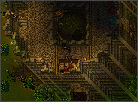
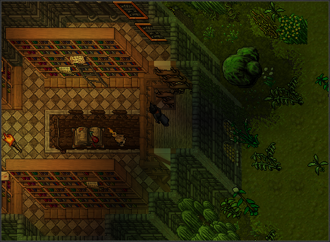
Contestant's Works
1.

2.
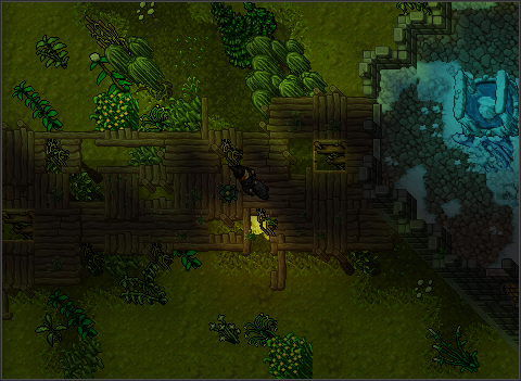

3.

4.


enjoy!
The following members are banned from next month contest:
- Alex Dark,
- Ayhan589,
- Beyond Sky,
- BlackList,
- Creon,
- Elixir,
- jagartrott,
- LATE,
- lord5,
- man boob,
- Misha,
- mymaxx,
- nevix,
- psykina,
- razdwatrzy
Vote Changes:
North: 3>2
Sentiello: 1>3
Last edited:
")

 ?
?