You are using an out of date browser. It may not display this or other websites correctly.
You should upgrade or use an alternative browser.
You should upgrade or use an alternative browser.
Post your latest work!
- Thread starter ZoOorO
- Start date

Rikci
Spriting :D
- Joined
- Jul 22, 2013
- Messages
- 328
- Reaction score
- 248
For sure.Great work man. One of the best on otland for sure. Make your own thread here aswell")


")
Shadowsong
Game Developer & Graphic Designer
- Joined
- Feb 23, 2010
- Messages
- 3,446
- Solutions
- 21
- Reaction score
- 3,014
- Location
- Bosnia & Herzegovina
- YouTube
- ShivaShadowsong
Good to see you're back Zepri, I like your work a lot. Awesome throne! :]

masterofthis
Member
- Joined
- Nov 5, 2009
- Messages
- 43
- Reaction score
- 23

those are free for use, just tell me where you are going to use them so i can see how they look ingame


Well, it could be huge 64x64 giant's cleaver... Perhaps for puting on map, or it might resize in character equipment...
That's quite good item, next time focus on lineart (there are some unnecessary pixels). Keep random-pixels (dithering) for texturing/detailing. Not used properly creates a mess.
That's quite good item, next time focus on lineart (there are some unnecessary pixels). Keep random-pixels (dithering) for texturing/detailing. Not used properly creates a mess.
edited the sprite a little bit, tried to remove some of the unneeded pixels and tried making the blood look a little more realistic (not sure if it worked)

any more tips on how i could improve it?
thx for all the feedback ^^ really appreciate it
any more tips on how i could improve it?
thx for all the feedback ^^ really appreciate it
Shadowsong
Game Developer & Graphic Designer
- Joined
- Feb 23, 2010
- Messages
- 3,446
- Solutions
- 21
- Reaction score
- 3,014
- Location
- Bosnia & Herzegovina
- YouTube
- ShivaShadowsong
It looks much better now. I would still recommend focusing those white (brightest) pixels on the blade into a row/line, rather than having them dispersed like that. Right now the blade looks like it's a stone, rather than a blade, if you know what I mean. The very edge (west side) of blood is also too bright, make that white color a bit more hue'd and darker towards red.edited the sprite a little bit, tried to remove some of the unneeded pixels and tried making the blood look a little more realistic (not sure if it worked)
any more tips on how i could improve it?
thx for all the feedback ^^ really appreciate it
SpookieGamer
!@Too Spooky 4 You@!
- Joined
- Mar 25, 2013
- Messages
- 565
- Solutions
- 1
- Reaction score
- 157
Really nice sprites, Zepri.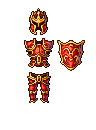
new crown set
Demetri World (c)
Keep them coming!
