L
LordVissie
Guest
Legend.


A great come-back after your inactivity <3
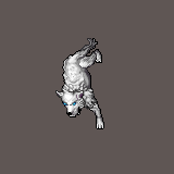
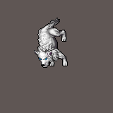
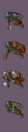
Animations are smooth and well planned. I just dont like the second animation of Wolf. Bite should be less of a walk-up and more of small jump-up, with few frames of preparation (think like arrow shoot anim: preparation, release, comeback).
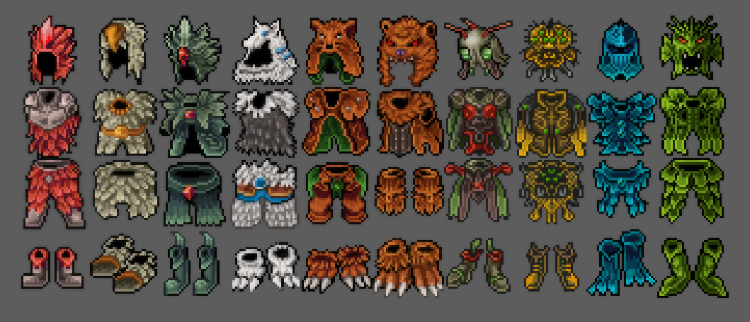
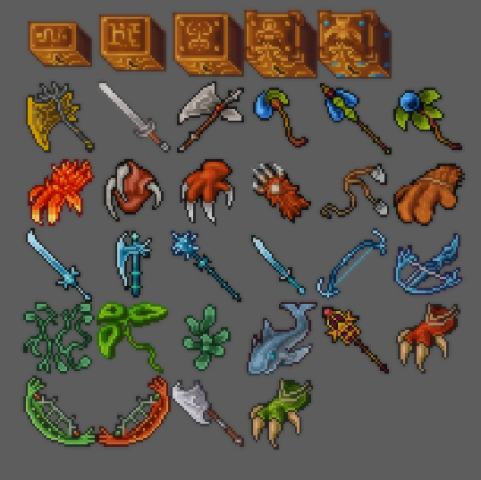
Good job on sets, I know how much of effort it takes, both designing and drawing. My fav are 1st and 3rd. You need to focus more on boots shapes next time
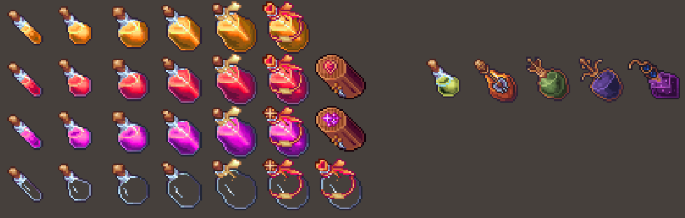
I'm in love with your potions. Color shifts emphasizes magic aspect of this drinks. I can't say anything wrong about them as objects separately, but as a whole hp/mana potions shouldn't be that close in colors. Make Hp more red, or mana more blueish
Good Job again, can't wait for your future works
xoxo

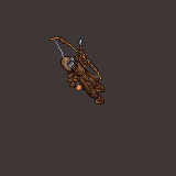
Thanks Kuzyn, appreciate your comment. The animated stuff is for a project called Frontiers of Fantasy. You won't find much info on it because it hasn't been released other than occasional pics that I post here.Thats sweet, awesome, pretty damn. Those sets are amazing, every piece follow the same theme, perfect. Animations are so smooth, for which project you've made them?
")
")
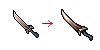
About the sets, you should take care with this "light-line-at-border" style.
It lacks AA on the edges and this leaves your sprites as swords and axes less sharp, and your curves without proper shapes due to aliasing.
Also it lacks global shading and contrast, so mostly the sprites looks flat.
Ex:
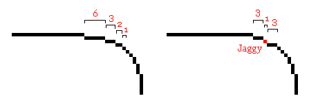
Take care also with this basic concept, the jaggy on the curves:
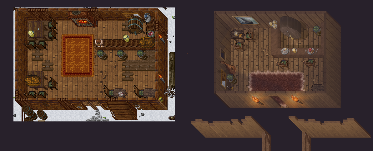
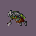
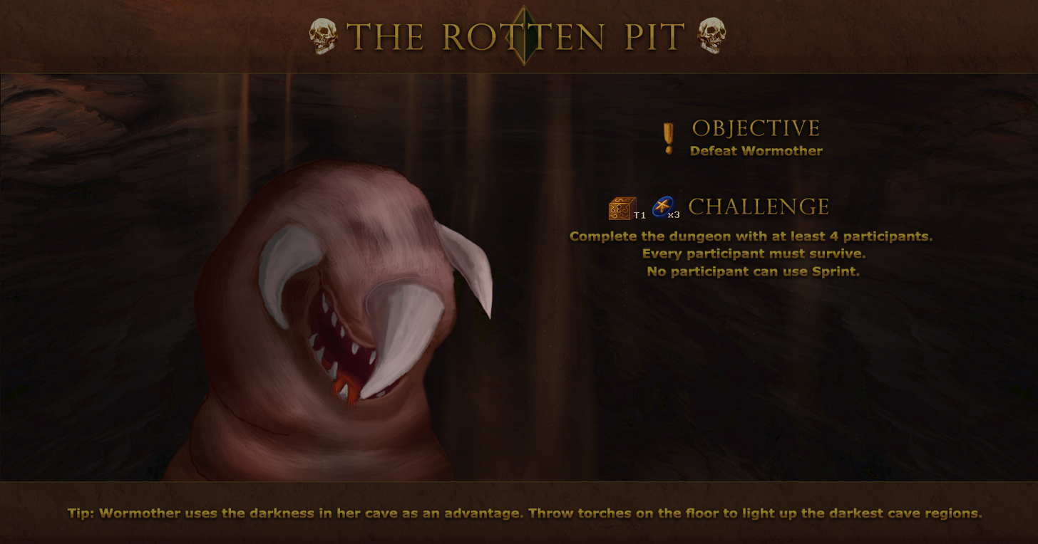
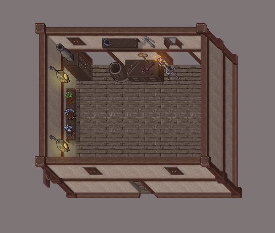
The house is good, reminds me Bloodstone, just take a look at the items on the surfaces that could appear a bit more using proper shadows/outline.
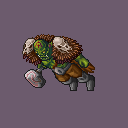
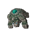
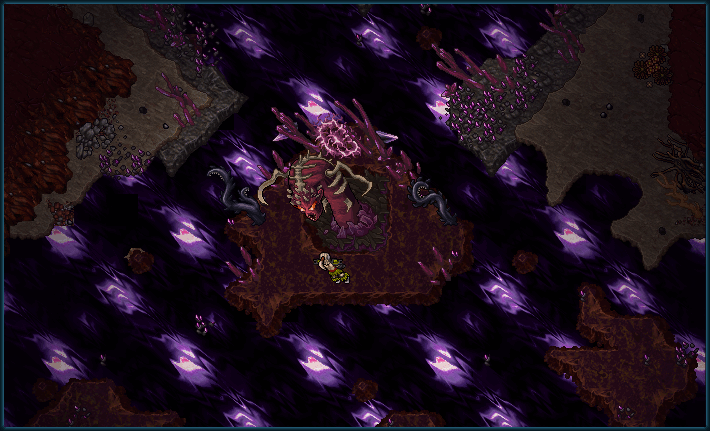
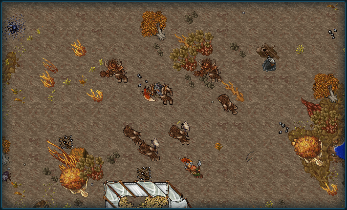
I'm a great fan of how you guys are putting effort on those animated creatures, it's awesome!
Just would give a bit more attention on the painting as pointed for the items
Happy new year!!
I must work on this train of thought.Welp, Shiva once again has lured me in to purchase more sprites. Keep up the absolutely savage work @Shadowsong and you got a lifetime customer from Archlight.
Will all this be implemented on Necronia? Or is it for any other OT?


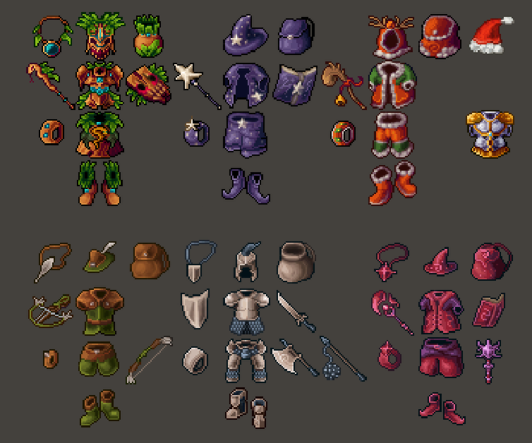
You need to improve the texture and contrast of the item, as the cloth texture among others. Beyond the contrast, try to give it light, metalic & golden objects have more contrast than cloth. Try to apply shadow and light with contrast. Besides that, it's good to try to smooth the lines inside the sprite. Try to do that with a cool shadow in your sprites. Try to enjoy AA, this means a lot to improve the sprite
use preservativo