You are using an out of date browser. It may not display this or other websites correctly.
You should upgrade or use an alternative browser.
You should upgrade or use an alternative browser.
Spriting like a boss. (Just a beginner haha)
- Thread starter Ranyo13
- Start date
1268995
Member
- Joined
- Sep 9, 2010
- Messages
- 422
- Reaction score
- 13
Updated:
- Flame Sword

Wich editor do u use? Noxitu? If yes, Noxitu work in 8.6 version?
hahaha that gap! People wearing these must have a hard time walkingSilver legs, Sucky though


OP
OP
Ranyo13
ManCausingMayhem
- Joined
- Aug 22, 2009
- Messages
- 981
- Reaction score
- 39
I use paint hahaWich editor do u use? Noxitu? If yes, Noxitu work in 8.6 version?
I hate those legs man, gonna change edit em for sure.hahaha that gap! People wearing these must have a hard time walking
Ye I liked the templar shield haha, tried to do the shadow and lighting and it turned out to be good.Templar shield looks very cool")
- Golden Sword: (Tried to make it light from the middle but kinda failed as usual)

1268995
Member
- Joined
- Sep 9, 2010
- Messages
- 422
- Reaction score
- 13
I use paint haha
I hate those legs man, gonna change edit em for sure.
Ye I liked the templar shield haha, tried to do the shadow and lighting and it turned out to be good.
- Golden Sword: (Tried to make it light from the middle but kinda failed as usual)
Ok, you are using painting to do your sprites. But you will put them where? in Noxitu Sprite Editor?
Saphron
Rare Pepe
- Joined
- Jul 7, 2010
- Messages
- 731
- Reaction score
- 1,311
Ok, you are using painting to do your sprites. But you will put them where? in Noxitu Sprite Editor?
Just because he is making sprites doesnt mean that he wants to put them in client o_0
OP
OP
Ranyo13
ManCausingMayhem
- Joined
- Aug 22, 2009
- Messages
- 981
- Reaction score
- 39
Any examples for how to "anti-aliasing" and maybe a plain noob sword and another one which seems like its glowing same shape and color to be good at the shadows and lighting parts ? Im not yet good at shadows and lights, they givin me a hard time to stand a part out and make it more visible than other parts.Alright, so since you are kinda familiar with how light works, you now have to understand and master technique of shading called "Anti aliasing"
Shadowsong
Game Developer & Graphic Designer
- Joined
- Feb 23, 2010
- Messages
- 3,446
- Solutions
- 21
- Reaction score
- 3,014
- Location
- Bosnia & Herzegovina
- YouTube
- ShivaShadowsong
Any examples for how to "anti-aliasing" and maybe a plain noob sword and another one which seems like its glowing same shape and color to be good at the shadows and lighting parts ? Im not yet good at shadows and lights, they givin me a hard time to stand a part out and make it more visible than other parts.
See if the tutorials here can help you understand some of those basic techniques, and don't stop working. 1 or 2 sprites a day will make for great progress in the longer run. In a few months you'll be able to sprite some great stuff, I can almost guarantee that!
OP
OP
Ranyo13
ManCausingMayhem
- Joined
- Aug 22, 2009
- Messages
- 981
- Reaction score
- 39
Read a whole tutorial and like studied it. But I still can't make my items look as realistic and curvy as the tutorial.See if the tutorials here can help you understand some of those basic techniques, and don't stop working. 1 or 2 sprites a day will make for great progress in the longer run. In a few months you'll be able to sprite some great stuff, I can almost guarantee that!
Will post a new sprite soon.
OP
OP
Ranyo13
ManCausingMayhem
- Joined
- Aug 22, 2009
- Messages
- 981
- Reaction score
- 39
True just realised the difference between handle and blade looks ugly xDYou need to keep the proportions right. So the handle will fit the blade
- GLASS BOW

Shadowsong
Game Developer & Graphic Designer
- Joined
- Feb 23, 2010
- Messages
- 3,446
- Solutions
- 21
- Reaction score
- 3,014
- Location
- Bosnia & Herzegovina
- YouTube
- ShivaShadowsong
Tried to copy Glass Battleaxe from skyrim.
Here's the original one:

Tibia:

Glass greatsword

(Epic fail xD)
Your images are either broken or my browser is :O
I can't see any pics, just
OP
OP
Ranyo13
ManCausingMayhem
- Joined
- Aug 22, 2009
- Messages
- 981
- Reaction score
- 39
I suppose your browser is bugged.Your images are either broken or my browser is :O
I can't see any pics, just
Seems like I can't do better than this shit, no more progress and maybe even worse and I'm getting pretty frustrated.

Shadowsong
Game Developer & Graphic Designer
- Joined
- Feb 23, 2010
- Messages
- 3,446
- Solutions
- 21
- Reaction score
- 3,014
- Location
- Bosnia & Herzegovina
- YouTube
- ShivaShadowsong
I suppose your browser is bugged.
Seems like I can't do better than this shit, no more progress and maybe even worse and I'm getting pretty frustrated.
You shaded the blade using a method called pillowshading which is wrong in most situations, especially for small sprites such as this. Axes tend to look great if a highlight color is outlining the inner border of their blade. Gives them that "sharp blade" feel. As for the texture, that can be done in a variety of ways, but pillowshading is certainly not an option.
Take a look:

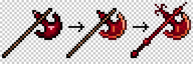
Pay attention to a few things:
On the second one, the way the I shaded the blade, especially the blade's edge. Notice that some of the outline is not black. Outline doesn't always have to be black, but it should be dark nevertheless. However, by giving it some hue and making it just a bit lighter, you can accomplish softening effects that help remove the crisp black pixels that make the sprite lines look jagged (read more on anti-aliasing).
On the third one, just by doing some very very minor pixel changes and additions, I was able to give the axe a more fearsome look.
I hope you can absorb some knowledge from this and use it in your next sprite.
If you want, here is a template of the 3rd axe so you can give it another shot and try practicing the technique above.

OP
OP
Ranyo13
ManCausingMayhem
- Joined
- Aug 22, 2009
- Messages
- 981
- Reaction score
- 39
You shaded the blade using a method called pillowshading which is wrong in most situations, especially for small sprites such as this. Axes tend to look great if a highlight color is outlining the inner border of their blade. Gives them that "sharp blade" feel. As for the texture, that can be done in a variety of ways, but pillowshading is certainly not an option.
Take a look:
Pay attention to a few things:
On the second one, the way the I shaded the blade, especially the blade's edge. Notice that some of the outline is not black. Outline doesn't always have to be black, but it should be dark nevertheless. However, by giving it some hue and making it just a bit lighter, you can accomplish softening effects that help remove the crisp black pixels that make the sprite lines look jagged (read more on anti-aliasing).
On the third one, just by doing some very very minor pixel changes and additions, I was able to give the axe a more fearsome look.
I hope you can absorb some knowledge from this and use it in your next sprite.
If you want, here is a template of the 3rd axe so you can give it another shot and try practicing the technique above.
Darandul:

Thoughts?
Shadowsong
Game Developer & Graphic Designer
- Joined
- Feb 23, 2010
- Messages
- 3,446
- Solutions
- 21
- Reaction score
- 3,014
- Location
- Bosnia & Herzegovina
- YouTube
- ShivaShadowsong
Darandul:
Thoughts?
The outline might be too light on the blade now, but it's definitely going in a better direction. Just compare that one to the red one you previously posted, and you'll see that it's much of an improvement. Now keep experimenting a bit with the thickness of the outline and light on the blade to get that perfect result.
Well done.
OP
OP
Ranyo13
ManCausingMayhem
- Joined
- Aug 22, 2009
- Messages
- 981
- Reaction score
- 39
Glad to hear that, any suggestions for my ugly legs?The outline might be too light on the blade now, but it's definitely going in a better direction. Just compare that one to the red one you previously posted, and you'll see that it's much of an improvement. Now keep experimenting a bit with the thickness of the outline and light on the blade to get that perfect result.
Well done.
- Emerald legs (turned into jungle legs lmao)

- Tweaked it a bit:

Gonna get to sleep, 9:45 am here haha
Practicing edges tomorrow thanks for the help appreciate it!
Jacobs
Webdev, mapper
Eh, if those legs are for gorgeous women with the purpose of camel-toe then yup. Well done.
Otherwise, just take a look at the already-made cipsoft legs dragon scale legs, etc. . You can see that those legs aren't so extremely slim like yours. I myself like the un-tweaked ones more.
Don't be afraid to make the legs wider, bigger. You've got enough place for that. With bigger legs you have more place to shade, put details and so on.