• There is NO official Otland's Discord server and NO official Otland's server list. The Otland's Staff does not manage any Discord server or server list. Moderators or administrator of any Discord server or server lists have NO connection to the Otland's Staff. Do not get scammed!

New TFS logo / icon

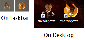
If you really want to get into it, think about it, the logo is 32x32, and the text takes up (width-wise) about 30% of that, let's be generous and say that's 11 pixels. You can't comfortably fit 3 letters with an outline in 11 pixels and make them readable. Even photoshop limits smallest font size to 6px per character, and that's without letter spacing accounted for. After all that, you have to pass it through the filter of different screen resolutions, icon size settings and pixel densities people may use on their devices, and you get a wide array of situations where it's not okay.

The point is, the text doesn't have to be present in order for the icon to represent what you want it to represent. People will associate the otland squirrel and the nut with TFS, they don't need the characters 'TFS' to make that connection, the executable's name is right there next to the icon most of the time anyway, and anyone else who is not acquainted with TFS who looks at it wouldn't know what 'TFS' is anyway.

I totally agree with you.
What I'm just saying is that on my monitor seems readable enough.

If you see the previous posts, you will notice that I was defending the idea of NOT to use the TFS letters, but I made with because some wanted it, so I try it.

Well, when I back home, I will make an test without the TFS and edit the post there.
I know, but as designer, it's better not to make general assumptions based on subjective experience (i.e. 'it looks good to me'), cuz if you're aware that it's already edging on uncomfortable territory, it's better to take into account the possibility that it might not feel the same for other users who aren't using the same device/settings, or simply have worse eyesight. At least that's kinda how I would approach a public release, I think it's not bad advice.
 
I know, but as designer, it's better not to make general assumptions based on subjective experience (i.e. 'it looks good to me'), cuz if you're aware that it's already edging on uncomfortable territory, it's better to take into account the possibility that it might not feel the same for other users who aren't using the same device/settings, or simply have worse eyesight. At least that's kinda how I would approach a public release, I think it's not bad advice.

Well, I'm not a designer as you. I'm a developer. xd

I tried to make one cool for my monitor because it's the one that I use. xd
But now you said that, I remembered that I have another small monitor. I will take a look there how it looks like when I get home, then I tell you what it's my opinion of it on a small monitor. The maximum resolution there is 1360x768.

I'm at the hospital, can't talk ATM. Ciao!
 
Last edited:
I feel like the recently posted designs are getting too complex. Honestly, I liked the simple squirrel designs from the first page more.

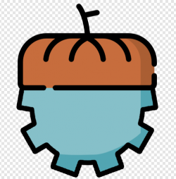
I have no idea what I'm doing and my design skills suck but I tried using some free icons to prototype something simple that would be related to nut and servers/tech and came up with this monstrosity:

1612801118376.png

Disclaimer: this is only a quick mockup created by merging two free icons (nut & cog) that require attribution to be used. I'm posting this only because it may inspire someone to do something better in similar theme.
 
I feel like the recently posted designs are getting too complex. Honestly, I liked the simple squirrel designs from the first page more.

I have no idea what I'm doing and my design skills suck but I tried using some free icons to prototype something simple that would be related to nut and servers/tech and came up with this monstrosity:

View attachment 54705

Disclaimer: this is only a quick mockup created by merging two free icons (nut & cog) that require attribution to be used. I'm posting this only because it may inspire someone to do something better in similar theme.

It is not complex. It's just that I'm trying to make changes about what people are suggesting. For example, I'll try to remove the TFS text now. It will make it much clean.

If people like your idea, they will suggest changes as they are already doing on mine.
 
Guys its a ICON
whats the point of the discussion at all haha
 
Yea well no question
but its useless a start a xxl discussion about a Icon if you ask me haha
 
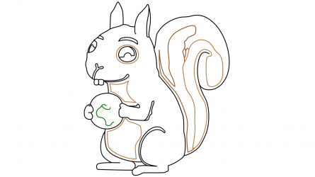
Hi again, I really want to contribute but these days I am overworked, however, I took the time to start the fury cleanup. In the first instance, I want to clean the line of the little friend so that you can use it in the resolution that you want (including highlights, shadows, and gradients).

White background
final-0001.png
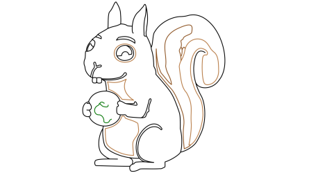
Transparent background (PNG4)
final-0001_2.png


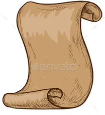
I can only move up here for now, I have to get back to work. But I promise to finish it. After finishing the cleaning, painting, and the rest, it will be easy to implement objects or decorations, The first idea that came to mind is making him hold a parchment, but if you want something different, do not hesitate to comment. This is a parchment example that fits well (I can put his hands inside the space that bends):

parchment.png

Regards!
 
I know, but as designer, it's better not to make general assumptions based on subjective experience (i.e. 'it looks good to me'), cuz if you're aware that it's already edging on uncomfortable territory, it's better to take into account the possibility that it might not feel the same for other users who aren't using the same device/settings, or simply have worse eyesight. At least that's kinda how I would approach a public release, I think it's not bad advice.

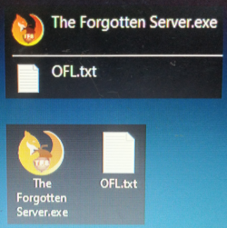
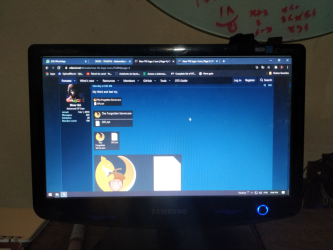
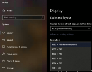
Well... I just tested in a small monitor and looks readable still to me. xd
The monitor has a resolution 1360x768 pixels and 15.6".

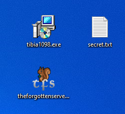
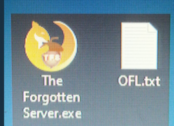
Look:

1612833006495.png

1612833079840.png

1612832601859.png


I think I will prepare a poll for some options I thought (with logo, without logo, with green background, without green background, ...).
xd
 
Apparently everyone wants the squirrel without more, they should implement the otland squirrel to identify the TFS engine
Anyway I use my own custom icon in my project, so it doesn't affect me

Support the squirrel!
1612889560992.png ;)
 
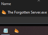
Wouldn't taskbar be the head icon he said?

View attachment 54790

It's because Xikini and BahamutxD prefer the icon of hemresnus321. So they are trying any argument they can, ignoring what I said already.

I showed already that the tiny icon changes, so it keeps readable on the others.

If people approve mine, I will make a poll for they choose minor changes like that.
 
Back
Top