oserc
Advanced OT User
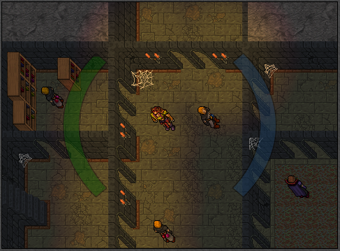
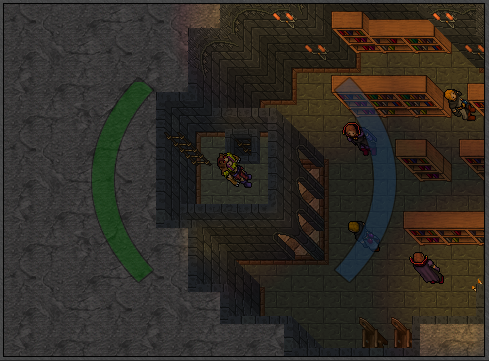
It all comes to mapping style, but in my opinion, your borders are a little rudimentary, specially the grass/dirt ones. It seems "pointy" and squared. Also, the visual transition from the grass border to the stone ground doesn't fit. A lot of mappers do that, but I think it's bad taste. Try smoothing this transition using the other grass borders under the ones you're using, like this:Would love some feedback here. WIP obviously.
View attachment 72857

Plus, the stones are very randomly placed. Try reorganizing them in a more natural way
Post automatically merged:
Would love some feedback here. WIP obviously.
View attachment 72857
One more advice, bro, regarding the columns inside the depot. Try this, feels more organic to me (Item ID 7143):


")