• There is NO official Otland's Discord server and NO official Otland's server list. The Otland's Staff does not manage any Discord server or server list. Moderators or administrator of any Discord server or server lists have NO connection to the Otland's Staff. Do not get scammed!

Eddanbiff's Mapping Thread

eddanboy

CDev.
Joined
Apr 15, 2012
Messages
47
Reaction score
8
Location
Sweden
Rather new to mapping, and working on a RPG map for me and a couple of friends, but I want to impress them with my map.
Any help/tips is appreciated! Do NOT hesitate to clamp down on me, I want to be good, I can take some critizism!
Also, I edited my post, some comments may be from my older pictures.

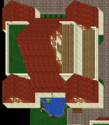
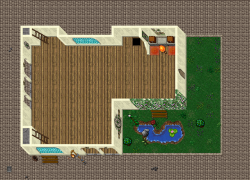
#1 - Temple
1.png
1.png
Would need a lot of tips of how to decorate this, and how to utilize it.

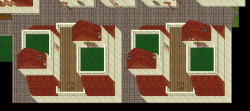
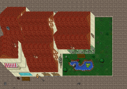
#2 - Temple (Whole)
2.png

2.png

How do I provide the roofing with a better "flow"?

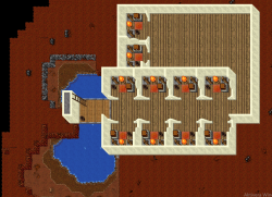
#3 - Under depot, bank (adding soon) and TM's
3.png

3.png
 
Last edited:
#4 - First Guildhall, will be granted to Rated Battleground team every season as a reward.
4.png

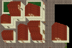
#5 - Am I way off with housing? This is an apartment complex, at University Lane.
5.png

#6 - Some houses in the city, with space between them for quick travels, and potentially traps.
6.png

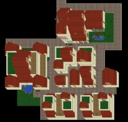
#7 - My progression with the map so far.
7.jpg

As per usual, any tips on how to improve and which mindset I should use is appreciated! Thank you for your time. :)
 
Last edited:
Feels like tibia 7.60 to me and why do you place trainers behind a depot? It is not like they will bite the player.
 
its so square. also the brick walls meeting up to the stone walls just dont seem right. Also, I would recommend using normal grass sprites. I would work on trying to not make things so squary and work with the nature some more
 
its a good start you should add more details around the temple
 
White walls and this roofs might not fit to each other very well. You could also make the streets brighter, so you can add details, such as trees, plant alleys, benches and so on.. i also dont rly like your arcitectur. The houses look somehow “dry“. Check our 2recs thread, hei has got some good houses.
 
White walls and this roofs might not fit to each other very well. You could also make the streets brighter, so you can add details, such as trees, plant alleys, benches and so on.. i also dont rly like your arcitectur. The houses look somehow “dry“. Check our 2recs thread, hei has got some good houses.

Brighter? Should be pretty bright since I use white walls? Or do you mean tiles for the streets? If you meant wider, yes, I have considered that.
Thanks for the tips, he's an awesome mapper, will definitely collect inspiration from him regarding the houses. Thank you for your time! :)
 
Good work , try to decorate the temple more its not interesting at all and try to use normal grass as Jfyre told you , you should make the stonetiles less more grass more statues and some misc and good luck , you are going good as a beginner for :D
 
Good work , try to decorate the temple more its not interesting at all and try to use normal grass as Jfyre told you , you should make the stonetiles less more grass more statues and some misc and good luck , you are going good as a beginner for :D

Yes sir, just worked for the ground look, I am currently decorating everything. :)
 
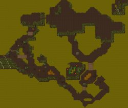
#9 - Tried to make it look like a slope, did I succeed? Not completely finished, would like some feedback regarding the idea!
f6b0c562e62546c55777916a51099046.jpg
 
#9 - Tried to make it look like a slope, did I succeed? Not completely finished, would like some feedback regarding the idea!
View attachment 34034
Idk if I completely agree with the color scheme, the brown to green clash a little too much imo.
Also you're still stuck on the straight lines a little too much, but I get what you're going for and I think it can work well if you give it some more natural curvature.
Keep it up bro.
 
Idk if I completely agree with the color scheme, the brown to green clash a little too much imo.
Also you're still stuck on the straight lines a little too much, but I get what you're going for and I think it can work well if you give it some more natural curvature.
Keep it up bro.

Agree with the coloring looking a bit off, I just wanted to try the concept, did everything by RAW for the first time, so mountains was kind of a pain to not get linear.. Appreaciate the feedback dude!
 
Back
Top