You are using an out of date browser. It may not display this or other websites correctly.
You should upgrade or use an alternative browser.
You should upgrade or use an alternative browser.
Noxz's Thread
- Thread starter Noxz
- Start date
Shadowsong
Game Developer & Graphic Designer
- Joined
- Feb 23, 2010
- Messages
- 3,446
- Solutions
- 21
- Reaction score
- 3,014
- Location
- Bosnia & Herzegovina
- YouTube
- ShivaShadowsong
Bump.
Here I am with some new stuff.
This is the axe I made for the contest

And this is a sword I made while beeing bored.
(which version u like the most?
#1

#2

#3

and my first backpack

The backpack looks pretty cool (tho the handle needs to be changed just a bit, dat shading on the edge), and I like #3 sword the most
 Also I don't think you're supposed to show the axe to anyone until the contest ends.
Bump.
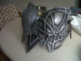
Here a brand new breastplate for LADIES.
This time step by step.
#1 outline.

#2 decide for colors + shading

#3 add some shadows.

#4 searching for details

#4.1 found a nice solution for details

#4.2 adding more details [cross]

#5 edit the outline for a better shape (imo)

I know it's pretty simple and colorless.
Could need some help with it.
I am clueless what to add.
Suggestions/Feedback needed.
If you cant imagine what this armor should look like here is my model:
Cheers Noxiz
Here a brand new breastplate for LADIES.
This time step by step.
#1 outline.
#2 decide for colors + shading
#3 add some shadows.
#4 searching for details
#4.1 found a nice solution for details
#4.2 adding more details [cross]
#5 edit the outline for a better shape (imo)
I know it's pretty simple and colorless.
Could need some help with it.
I am clueless what to add.
Suggestions/Feedback needed.
If you cant imagine what this armor should look like here is my model:
Cheers Noxiz
Shadowsong
Game Developer & Graphic Designer
- Joined
- Feb 23, 2010
- Messages
- 3,446
- Solutions
- 21
- Reaction score
- 3,014
- Location
- Bosnia & Herzegovina
- YouTube
- ShivaShadowsong
I find it nice that you added step by step previews 
I already commented on it so you know what I think, my suggestion is to add the lines like on your reference picture, at least over the parts that are below breasts.
I already commented on it so you know what I think, my suggestion is to add the lines like on your reference picture, at least over the parts that are below breasts.
Shadowsong
Game Developer & Graphic Designer
- Joined
- Feb 23, 2010
- Messages
- 3,446
- Solutions
- 21
- Reaction score
- 3,014
- Location
- Bosnia & Herzegovina
- YouTube
- ShivaShadowsong
I love how it recaps all of your work and OT dev abilities XD
bump.
a new sword.

contest armor

I've started to work on a Rod already but its for the contest so you will see it next week")
And heres a row of pictures how i drew my tree.

shape.

adding green spots to it + shading the trunk.

adding leave details.


highlighting the leaves.

using burn tool to make it look "deeper".
Cheers Noxiz :3
a new sword.
contest armor
I've started to work on a Rod already but its for the contest so you will see it next week
And heres a row of pictures how i drew my tree.
shape.
adding green spots to it + shading the trunk.
adding leave details.
highlighting the leaves.
using burn tool to make it look "deeper".
Cheers Noxiz :3
Bump.
I'm sad of so low feedback at this forum i wish more guys would be interested in this.
whatever here my first monster i started with :3
#1 lineout.

#2 redoing the head.

#3 adding some color (yep it sucks but its my first try)

#4 editing the right side (im still unhappy with it)

#5 next try you think it's better now? :3

#6 adding some details

well as you can see it still needs alot of work and
i need to learn how to do muscles the right way
I hope i'll get some comments this time :3
I'm sad of so low feedback at this forum
i wish more guys would be interested in this.whatever here my first monster i started with :3
#1 lineout.
#2 redoing the head.
#3 adding some color (yep it sucks but its my first try)
#4 editing the right side (im still unhappy with it)
#5 next try you think it's better now? :3
#6 adding some details
well as you can see it still needs alot of work and
i need to learn how to do muscles the right way
I hope i'll get some comments this time :3
Last edited:
I think you didn't get how tibia perspective works yet. The best part of monster is overall shape (and boxer shorts =]). Although, face and abs been drawn wrong. Eyes shouldn't be diagonal, but at same level - horizontally.
Colors - Imo too bright.
Colors - Imo too bright.
Shadowsong
Game Developer & Graphic Designer
- Joined
- Feb 23, 2010
- Messages
- 3,446
- Solutions
- 21
- Reaction score
- 3,014
- Location
- Bosnia & Herzegovina
- YouTube
- ShivaShadowsong
Well, what Anevis said, it's out of perspective on these 2 things, the shoulder, and the eyes. Eyes should be horizontal and the left shoulder (our left) should be barely visible, this way its popping out in front of him and going over his head. And yes, the colors are too bright, there's too much highlight, try toning it down a bit, especially on the muscles.
++++++1 for the boxers, had a top lel
++++++1 for the boxers, had a top lel

bumperz. I hope u like it. I think i learned many many things about the perspective in tibia
.Please give me some suggestions.
It's just the "naked" version i plan to add some details and clothes (different types just as warrior, mage, archer). We'll see
Rate it please!
well it is a darker bluei'm just a noob in what sprites are, but i believe maybe the black lines that draw the abs shouldn't be black, maybe a darker blue, just an opinion. Keep going you are good man