• There is NO official Otland's Discord server and NO official Otland's server list. The Otland's Staff does not manage any Discord server or server list. Moderators or administrator of any Discord server or server lists have NO connection to the Otland's Staff. Do not get scammed!

[OtLand Official Mapping Competition] [S2] - September Voting Thread

Which of the submissions do you think is the best?

  • Submission #1

  • Submission #2

  • Submission #3

  • Submission #4

  • Submission #5

  • Submission #6

  • Submission #7


Results are only viewable after voting.

GhostX

Mapping Board Moderator
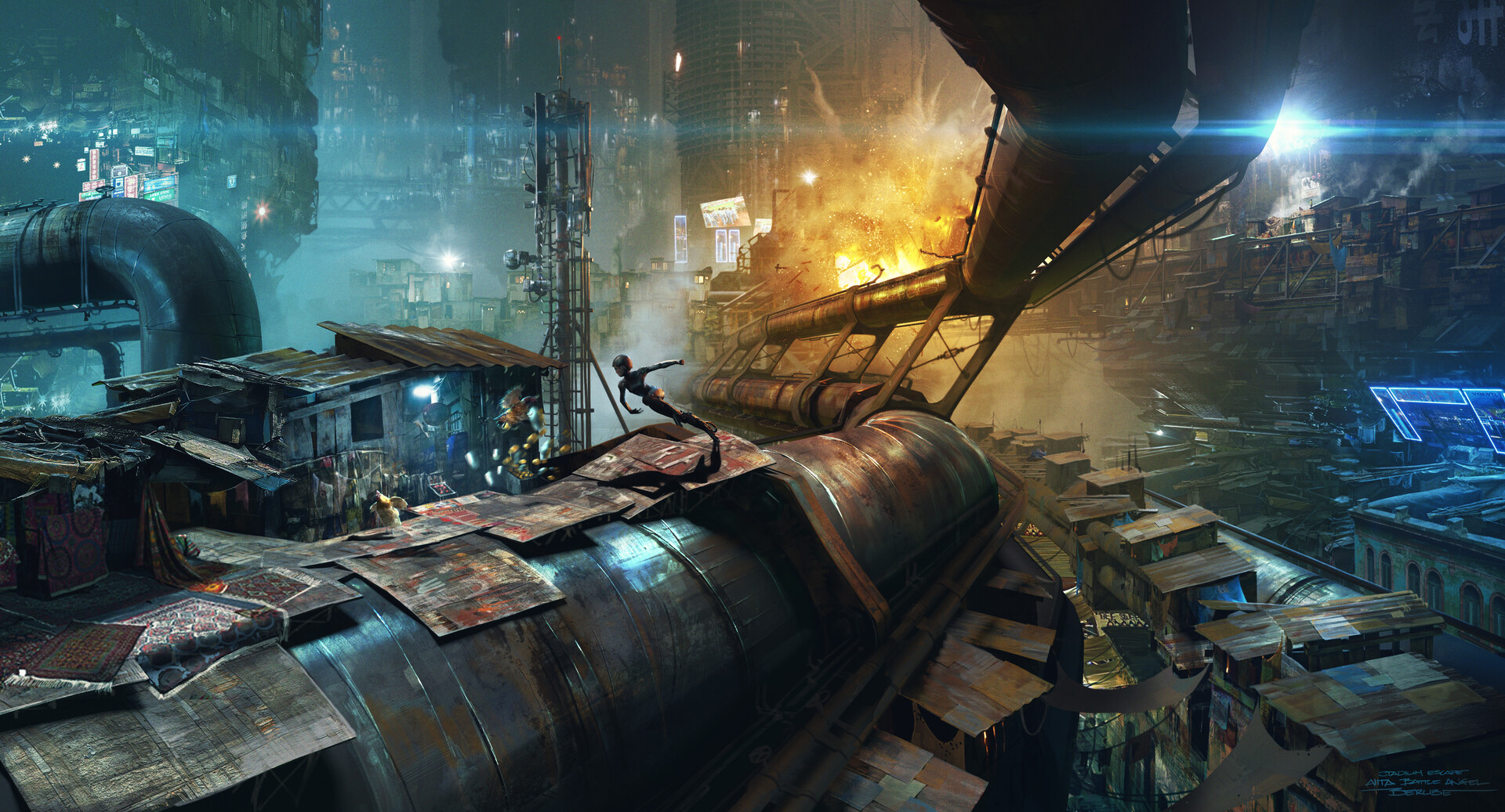
Staff member
Board Moderator
Joined
Nov 2, 2011
Messages
6,049
Reaction score
1,802
Location
UK
Twitch
ghostxpr0
new map banner (1).png
Welcome back to a new season of the official OTland Mapping Competitions.

VOTING STAGE: September - "Cyberpunk"

The entrants shall remain anonymous until the voting stage has concluded.


Remember: The prize for the winner of the competition will receive 3-months free premium on OtLand.

It is worth noting that there is now a league system that is tracking the points of the top 3 from each competition. At the end of a "season", the winner will receive an additional prize! Stay tuned. More details and current standings as well as a more detailed account of the rules can be found here: Hall of Fame | Rules | F.A.Qs
Rules:
  • You MUST NOT vote for yourself
  • You MUST NOT entice others to vote for your entry
  • You MUST only vote once. Anyone found using multiple accounts to vote will have all of their votes discounted. If an entrant decides to violate this rule, they will be banned indefinitely from the competitions and have their entry disqualified.
  • You MUST NOT inform, hint or otherwise let any other members know which entry is yours (until the winner is revealed obviously)
  • You MUST NOT insult or "flame" anyone, their maps or their comments
  • Please vote for the entry that best suits the theme of the competition (in this case; the theme is ("Cyberpunk")
  • If you know who mapped what just by style, do not post saying who it is. You will receive an infraction for doing so.
  • If you wish to change your vote, please comment below and this will be accounted for once the voting stage has concluded. You should now be able to change your vote yourself

Disqualifications:

Vote Changes: I've allowed it so you can change your vote yourself now
However, you cannot see the results until you vote, alleviating some bias initially, i.e. If you wanted to sit on the fence and try to balance the votes.

PLEASE NOTE DUE TO THE LARGE SIZES OF SOME OF THESE IMAGES, YOU MAY NEED TO CLICK THEM TO GET A FULL DETAILED VIEW


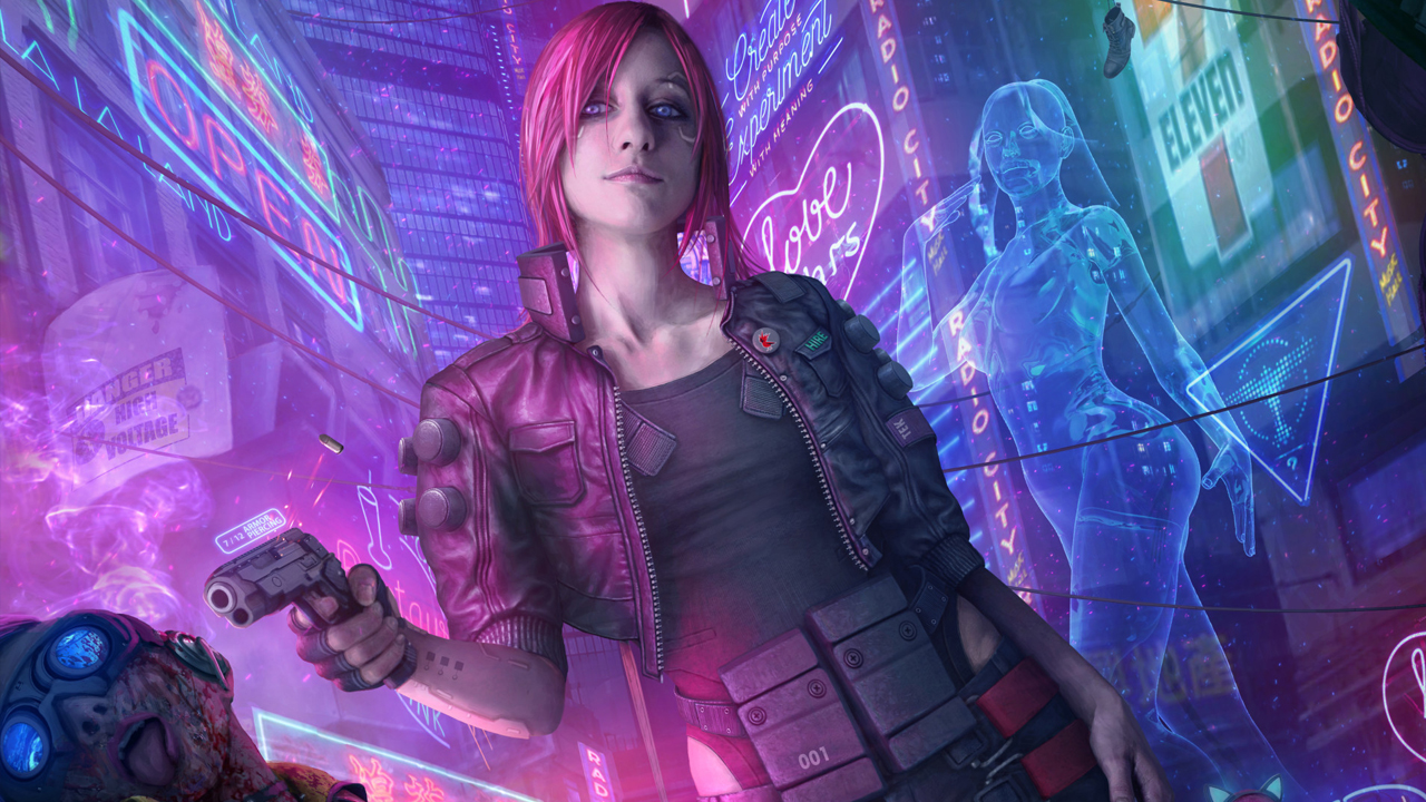
Submission [1.] 2nd Place - Mapped by @Berciq
LEFT.pngRight.png

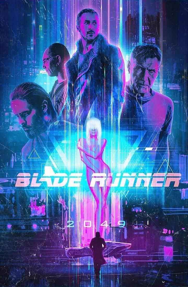
Submission [2.] 3rd Place - Mapped by @scheisse
cyberpunk-city-vers2.png

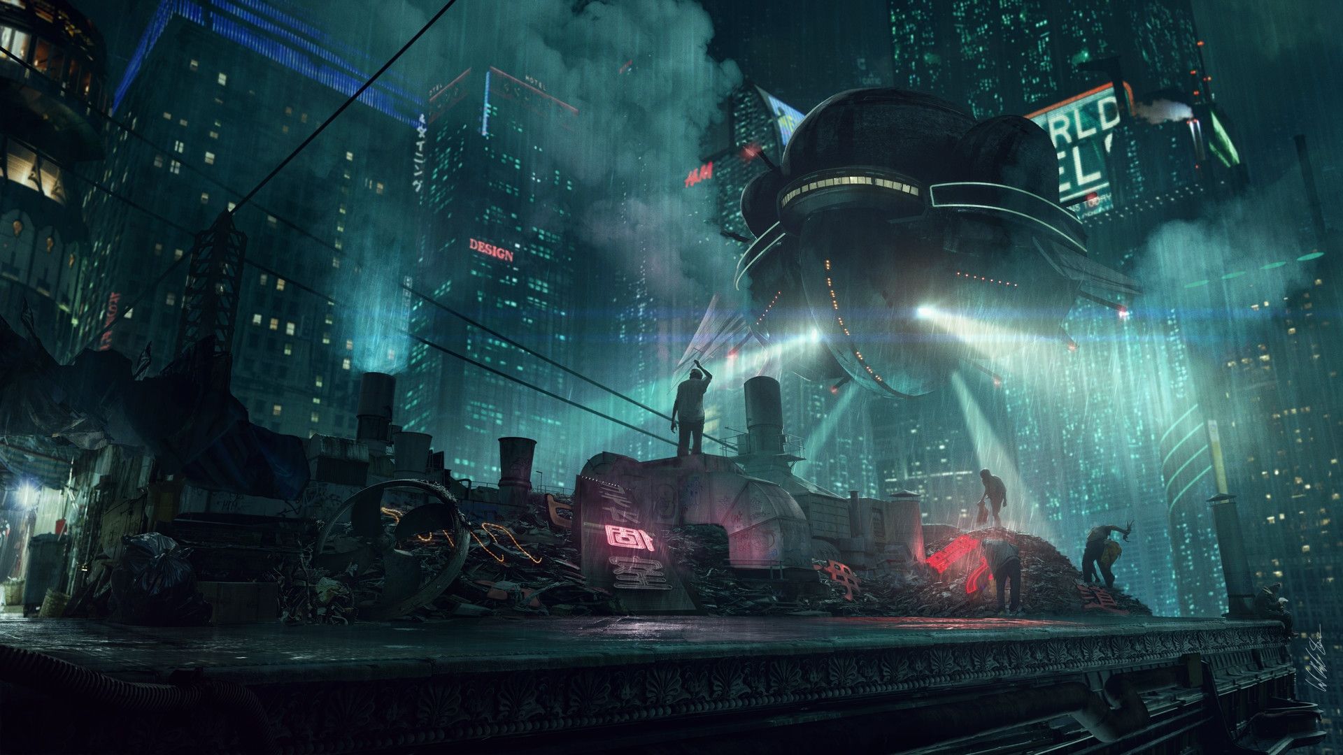
Submission [3.] 1st Place - Mapped by @Cwiras
2aNcyi1.png

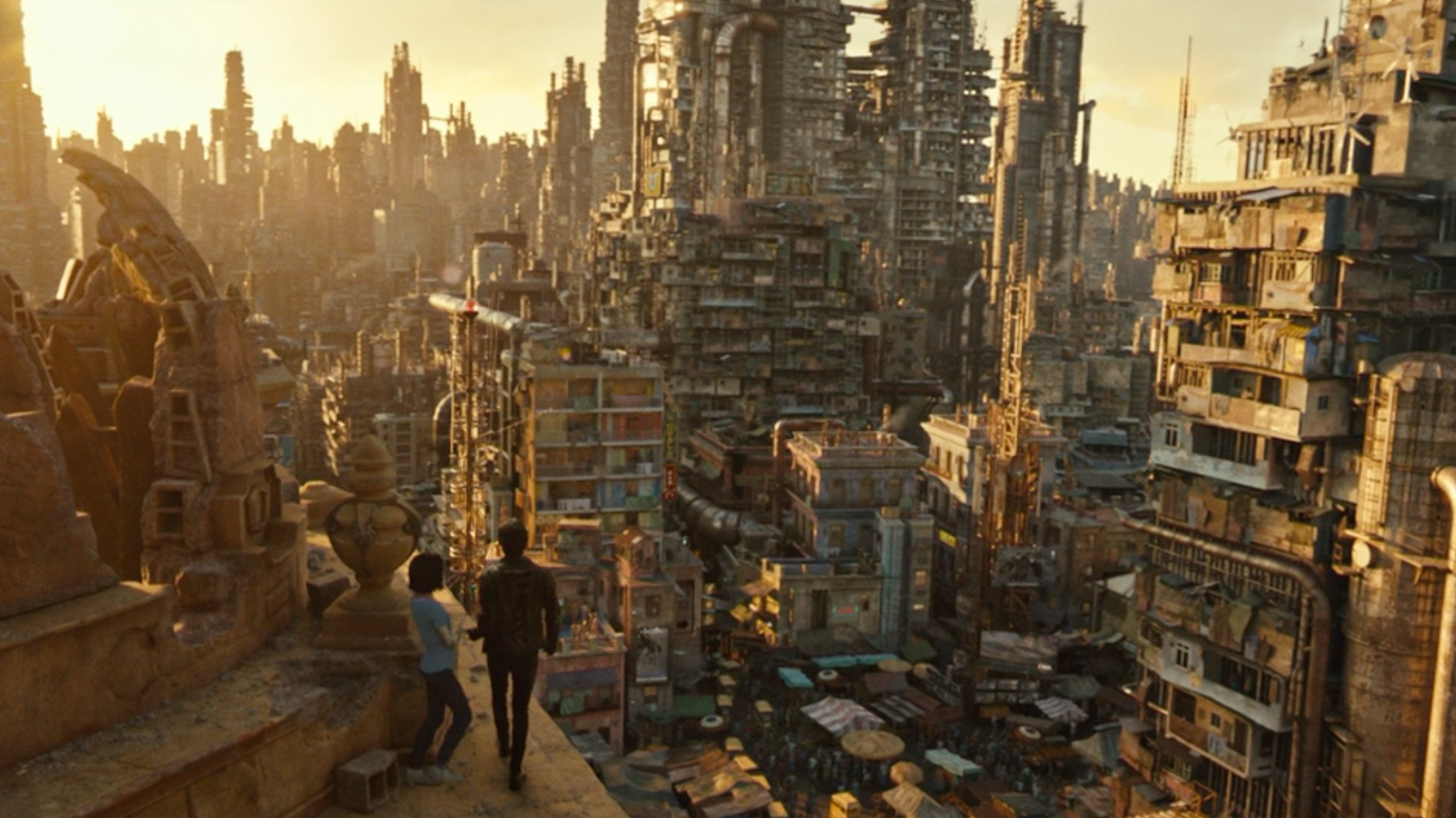
Submission [4.] Mapped by @Gilgamach
Cyberpunk Theme.png

Submission [5.] Mapped by @royalpala


092020_mapping_contest.png

Submission [6.] Mapped by @Hover Design
5wh4lyC.png

Submission [7.] Mapped by @xbaconghostx
halloweencyberpunk.png

Some nice entries, especially considering this is a creatively demanding theme. Good luck and happy voting :)
 
Last edited:
Honestly, if the theme was a steampunk I would vote for 2. But for cyberpunk 4 is my choice.
 
Honestly, if the theme was a steampunk I would vote for 2. But for cyberpunk 4 is my choice.
I have to agree with you that entry #2 was a really good execution of a steampunk themed competition. Sadly, this was a cyperpunk themed competition so I will have to vote for another entry. I do have to disagree with you regarding entry #4 though. I feel like having huge ass steam-driven, old designed trains, is not really fitting to the cyberpunk theme (since it's not futuristic in regards to modern era at all).
Overall, I think that each and every entry is creative in their own way, and kudos to everyone that entered this competition since it's a really hard one to pull off.
 
As I thought, it's almost impossible to make something looking cool in this theme.

1. At first I was not convinced of this map because of the overall quality, but I think this is the best image of cyberpunk city.
2. Very good piece, it looks like skyscrapers are coming out but it lacks of some cyber/neon things.
3. It catches the theme quite well.
4. Would be really cool (imo it is) but aims more at steampunk.
5. A little bit messy, reminds me of Yalahar districts.
6. To little on the screen.
7. I don't feel cyberpunk here :(

I would like to vote on 1&3 but finally my vote goes to 1.
 
I dont really agree with the idea of making destinction between cyber and steampunk based on the absence/presence of “neon things“.
 
I dont really agree with the idea of making destinction between cyber and steampunk based on the absence/presence of “neon things“.
Those 2 things are so far apart, it's like when I tell you to draw an apple, but you draw a pear. And then you try to come with "oh come on, it's almost the same thing".
 
I dont really agree with the idea of making destinction between cyber and steampunk based on the absence/presence of “neon things“.
the color palette afects the perception of the enviroment:
  • steampunk is rust metal and ornamented such in as retro or vintage enviroment
  • cyberpunk is shiny metal, energy based ornaments, blue,gray, black pallette, tendency to minimalism most of the times

cyberpunk palette / steampunk pallette

ef559adb2a37a0cd6df0295a8e03c1f9.png
9406.png


also, you cant have "Neon things" on steampunk, in cyberpunk you can have a small percentage of rust & old things
just my opinion
 
Those 2 things are so far apart, it's like when I tell you to draw an apple, but you draw a pear. And then you try to come with "oh come on, it's almost the same thing".

there is absolutely no argument in what you said. you just repeat your previous message and try to argue for its rightness with a comparison. Its true, that apples and pears are different from each other, but where is the connection between apple/pear and cyber/steampunk? You might use this metaphor to explain your point, but it cant serve as a proof, since both are unrelated to each other.

what royalpala says, makes more sense. But even here is just his own perception of things. Just look at the typical cyberpunk/futuristic themes, such as coruscant (higher levels), bespin (both are star wars planets) and the new blade runner movie. In both you see skyscrapers, skies/fog, no neon things (on the higher levels) and the colorpalette is not nearly as bright (pink and such) as you have portraited. I think talking about stream/cyberpunk is mostly a matter of definition and opinion.

Maybe next time we add a theme, whose diffenition is not so highly contested or we say right from the beginning what elements should be included in the picture and define the colorpallette and so on...
 
i would say that cyberpunk it's a prior step to futuristic style which seems neat and also useas a more gray, gold & white pallette , star wars cities look so advanced IMO to be cyberpunk, for me cyberpunk is more like Elysium, Chappie, Alita Battle angel, the color pallette doesnt need to be mandatory blue-ish neon, but I think it's kind of an Icon of what represents the Urban enviroment of a Cyberpunk city, also I agree on the fog, skyscrapper urban enviroment such as in Altered Carbon just as an example.

On what i do not agree is on steampunk and cyberpunk to be a matter of opinion, each style has it's own elements that define the "character", they can have some degree of variation (talking about the color pallette, ornaments, etc.) but theres a limit for which elements you can include/ exclude from the environment. Steampunk is kind of "Industrial Revolution" Style as in mechanical, while cyberpunk is more like "Technological Revolution" as in electronics

Cyberpunk-2077-foto-1.jpg
ae0c1c180a4bde92bcec6fe2401ca408.jpg
Altered-Carbon-Wallpapers-Wallpaper-Cave.jpg
final-film-stills-alita-battle-angel_dezeen_2364_col_6.jpg
jonathan-berube-jonathan-berube-art-director-alita-battle-angel-concept-street-scene.jpg
 
This is a difficult topic to make maps taking into account the limitation of doing something only with Sprites from Global. For me the difference between Cyberpunk and Steampunk is that the first I think are "normal" buildings and houses with lights, banners, cars and other aspects that refer to futurism. The second, on the other hand, I see as something of rough metal with a gray palette and a lot or practically everything of pieces of metal.
 
It makes sense that comes to be kinda hard to Tibia mappers/players to create a cyberpunk theme map since the game is based more on a medieval topic. I know theres sprites enough to create an cyberpunk theme map but it will hardly be decent, or pleasent for the sight and STILL, theres some beautiful and funny map pieces over here! Your imagination is insane, guys!

I dunno why or where did it came the discussion about the differences between steampunk and cyberpunk, but I'm totally agree with Royalpala. Even when the color patterns could play an important role they aren't strict attached to any, it's the concept what matter and differences them. We can get a few quick examples from the movie Blade Runne 2049: the edible insects farms, Las Vegas as an abbandoned city consumed by the desert or the factory in the scrapyard. None of these scenes have neon or electric colors and still they take a part as a cyberpunk theme.

Now, going back to the thread I'll mention some things that I liked from some entries.

Let start, the 1st entry:
The only one that played with night time and illuminations, which are the most common things on a cyberpunk enviroment. You did it really well. Liked the 2nd screenshot with that green building and also the signs you put in the one next to it. Pretty cool how you also put the smoke/fog coming out from the sewer, which can never lack on a futuristic scene. Thumbs up!

The 3rd entry:
The must funny one! Incredible concept on how you played with some things that most of other entries didn't include, the most remarkable from my point of view is the Vampire Boss, which really looks like some futuristic fashion that can only be afford by a rich/important person which of course, has to be followed by it's servants and its android bodyguard! Also the line to enter, what I want to believe could be a nightclub? made me smile, even with a doorman! and the stores next to it managed by non-human species, cool! That big H on the rooftop, pretty important since the most quickest transport is by air.

The 2nd entry:
As mapping piece, it's the one I liked the most. You totally captured the essence of a elevated city with high buildings consumed by the fog/smoke, even with an air highway which could be used by magnetic transport maybe? I really find amazing everything on it because you take care of every detail. The most I look it, the most things I discover everytime.

If I could just fusion the map from the 2nd entry, with the light illumination from the 1st entry and also put the NPCs and scripts from the 3rd entry, would make the perfect cyberpunk theme piece that could ever be made with Tibia sprites. Congratulations to every one of you guys and thanks for sharing your amazing work. Keep going and good luck.

At the end of the contest will we know from who's each entry? Or it will still remain hided?
 
In 2nd one I like how towers sink in clouds, read that Venus atmosphere is so dense that we could build flying building just by filling them with our air. anyway this looks like steampunked cities of the future... sth close to maybe disney adaptation of john carter on mars?^^

I like in 3rd one that you shouldn't change line on the street close to zebras and helicopter landing! ofc sewers on the street are placed exactly like in real life - under the wheel! nothing has changed in future. I like also how sewer was overfilled and ughhh! and this tentacle guy selling stuff =D
I really like all this detailed ideas you've put, they are really creative :)

in 4th imo there is nothing more steampunk than steam engine train, anyway this train zoomed out looks awesome! but not for this theme :(

in 5th I see how waste is just poured outside the city, on the desert land but overall autobordered interior of the city, this crates and barrels not mixed, building got 3 floors and are placed originally but because of ground you cannot see which level you are looking at :( this electric fence is nice idea, but i'm afraid it is mor about post apocalyptic theme

in 6th and 7th there is lack of details, and this which are are cut off by walls and so. I wouldn't feel climate of cyberpunk if you didn't tell me :(

I have to vote for one of (in my opinion) just 2 cyberpunk works :( hoped to see more cyberpunk ideas
 
The map that best fit the cyberpunk theme, without a doubt, was map 1.
I felt like this participant had tried less and achieved more. It brought me Tokyo Vibes. haha

The combination of colors in a darker theme; the choice of walls (this crystal wall gave an extra feeling), the use of hangables, lighting details in general and mainly: the functionality of the structures in the "client view" is what makes the map better, in my opinion of course.

I didn't like the wooden border on the streets (map 1), but it's still great, congratulations.

Congratulations to the other participants, it is very good to see maps of different styles looking for a common theme. Good topic!
 
So for some reason, the timer didn't go on the poll correctly. Therefore the competition has thus finished and these are the final results.
September Comeptition.PNG

I'll update the participants asap. Congratulations to @Cwiras for winning this months competition!

New competition will be up on the weekend :)

Good job to all those who entered.
 
Back
Top