You are using an out of date browser. It may not display this or other websites correctly.
You should upgrade or use an alternative browser.
You should upgrade or use an alternative browser.
The white city
- Thread starter scheisse
- Start date

GhostX
Mapping Board Moderator
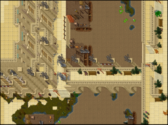
this looks so pleasing on the eye.. Maybe change the grey gravel for the sandstone version, but the mini mooring section and the brown river with the venore walls just compliments eachother so wellHere is a little update on what i have made few days ago.
click on the pics for better quality.
View attachment 50591
View attachment 50589
") . I even like the blue water border in this environment and I dislike that sprite normally.
. I even like the blue water border in this environment and I dislike that sprite normally.
OP
OP
scheisse
Excellent OT User
- Joined
- Oct 6, 2015
- Messages
- 582
- Reaction score
- 795
this looks so pleasing on the eye.. Maybe change the grey gravel for the sandstone version, but the mini mooring section and the brown river with the venore walls just compliments eachother so well
Thank you!
And yes, i tried the sand gravel, but it looks too bright in my opinion. I know the current grey gravel isnt the best, but i dont know what else to take and without it looks like smthing is missing.
how about mixing both of them, grey and sand? just adding borders of the sand gravel on the square grey gravel... I would put there mailboxes/corts/barrels/hawsers/ etc as it is close to harbor.. but it would be such a shame to hide this beautiful city!
PS on the last one people will throw all the trash on this unaccesable balconies around harbor, If you haven't use this so far there is "nothing special" which is invisible and prevents doing it
PS on the last one people will throw all the trash on this unaccesable balconies around harbor, If you haven't use this so far there is "nothing special" which is invisible and prevents doing it
OP
OP
scheisse
Excellent OT User
- Joined
- Oct 6, 2015
- Messages
- 582
- Reaction score
- 795
Here are some updates.


I didnt add gravel and stones this time, cuz i thiunk that it will make the pic a but overdetailed and atm i cant even decide myself on which stones/gravel to take. maybe ill add some later.
by the way, as u can see, shirako is not the only one who is addicted to bridges.
Okay, just got an idea. I will add an y-shaped piece of land in the middle of the river. It looks somehow empty and an island would “underline“ the direction of the river. So, an update will come soon.
I didnt add gravel and stones this time, cuz i thiunk that it will make the pic a but overdetailed and atm i cant even decide myself on which stones/gravel to take. maybe ill add some later.
by the way, as u can see, shirako is not the only one who is addicted to bridges.
Post automatically merged:
Okay, just got an idea. I will add an y-shaped piece of land in the middle of the river. It looks somehow empty and an island would “underline“ the direction of the river. So, an update will come soon.
Attachments
-
 erweiterung2.png869.9 KB · Views: 13 · VirusTotal
Last edited:
OP
OP
scheisse
Excellent OT User
- Joined
- Oct 6, 2015
- Messages
- 582
- Reaction score
- 795
Okay, i promised to change some things, so here is the result:
in the first 2 pics i have changed the borders and added a little island with a wooden building. And in the 3rd picture i have changed the fassades a bit.


in the first 2 pics i have changed the borders and added a little island with a wooden building. And in the 3rd picture i have changed the fassades a bit.
Blackstone
Legendary OT User
Amazing architecture but as being said the grey debris does not fit in, so doesn't the dark swamp grass and those blueish borders of the dirty water.
The borders are something you can't change actually so it doesn't bother me too much.
Still you got to work on some other details that leap out negatively. I hope this feedback might help you to focus on some additional details
Cheers! I hope to see more soon
The borders are something you can't change actually so it doesn't bother me too much.
Still you got to work on some other details that leap out negatively. I hope this feedback might help you to focus on some additional details
1) That one tile in the middle of the grass is cut off too sharp.
2) I do usually not like stones and grass tufts on the border/hanging in the water.
3) That one statue does look off. It could also just stand in the water (perspective wise)
4) Also do not use the same straight borders too much in a row. It does look unnatural/unattractive somehow. (Even though it isn't about realism)
Cheers! I hope to see more soon
OP
OP
scheisse
Excellent OT User
- Joined
- Oct 6, 2015
- Messages
- 582
- Reaction score
- 795
Amazing architecture but as being said the grey debris does not fit in, so doesn't the dark swamp grass and those blueish borders of the dirty water.
The borders are something you can't change actually so it doesn't bother me too much.
Still you got to work on some other details that leap out negatively. I hope this feedback might help you to focus on some additional details
1) That one tile in the middle of the grass is cut off too sharp.
2) I do usually not like stones and grass tufts on the border/hanging in the water.
3) That one statue does look off. It could also just stand in the water (perspective wise)
4) Also do not use the same straight borders too much in a row. It does look unnatural/unattractive somehow. (Even though it isn't about realism)
Cheers! I hope to see more soon
alright i have changed the details a bit. i think it looks somehow cleaner now, without looking too empty. but i didnt remove the statutue, cuz i think the wall beneath the statue is still visible and it doenst make the status look like its floating in the air + i need this statue there, cuz it is patz of the building and without the statue the symmetry would be gone :/
and regarding the green swamp gras.. well yes, it is a matter of taste. i tried the normal dirt, but the water borders just dont fit it ://

Post automatically merged:
BTW, always click on the pic for better quality! ! !
Blackstone
Legendary OT User
alright i have changed the details a bit. i think it looks somehow cleaner now, without looking too empty. but i didnt remove the statutue, cuz i think the wall beneath the statue is still visible and it doenst make the status look like its floating in the air + i need this statue there, cuz it is patz of the building and without the statue the symmetry would be gone :/
and regarding the green swamp gras.. well yes, it is a matter of taste. i tried the normal dirt, but the water borders just dont fit it ://
Post automatically merged:
BTW, always click on the pic for better quality! ! !
I like this way more already. And it is a great piece still.
I made some small edits and I personally would prefer the usual grass at this area.
But this might also just be me. I feel it fits the brighter sand stone a bit better. (it's just a proposal)
Obv. you would need to replace all of the grass. I jsut edited the main area.

Last edited:

OP
OP
scheisse
Excellent OT User
- Joined
- Oct 6, 2015
- Messages
- 582
- Reaction score
- 795
For me previous grass was better, are You sure that players will see this islands?
View attachment 50968
This details looks awesome!!!
Thanks and yes, from the bridges they will see them, but maybe not fully. Anyway i dont think it will ever be relesed

I dont understand what u mean with the first picture? The window or the statue?
OP
OP
scheisse
Excellent OT User
- Joined
- Oct 6, 2015
- Messages
- 582
- Reaction score
- 795


Hey, i was thinking about adding another street in this style. What do u think about the buildings? Honestly i dont really like em myself, thats why i have put em here for feedback.
The first one is very bad and second one i think is just okay (what do u think about the reb brick wall? or the combination of yellow/white walls and blue roofs? i am not sure about these details...)
i also dont the the way i made that entrace with statues...


OP
OP
scheisse
Excellent OT User
- Joined
- Oct 6, 2015
- Messages
- 582
- Reaction score
- 795
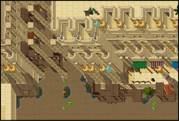
Okay, made some updates today/yesterday.
I think mixing brown walls with venore walls + adding these green roofs with brown water looks very good.
Not sure about the wooden structures along the passage. They are all okay, but maybe it makes the map look too spammed. Not sure.
Tell me what you think.
Click on images for better quality.


I think mixing brown walls with venore walls + adding these green roofs with brown water looks very good.
Not sure about the wooden structures along the passage. They are all okay, but maybe it makes the map look too spammed. Not sure.
Tell me what you think.
Click on images for better quality.
Attachments
-
 passage.png400.7 KB · Views: 5 · VirusTotal
eiserne festung
EmfF
I don't wanna sound mean, and please don't get me wrong....
But you're posting kinda everytime the same picture..... Would be cool to see something different of you.
Without the White Walls, grey statues and Water.
Cheers Eiserne!
But you're posting kinda everytime the same picture..... Would be cool to see something different of you.
Without the White Walls, grey statues and Water.
Cheers Eiserne!
OP
OP
scheisse
Excellent OT User
- Joined
- Oct 6, 2015
- Messages
- 582
- Reaction score
- 795
I don't wanna sound mean, and please don't get me wrong....
But you're posting kinda everytime the same picture..... Would be cool to see something different of you.
Without the White Walls, grey statues and Water.
Cheers Eiserne!
Well, the last 3 pics are new, i finished them today. Its true, that the venore sprites make up the biggest part of my work, but i always mix em up. The last 3 pics show a completely new style.
And the reason why i always post city maps, is because i want to finish this city one day. I have no other interest except finishing the flooded (venice style) city one day. So yes, my main mapping topic will remain the same for a long time (and i dont like mapping nature). But i try to add variations as much as possible and i think there are many ways for adding variability. People focus mostly on different sprites, but its simply not everything. The archtecture/geography, the way you place streets, the way bridges connect buildings... it all can be done in a variety of ways; change it a little bit and you get a new style; it will look same but somehow different.
So if you say, that i am posting the same things all the time, then this is not 100% true. The mappig topic is always the same, true; but the style and shape is always different.
Cheers.
Ps: i was trying to use other city sprites from time to time, but its very hard to map with them the way i want to map; the other sprites are simply not numerous and variable enough. You have wall, window, door...this is just not enough for me to create the city look i want. So when use other sprites, i try to mix em up with venore sprites. But here us another problem: not all city sprites go well with venore sprites, so meine wahloptionen are oncecagain limited :/
Its not like i am maping cuz i want to become a good mapper. I map with the sole intention of creating a city that looks like venice.