You are using an out of date browser. It may not display this or other websites correctly.
You should upgrade or use an alternative browser.
You should upgrade or use an alternative browser.
The white city
- Thread starter scheisse
- Start date


Blackstone
Legendary OT User
I always like the overall structure of your city. But even though you are now using some additional sprites, it all stays the same kind of stuff we see everytime.
You have shown new combinations which are nice but that's all that has changed. Many sprites and colors do not match each other.
You have a good eye on structures but not colors and details. All kinds of nature, even in cities do not look as they were well done. Some do also not make sense.
I personally believe if you would work with other areas, you would also learn a lot to even improve you white city.
It's always the same skills you show but you do not really improve in other areas of mapping. It's so much more than just using venore sprites and creating structures.
This is why I do not get attracted by your maps anymore. I would like to see something totally different. For me this is getting boring even though the structures are well done.
OP
OP
scheisse
Excellent OT User
- Joined
- Oct 6, 2015
- Messages
- 582
- Reaction score
- 795
Thanks for feedback. There are 2 main reasons why i always map this city and why i cant stop it. 1) I rly want to finish it 2) I am only interested in mapping cities; i am simply not feel attracted to nature so much :/ If there would exist another program for mapping vurtual cities, i would use it, but i check out there is no such thing. But i would rly like to map baroqe, rennaisace looking cities. For me its not so much about RME or tibia, but more about city building. Its a strange thing; I always get imaginations in my head of cities/buiildungs, but not of nature. (I was thinking about mapping cannoyon or smthing like that. Thats the only thing that would be interesting for me. Maybe ill do it the next time i have an "imaginationg bump"))
Tell me what colors and details do not fit with each other. I will try to change them. Last time you made some improvements on my map and i changed it and it really became better.
Its strange that people do not like the latest pieces; i rly thought that they are my best so far D I rly liked mixing different sprites with each other, cuz i think it creates this "busy, noisy" city atmosphere. Anyway, tell me what details/colors do not fit each other andi consider replacing them!
Another thing is, that the pics are huge. The player wouldnt see even half of the sprite combinations in game; he would see only a tiny part and encounter different envirobmebt step by step.
Tell me what colors and details do not fit with each other. I will try to change them. Last time you made some improvements on my map and i changed it and it really became better.
Its strange that people do not like the latest pieces; i rly thought that they are my best so far
D I rly liked mixing different sprites with each other, cuz i think it creates this "busy, noisy" city atmosphere. Anyway, tell me what details/colors do not fit each other andi consider replacing them!
Post automatically merged:
Another thing is, that the pics are huge. The player wouldnt see even half of the sprite combinations in game; he would see only a tiny part and encounter different envirobmebt step by step.
Last edited:
OP
OP
scheisse
Excellent OT User
- Joined
- Oct 6, 2015
- Messages
- 582
- Reaction score
- 795
okay, some times i check out my works few weeks after i have posted them to see whether i still like them and yes, i still think they are good. Maybe tell me what areas/colors/sprite combinations are bad and i would improve it. I would especially like to know how to improve the nature (but dont force me to remove that giant trees; they are giant and pale and fit to the yellow walls very well, i think). Ofc only if u have time and are up to it. Cheers!


OP
OP
scheisse
Excellent OT User
- Joined
- Oct 6, 2015
- Messages
- 582
- Reaction score
- 795
@Nokturno, thanks!


In the future i am planning to make more of such little "piazzas"... I dont know how to better name these open spaces between buildings haha

Post automatically merged:
In the future i am planning to make more of such little "piazzas"... I dont know how to better name these open spaces between buildings haha
Post automatically merged:
Attachments
-
 ganzneu1.png588.2 KB · Views: 8 · VirusTotal
Last edited:


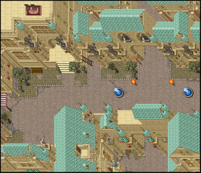
@scheisse amazing city  , I would only take out this statues looks like they're breaking the armony it's value is too dark. And if there's a sprite that fits well, change the roof border for another.

Another thing is that this shops looks a bit weird with the sprite combination, I think will be look better if you only use the white/red roof with linen on walls instead of that dark supports.

Regards!
, I would only take out this statues looks like they're breaking the armony it's value is too dark. And if there's a sprite that fits well, change the roof border for another.Another thing is that this shops looks a bit weird with the sprite combination, I think will be look better if you only use the white/red roof with linen on walls instead of that dark supports.
Regards!
OP
OP
scheisse
Excellent OT User
- Joined
- Oct 6, 2015
- Messages
- 582
- Reaction score
- 795


@nocturno, thanks man!
@ralke, yes, i have deleted the second house completly. this is what i have put instead.
And yes, i agree with the problems with roofs and this railing, but cant find anything better and cant cover the "holes" in the roofs. The grey statues... well yeah same problem. Not much alternatives :/ But i think when i add this green grass, it looks much better with grey statues. Thanks for comment!
Post automatically merged:
i dont fucking know why the quality turns out so bad... sometimes the pics are sharp and with contrast, now they arent.... wtf
Post automatically merged:

Post automatically merged:
a fuck it... i give up
Attachments
-
 geändert2.png513.6 KB · Views: 10 · VirusTotal
 -
 geändert3.png558.3 KB · Views: 10 · VirusTotal
Last edited:
OP
OP
scheisse
Excellent OT User
- Joined
- Oct 6, 2015
- Messages
- 582
- Reaction score
- 795
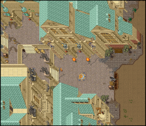
Reworking my recent pieces. I am not happy with it yet and its not finished. Any ideas how to improve it? I tried mixing grounds, but all of them suck. Only these yellow tiles fit very good, but they make the streets look too empty.... anyway, i dont know how to improve it. Any ideas?
I would simply add lanters, some boxes, trunks, gravel, scratches, benches, signs, chairs, tables..... my usual repertoire... i dont like it anymore when its too detailed and i want the style to fit my previous works; i think its better when the city streets have more or less the same style.... My biggest problem is that i dont know what to add to make the streets not look so empty and "blank".... with other tiles you can mix borders and so on (which i dont like, cuz it looks messy) but i cant do it with yellow tiles.... anyway ideas... i heard some of you guys are improving each others works.. so....


I would simply add lanters, some boxes, trunks, gravel, scratches, benches, signs, chairs, tables..... my usual repertoire... i dont like it anymore when its too detailed and i want the style to fit my previous works; i think its better when the city streets have more or less the same style.... My biggest problem is that i dont know what to add to make the streets not look so empty and "blank".... with other tiles you can mix borders and so on (which i dont like, cuz it looks messy) but i cant do it with yellow tiles.... anyway ideas... i heard some of you guys are improving each others works.. so....
EvilSkillz
Back
No hate but every single picture looks kinda same

EvilSkillz
Back
Yea I do not have any problem with it
But it starts to get ridiculous
Every month almost the same picture
As I said above its not a hate")
But it starts to get ridiculous
Every month almost the same picture
As I said above its not a hate
EvilSkillz
Back
Relax, i was trying to be funny
was so funny that i started to map a white city
love you <3
kind regards
Hashirama479
World of Ninja
- Joined
- Dec 19, 2016
- Messages
- 536
- Solutions
- 6
- Reaction score
- 74
even after my unban
your white city is still there
your white city is still there