Big news...
Today we began the implementation of the new UI. It might take a couple of weeks before it's entirely ready for live testing, but we feel very confident about it being a great replacement for the current one.
From a delicate design to a more user-friendly interface, this UI will bring many changes that the community requested during the previous months of testing.
The main thing we're trying to accomplish, beside having a nicer, more professional look here, is to make information easily accessible to everyone, including those who play Necronia for the first time.
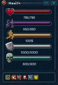
We'll remove the Extra Stats Panel completely and scatter its information into 2 places:
1. The information about your critical chance, dodge chance, military points, jigglesmile tokens, movement speed and SDC rank will be stored in the Skills window, which we will also rename to something more fitting. Its shortcut will remain as CTRL+S.
2. The information and buttons related to the consumption system will be placed on the screen and will be easier to use and understand.
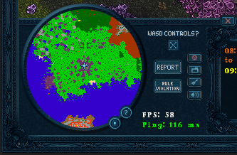
Another major thing that's happening is the fact that the game-screen will become bigger. And by that, I mean that you will actually be able to see more tiles both in width and height, and maybe we'll even manage to preserve the original sprite quality and size, with no zooming of the screen.
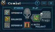
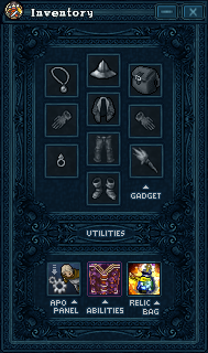
Countless other changes will take place, but we'll take things one at a time, so until we bring more specific updates about UI parts, enjoy this prototype design:
You may have also seen some new developers floating around on Deity characters. We're happy to say that we are looking at a possibility of having 2 awesome scripters join our team, but we're still holding back on a specific announcement until all parties are sure that this is how it will go down. All in all, February should be an awesome month for Necronia and its progress as we already began reworking some stuff on mainland and you will soon get access to it as testers.
I am also going to rework the main page of the thread and update it for better appeal and information!
 ?
?