You are using an out of date browser. It may not display this or other websites correctly.
You should upgrade or use an alternative browser.
You should upgrade or use an alternative browser.
2Rec
Excellent OT User
- Joined
- Jul 31, 2013
- Messages
- 550
- Solutions
- 48
- Reaction score
- 887
Perspective on 29. is a bit off i think.29.
30.
Love the second helmet. Isnt it a bit small tho?
More of a furnitures maybe? Or some basic town objects. Sounds easier than nature.I started to think to try some tiles/woods/trees etc instead of items.
Is it too soon or should I give it a try?
X
Xikini
Guest
Congrats on 5 weeks, ish.I could make it a bit bigger indeed. Had like 3-4 pixels height more.
31.

OP
OP
Ochman
Veteran OT User
- Joined
- Feb 27, 2016
- Messages
- 351
- Solutions
- 5
- Reaction score
- 252
Well, thanks! But actually, there should be more of those... Had some important real-life stuff
I'm trying to catch up.
32.

33.

34.

35.

36.

In 36., how I should make cape to look like "behind" armor part? I'm too bad to manage to do it :/
I'm trying to catch up.
32.
33.
34.
35.
36.
In 36., how I should make cape to look like "behind" armor part? I'm too bad to manage to do it :/
Last edited:
MikeOT
Well-Known Member
- Joined
- Jan 22, 2017
- Messages
- 245
- Solutions
- 2
- Reaction score
- 99
Personally, I love the look of those 32-36. Simple and effective. I think there is way too much emphasis nowadays on "realism". To each his own, but I'd be perfectly happy playing a game with graphics that look like those!
Great job, keep it up!
Great job, keep it up!


OP
OP
Ochman
Veteran OT User
- Joined
- Feb 27, 2016
- Messages
- 351
- Solutions
- 5
- Reaction score
- 252
Thanks.I love your enthusiasm, a piece of advice, use more contrastand you will see how the sprites will start looking better
")
I will try more contrast next time for sure!
There goes 39., i know it has many many many flaws, to the point you might wonder what it is (it's not clear, I tried to do cape haha).
But the point is; that while doing "worst" sprites, I learn a lot more than doing "fine" sprites. So I'll keep posting them, even if those are terrible, just to ensure that I did not abandon this project.
39.


OP
OP
Ochman
Veteran OT User
- Joined
- Feb 27, 2016
- Messages
- 351
- Solutions
- 5
- Reaction score
- 252
Thanks!32, 35, 40, 45 have a lot of potential in my opinion.
Maybe it would be cool to slow down the rythm and put more effort in the painting of those good designs.
The thing is, that even tho I made ~45 sprites, I still don't know what exactly I'm doing wrong with a majority.
Obviously, I can tell when I see the final result... but it's usually too late.
Sometimes the shape of the item is off, but when I try to correct it, it gets worse, so I ctrl + z to initial state.
Sometimes shading is too smooth, but then again - I make it too noisy.
I cannot find the compromise, don't know when to stop or what I should focus on.
I don't even know what makes "good" sprite "good" from a technical point.
Finding tutorials in this matter is also a bit tricky, some pixel-art tutorials have way different style; most tutorials are "do some crazy sword" and do not teach how to sprite, but rather how to create this exact item.
Also, my shading is kind of "random" - I just "think" that it should be this way. I would rather like to "know" it.
Leshrot
Best spriter & cutest too
- Joined
- Nov 17, 2012
- Messages
- 391
- Reaction score
- 791
Thanks!
The thing is, that even tho I made ~45 sprites, I still don't know what exactly I'm doing wrong with a majority.
Obviously, I can tell when I see the final result... but it's usually too late.
Sometimes the shape of the item is off, but when I try to correct it, it gets worse, so I ctrl + z to initial state.
Sometimes shading is too smooth, but then again - I make it too noisy.
I cannot find the compromise, don't know when to stop or what I should focus on.
I don't even know what makes "good" sprite "good" from a technical point.
Finding tutorials in this matter is also a bit tricky, some pixel-art tutorials have way different style; most tutorials are "do some crazy sword" and do not teach how to sprite, but rather how to create this exact item.
Also, my shading is kind of "random" - I just "think" that it should be this way. I would rather like to "know" it.
First problems are values. You need colors with a good contrast.
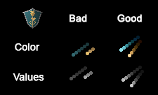
Values are the LUM property of a color.
The shield colors have no contrast, check it better by looking at the values on grayscale.
Try to paint the shield with the new values, don't be afraid to add more colors if you feel it needs, just be careful to not break contrast or it will get blurry.
Second problem is Anti-Aliasing, with the small tutorial I've posted in other page you may get the very basic of it (darker dots on the borders), and you must search for more in future.
Without good values and AA you can do great designs as you've been doing but you won't be able to do a good shading.