• There is NO official Otland's Discord server and NO official Otland's server list. The Otland's Staff does not manage any Discord server or server list. Moderators or administrator of any Discord server or server lists have NO connection to the Otland's Staff. Do not get scammed!

Rik123's mapping showoff

I like that, nice work!

Thanks, I'll try to post some more pics this week as I've got holidays now. I barely got time to map during the week.


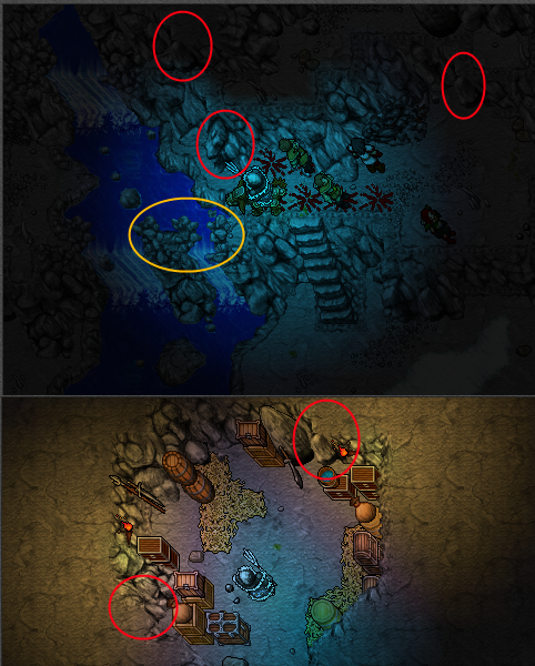
Everything looks great! There are some quirks I've always found unappealing though;

red: I prefer 4468 and 4469 respectively instead of these.
yellow: I think this looks somewhat strange, have you tried thinking of some different solution?
d6dSSU4.png

Well, I don't really like it if it's like every corner is the same that's why I kinda use both, but I think those you circled look better. Just a matter of taste ;> The waterfalls are a struggle for me haha, I've been trying to figure out how to do it properly and I thought this was the best solution, even tho it's not that good looking.

i like your work men :D

Thanks :>
 
Well, I don't really like it if it's like every corner is the same that's why I kinda use both, but I think those you circled look better. Just a matter of taste ;> The waterfalls are a struggle for me haha, I've been trying to figure out how to do it properly and I thought this was the best solution, even tho it's not that good looking.

Indeed! As for the waterfalls, I think this looks better:
zOMO3Ks.png
 
Depot: (Totally not inspired by Mackan's Ramurika #Therran)
View attachment 27216

I think the "design" is good, but at the same time the depot feels somewhat cramped. Is there a reason for why you chose to go with this size? Furthermore, I'd say that you went slightly overboard with the dirt usage & grass bordering, and I've never been a fan of trees & big grass tufts on dirt. Could we see it with less dirt? Perhaps the outermost tile dirt, and the innermost grass, moving the poplars next to the depot walls?
 
I don't get it? :p

The rest looks like your town haha


Yup

I think the "design" is good, but at the same time the depot feels somewhat cramped. Is there a reason for why you chose to go with this size? Furthermore, I'd say that you went slightly overboard with the dirt usage & grass bordering, and I've never been a fan of trees & big grass tufts on dirt. Could we see it with less dirt? Perhaps the outermost tile dirt, and the innermost grass, moving the poplars next to the depot walls?

Yeah I noticed it was pretty small. The dirt and grass bordering is to create somekind of sphere, this includes the poplars. The big grass tuffs look horrible idd, didn't notice it there haha. The poplars are staying where they are. Changed the rest, thanks for the advice
upload_2014-10-19_11-22-24.png

PS: The whole town is far from finished. Never made a town this way before ;p

I don't like your maps.

Ok
 
There we go! It looks a lot better now that the depot is more spacious :)

psst: use ctrl+scroll wheel in RME before taking your screencaps
 
There we go! It looks a lot better now that the depot is more spacious :)

psst: use ctrl+scroll wheel in RME before taking your screencaps

I assume you're talking about zooming in? Yea well it was meant to show you the whole depot, and I'm not gonna take two screens for that :p
 
I assume you're talking about zooming in? Yea well it was meant to show you the whole depot, and I'm not gonna take two screens for that :p

Oh! My monitor covers 52 SQM's from left to right so that being an issue didn't cross my mind, my bad :p
(I'd still prefer picture "merging" though, so that we get the actual sprite sizes, but it does take a tiny bit more time than just uploading the screenshot)

EDIT: I hate picture merging. This crap takes time, would not try again. LOL

(Large picture) i.imgur.com/mYJBmwr.jpg
 
Back
Top