You are using an out of date browser. It may not display this or other websites correctly.
You should upgrade or use an alternative browser.
You should upgrade or use an alternative browser.
My first PS try xD
- Thread starter Znote
- Start date

D
Deleted member 92788
Guest
Everything is so big xd
Try to stick with a color scheme Not just one xd makes it looks wierd xd
Try to stick with a color scheme
Not just one xd makes it looks wierd xd
R
Runes
Guest
Looks like we're back in the 90's!
Explained.
Tibiamakers
yourolist.com
mmmm... no
contact text isn't aligned with the others text's buttons [1], and home and download button isn't aligned with the other 2 buttons [2], buttons background is aligned with main text background [3], footer background isn't well aligned with background of buttons [4].
Later you could have put a better background than a black bg, maybe something like a stars bg or something.
The structure of main text reveals too much moon at the right than left [5], so you could extend a bit more and finally the space between footer and main bg and the space between main bg and the buttons isn't the same, and right and left spaces aren't the same [6].
But for the first time is pretty nice, you will improve your skills just skilling so don't desist, also you could see some tutorials for learn some tips

Just are a small details that breake the harmony of the layout")
contact text isn't aligned with the others text's buttons [1], and home and download button isn't aligned with the other 2 buttons [2], buttons background is aligned with main text background [3], footer background isn't well aligned with background of buttons [4].
Later you could have put a better background than a black bg, maybe something like a stars bg or something.
The structure of main text reveals too much moon at the right than left [5], so you could extend a bit more and finally the space between footer and main bg and the space between main bg and the buttons isn't the same, and right and left spaces aren't the same [6].
But for the first time is pretty nice, you will improve your skills just skilling so don't desist, also you could see some tutorials for learn some tips

Just are a small details that breake the harmony of the layout
OP
OP
mmmm... no
contact text isn't aligned with the others text's buttons [1], and home and download button isn't aligned with the other 2 buttons [2], buttons background is aligned with main text background [3], footer background isn't well aligned with background of buttons [4].
Later you could have put a better background than a black bg, maybe something like a stars bg or something.
The structure of main text reveals too much moon at the right than left [5], so you could extend a bit more and finally the space between footer and main bg and the space between main bg and the buttons isn't the same, and right and left spaces aren't the same [6].
But for the first time is pretty nice, you will improve your skills just skilling so don't desist, also you could see some tutorials for learn some tips
Just are a small details that breake the harmony of the layout
Ahh yeah, thanks.
Was kinda rushing it and didnt pay attention to such details. D:Sharp
Veteran OT User
use a ruler menz :3 and round your buttons, most people like rounded buttons, that is why Apple changed their sliding buttons to a circle XD
XDtroxet
New Member
To make a creative evaluation of your design I would say:
- In navigation you should use font size 12-11px which is alright and you got things like sharpen, smooth etc use first option (blank or something cant remember it and photoshop switched off).
- For colors use kuler.adobe.com
- To get familiar with photoshop please use: Adobe Photoshop Tutorials from Beginner to Advanced | Psdtuts+
- To get ideas please use deviantart.com
I think that would help you in futher webdesigns,
Regards,
Troxet
OP
OP
use a ruler menz :3
What is that? D:
Tibiamakers
yourolist.com

Sharp
Veteran OT User
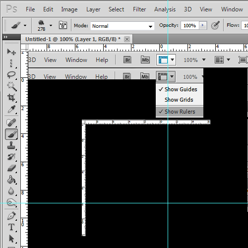
Basically, get the rulers out by turning them on, then to get the blue lines click and drag in the ruler onto the canvas, horizontal lines come from the top ruler, vertical from the left ruler.
To remove them use the moving tool, and just drag them back into the ruler
Pretty sure when you have rulers, layers will snap too if you drag them close enough

Tibiamakers
yourolist.com
well, photoshop have an auto quadrate (?) and if you see carefully the layers, you don't need to use that
Basically, get the rulers out by turning them on, then to get the blue lines click and drag in the ruler onto the canvas, horizontal lines come from the top ruler, vertical from the left ruler.
To remove them use the moving tool, and just drag them back into the ruler
Pretty sure when you have rulers, layers will snap too if you drag them close enough
Or you could just press CTRL + R
squidy
Member
I see that everybody is helpful here, so let me be too!
As you can see your home text is not centered with the button below it. To center them each other, select text layer and button layer (crtl+left click) then choose move tool(v) and then in the top panel you will have few icons like align verticaly etc.
Btw. bevel&emboss sucks At least in default way.
As you can see your home text is not centered with the button below it. To center them each other, select text layer and button layer (crtl+left click) then choose move tool(v) and then in the top panel you will have few icons like align verticaly etc.
Btw. bevel&emboss sucks
At least in default way.Sharp
Veteran OT User
Or you could just press CTRL + R
SO THATS THE HOTKEY xd
sorry, even though ive been using photoshop for a long time, Ive never actually figured a hotkey for rulers :/
I don't know, I actually like it dispite how plain and old style it looks Nice job though xD
Nice job though xD
OP
OP
I don't know, I actually like it dispite how plain and old style it looks
Hehe, it looks a bit retro.
I see that everybody is helpful here, so let me be too!
As you can see your home text is not centered with the button below it. To center them each other, select text layer and button layer (crtl+left click) then choose move tool(v) and then in the top panel you will have few icons like align verticaly etc.
Btw. bevel&emboss sucks
Thanks for the tip!