Karain
Jack of all trades
in the end it all comes down to your standard of "success" and your players' preferences, either way, keep working, keep improving.
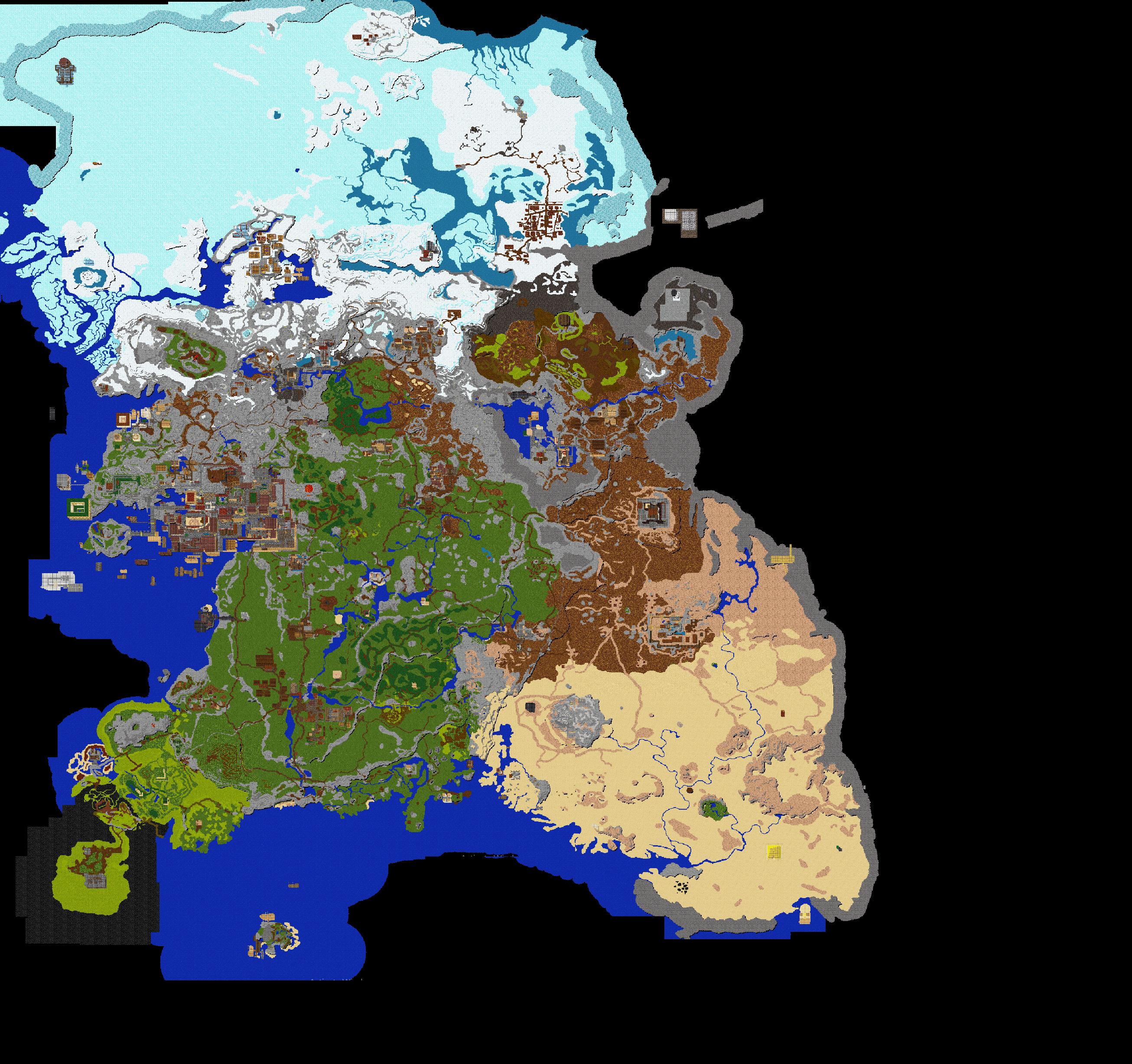
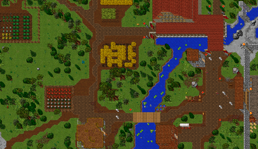
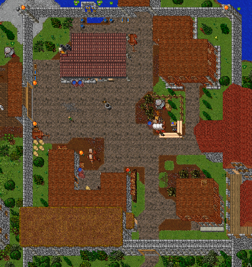
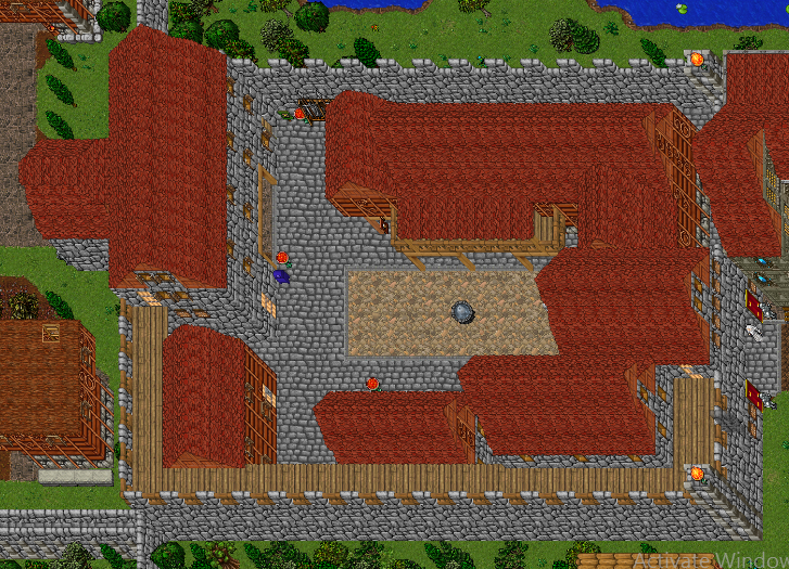
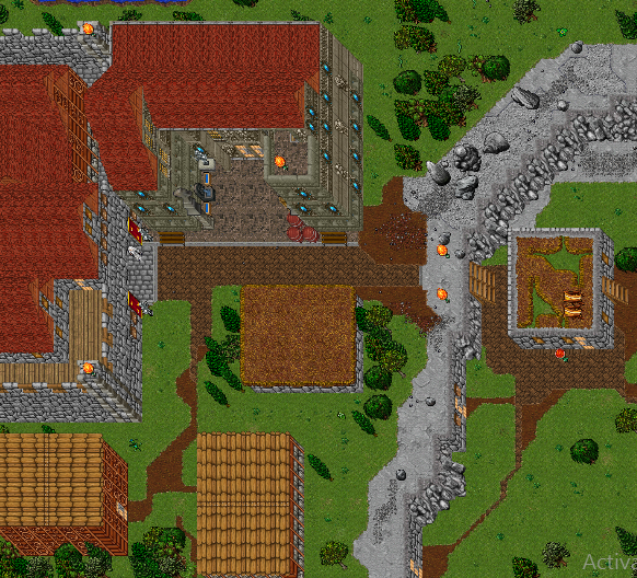
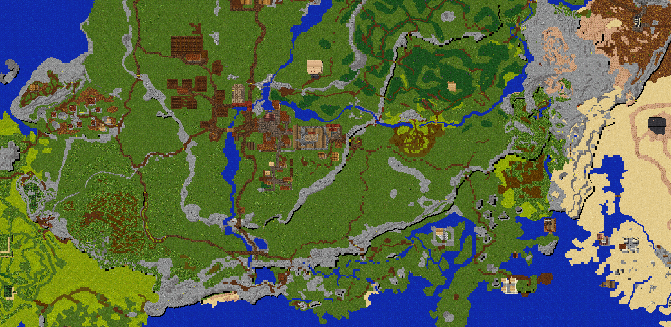
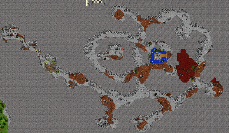
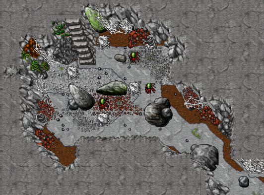
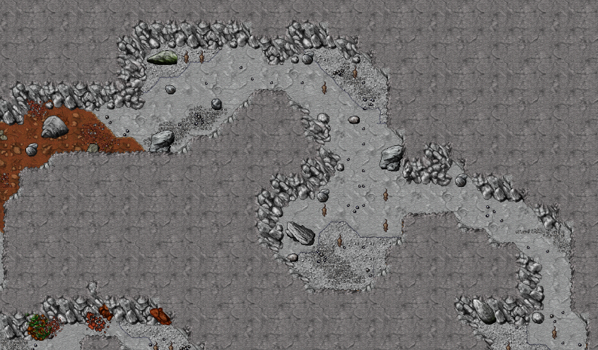
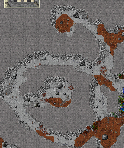
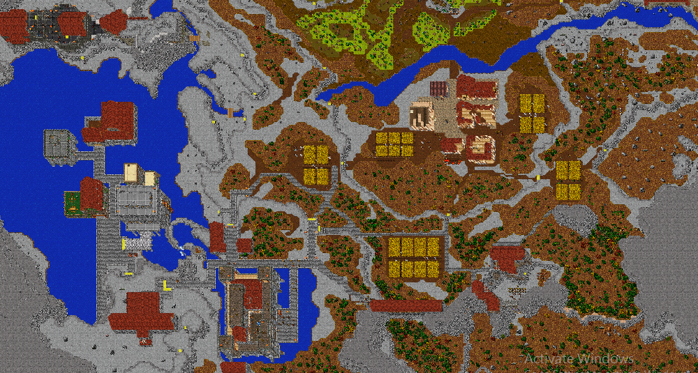
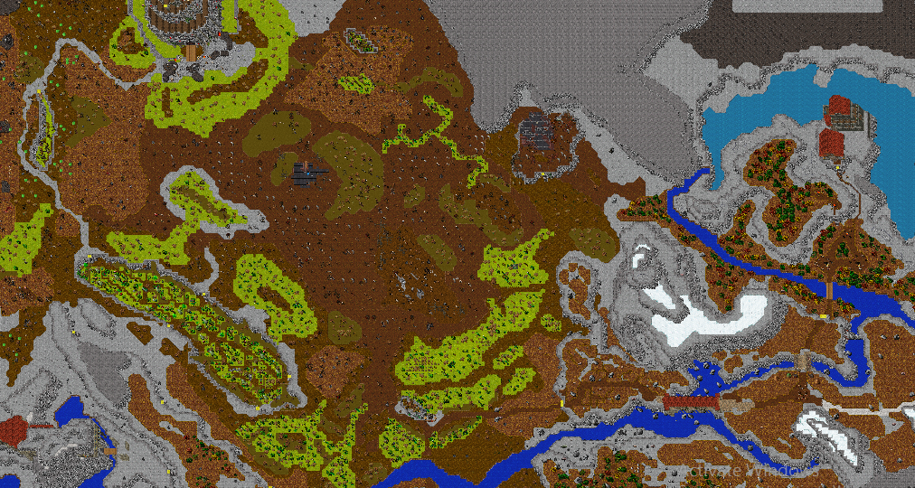
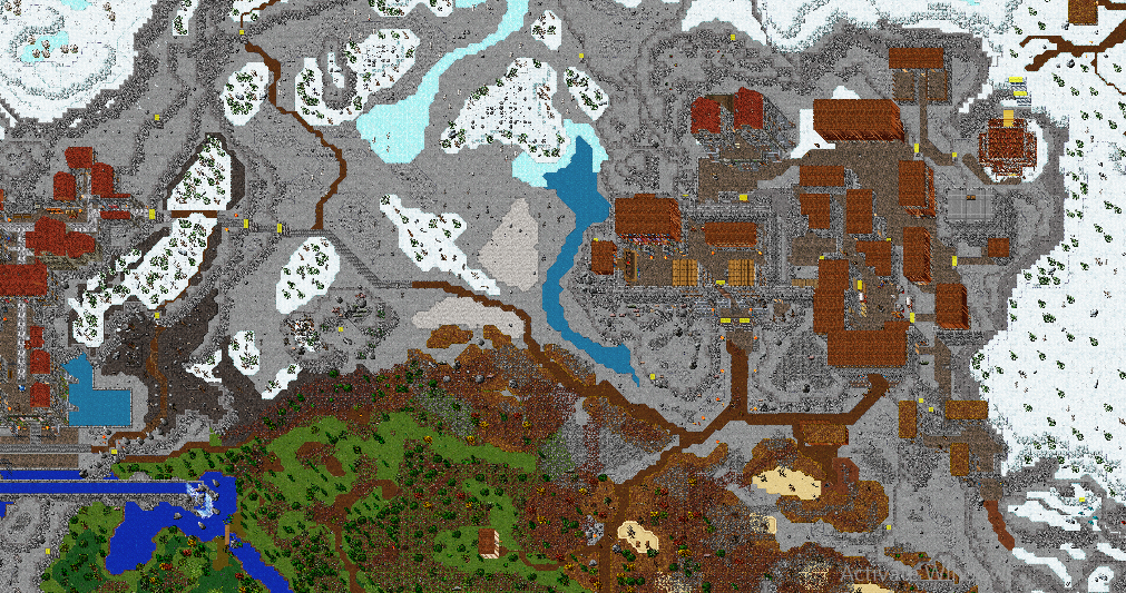
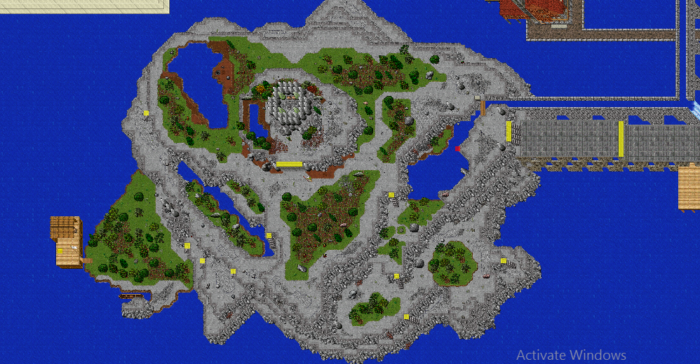
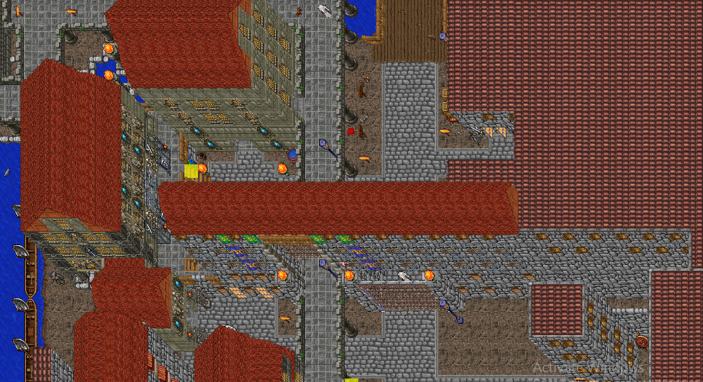
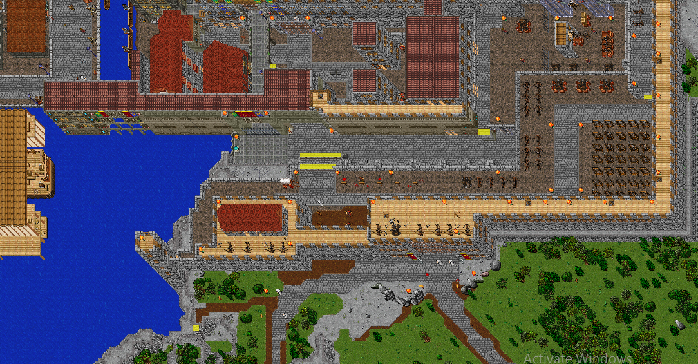
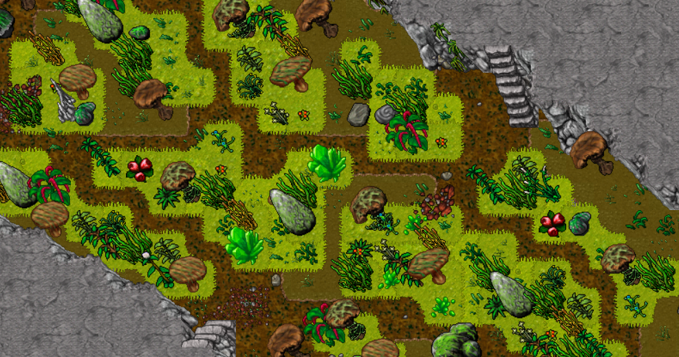
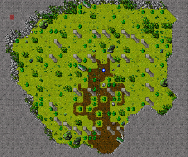
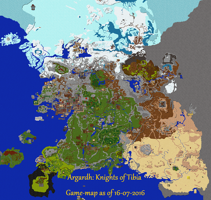
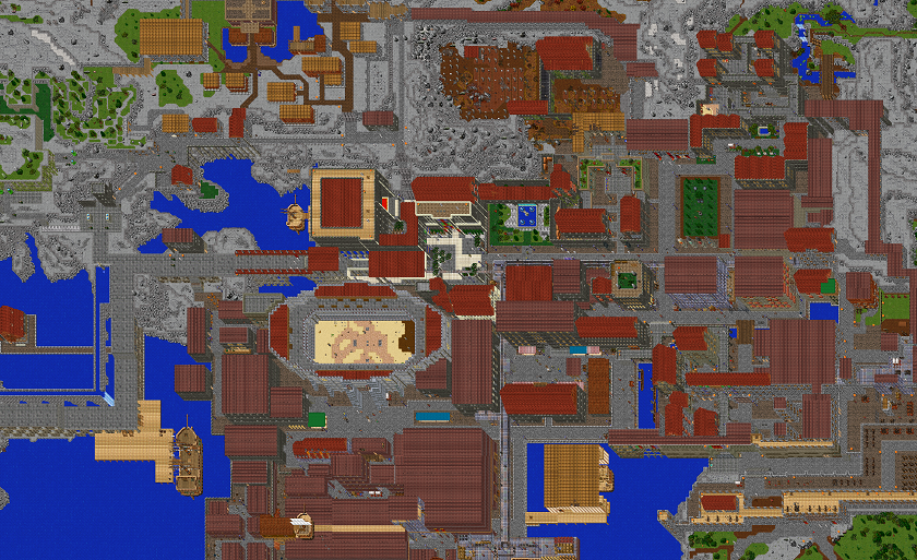
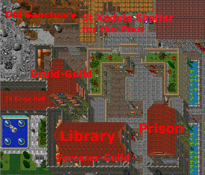
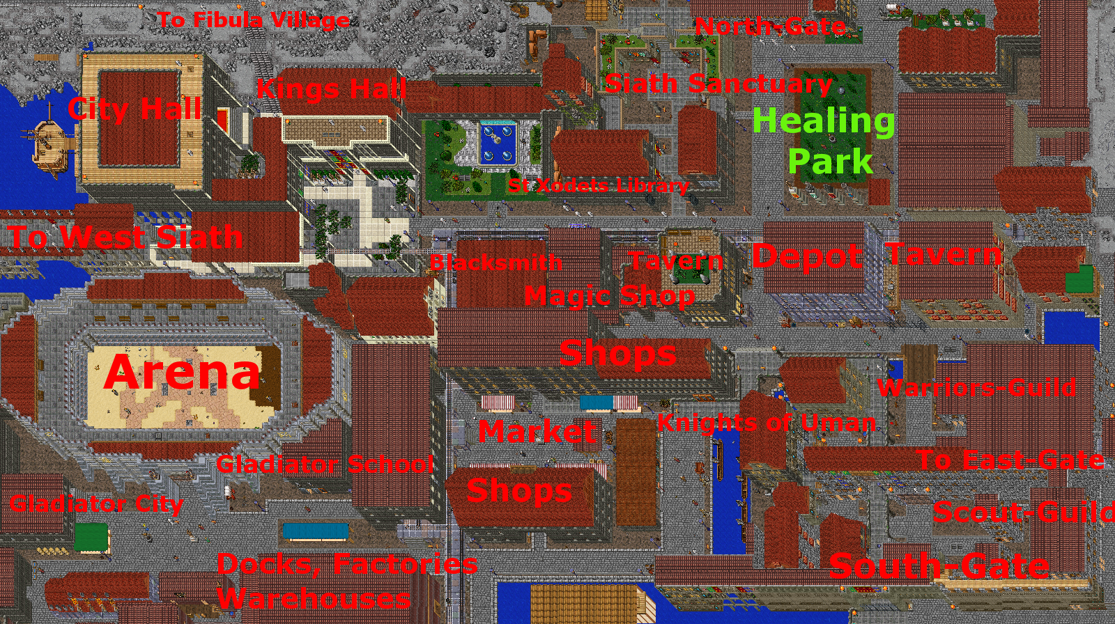
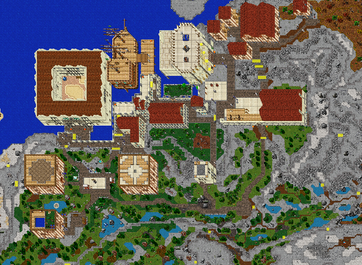
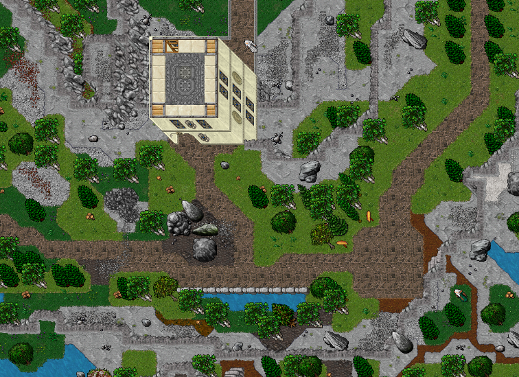
I noticed you said earlier that you love the old school tibia style of maping, so i suggest you download the 8.60 rl map and take inspirations from it, like how cipsoft mapped and detailed grass plains, how they did mountains and caves, how they planned cities, how they placed monsters and created new zones, etc etc.
If you know that there is much more to learn, then we will all encourage you to keep working and practicing.
But if you are here to boost your ego and expect only positive comments and praise, then i am sorry to say that you are in the wrong place.
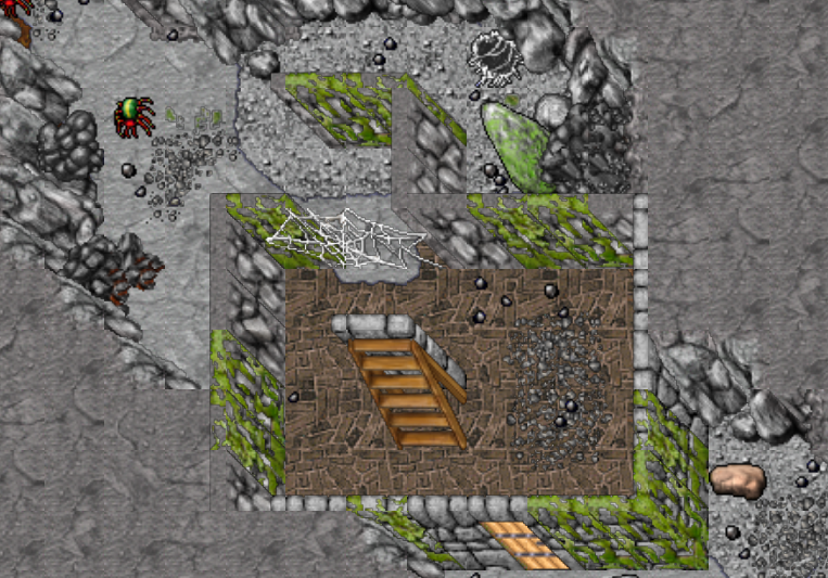
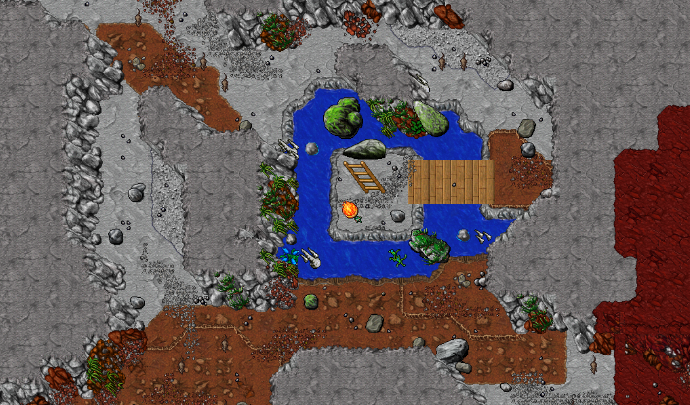
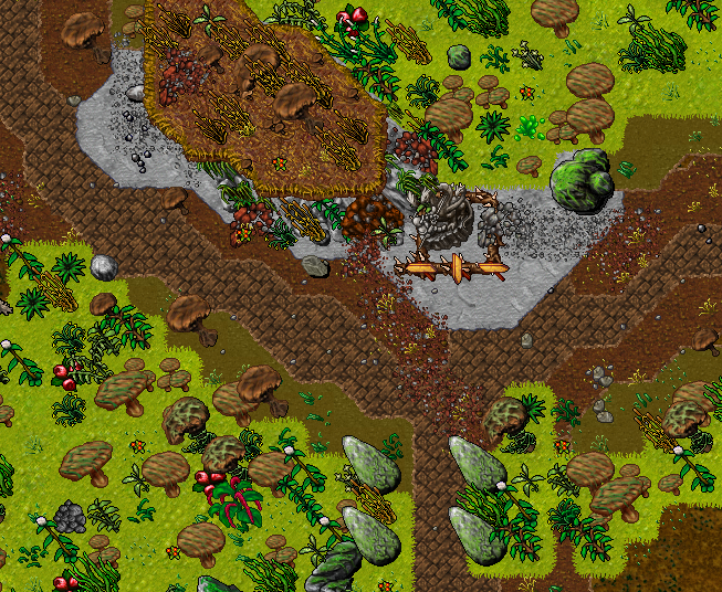
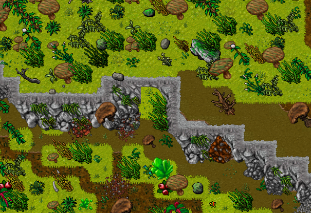
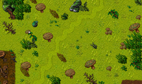
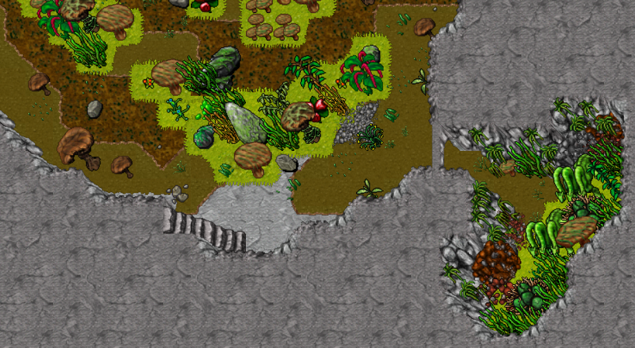
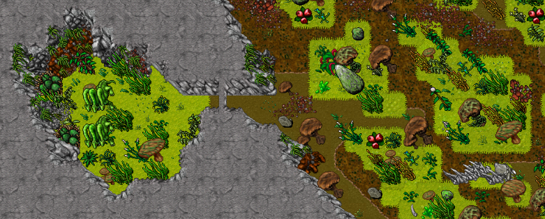
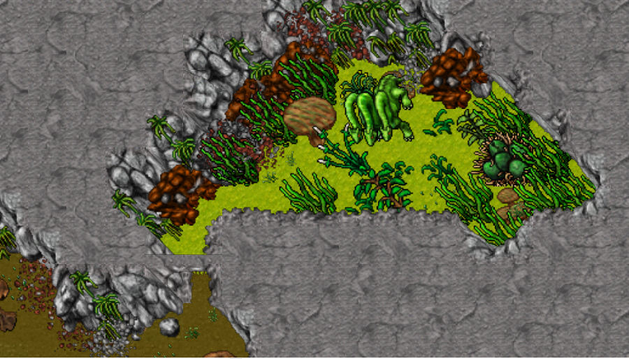
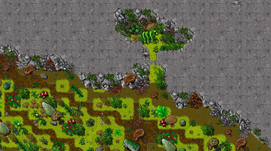
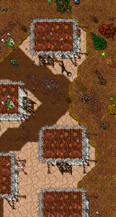
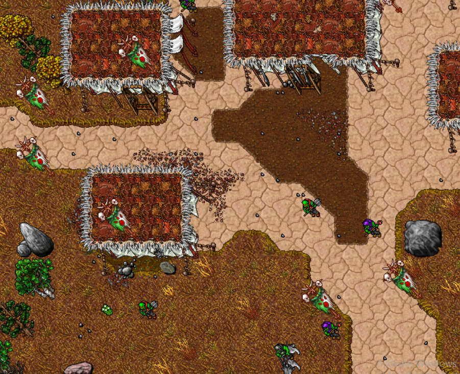
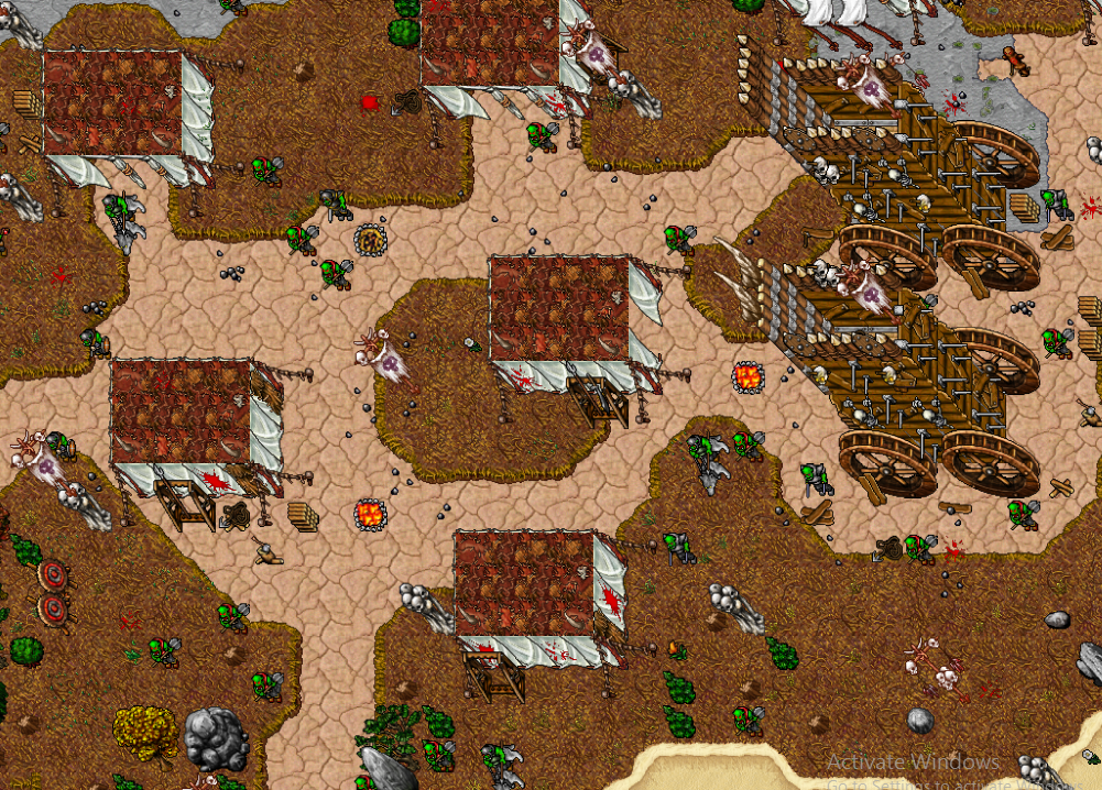
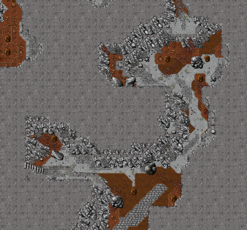
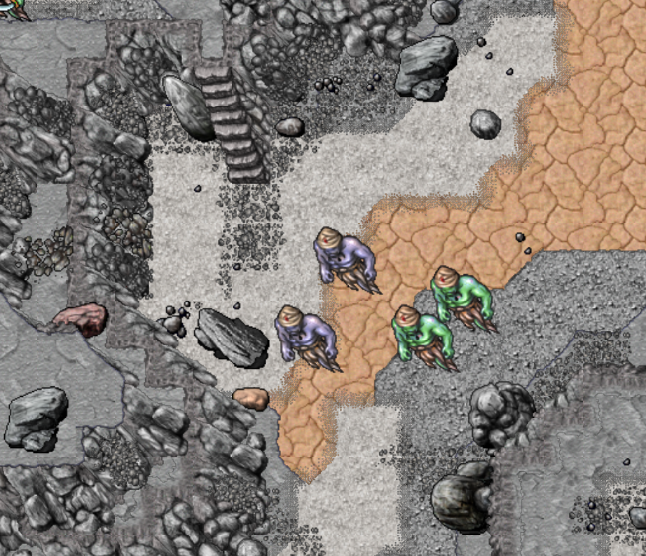
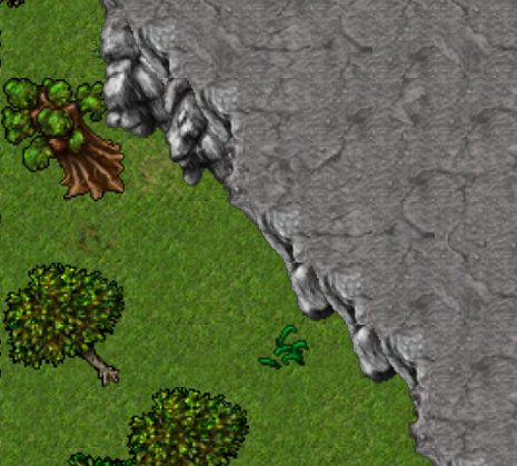
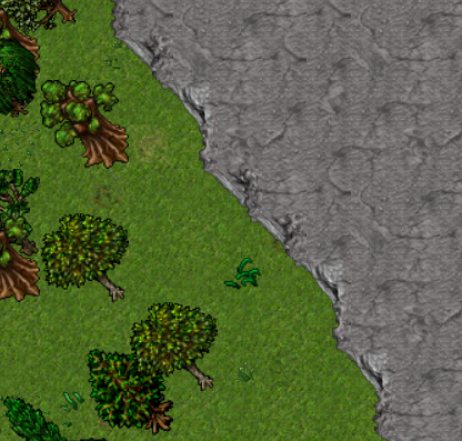
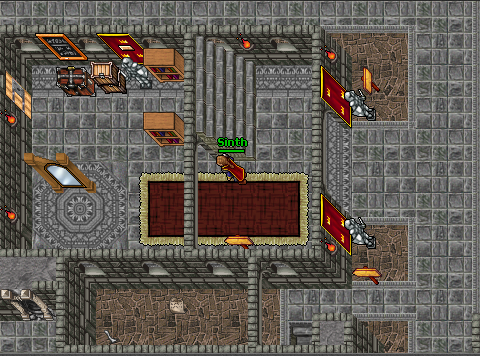
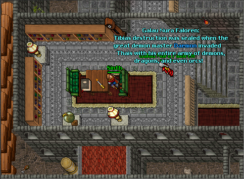
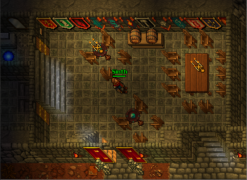
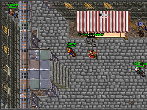
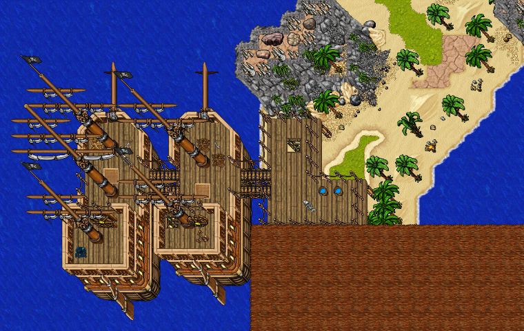
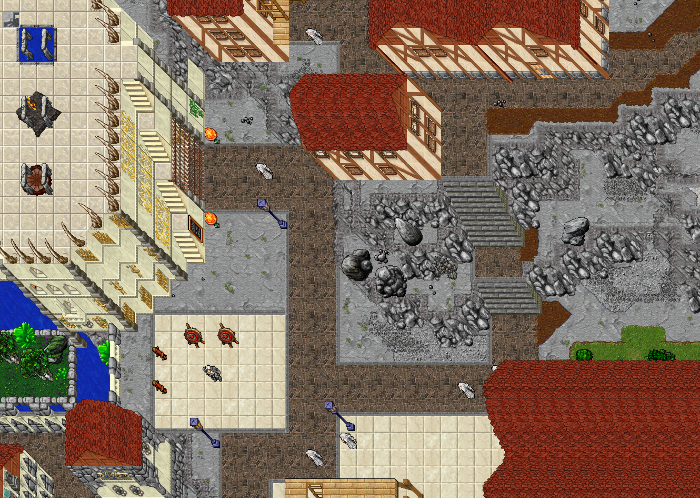
 I have a lot to learn, for sure. But I'm still not taking bullshit from other mappers just because I map with a different style
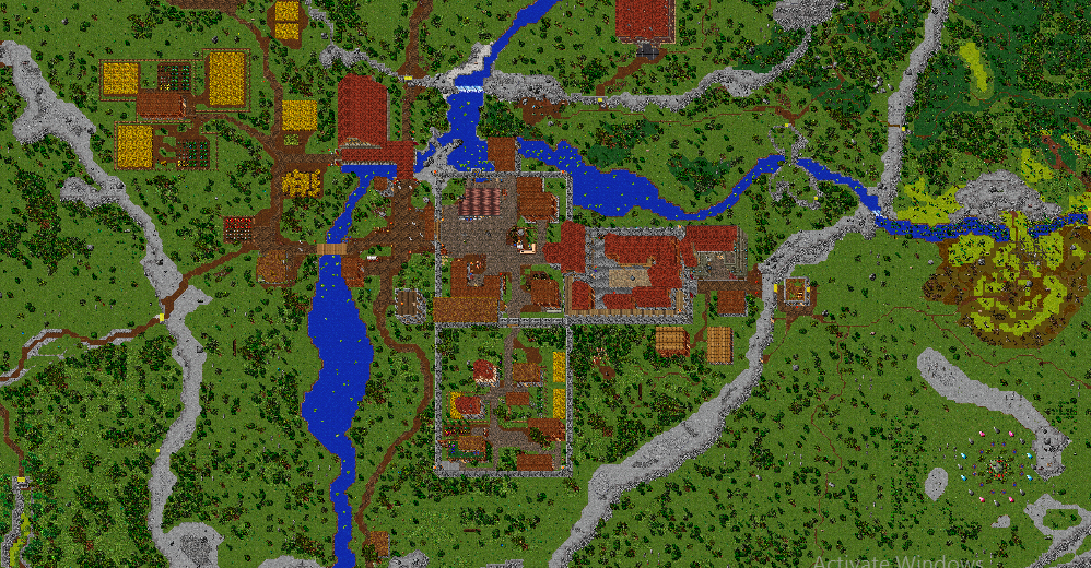
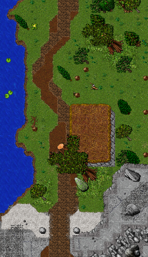
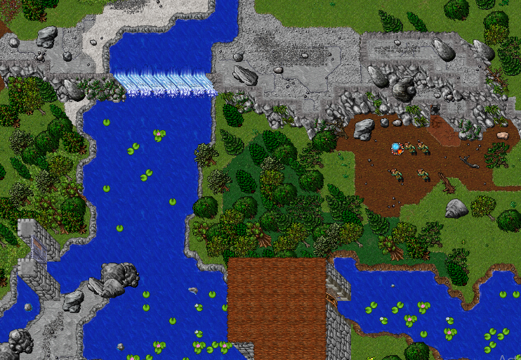
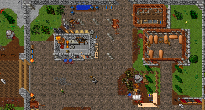
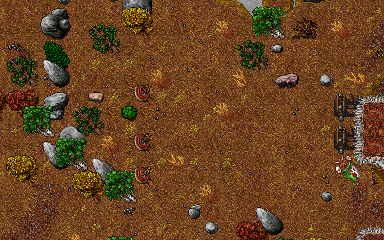
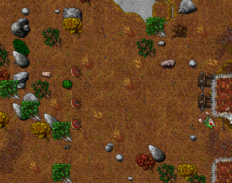
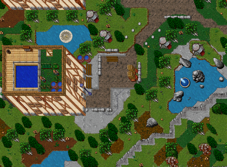
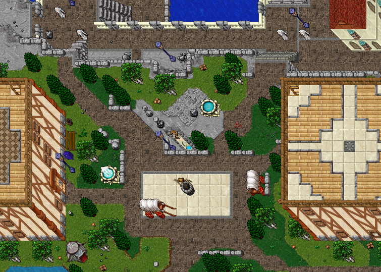
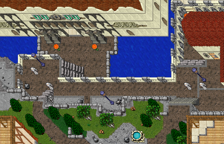
 ") I am allergic against a ton of stuff other mappers use alot(like fat mountain-borders.. euw!) and got a lot of praise for, for example.. anyways, I map to try and make the background disappear instead of stealing your attention. It should be easy to see the tiles and where you can and can not go imo.
I am allergic against a ton of stuff other mappers use alot(like fat mountain-borders.. euw!) and got a lot of praise for, for example.. anyways, I map to try and make the background disappear instead of stealing your attention. It should be easy to see the tiles and where you can and can not go imo.")