Here is another small wolf cave I made. Looking to get opinions again on what it could use for improvement.
Wolf Cave:
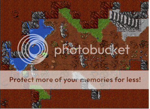

I think it is best to use some other type of grass for the insides of a cave, but I'd keep it just as long as the grass tuffs are ON the grass and not on the dirt.

")